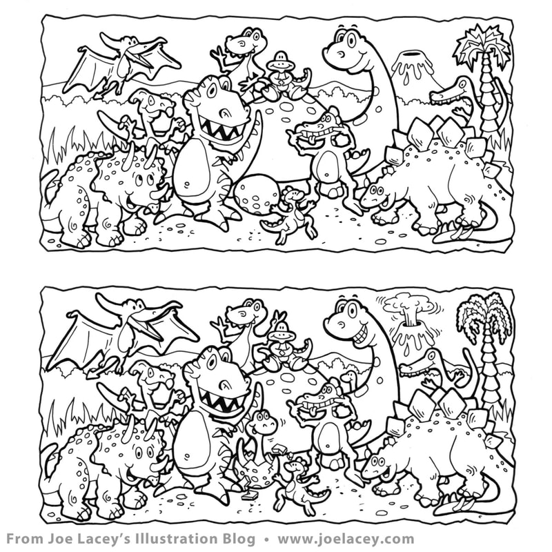
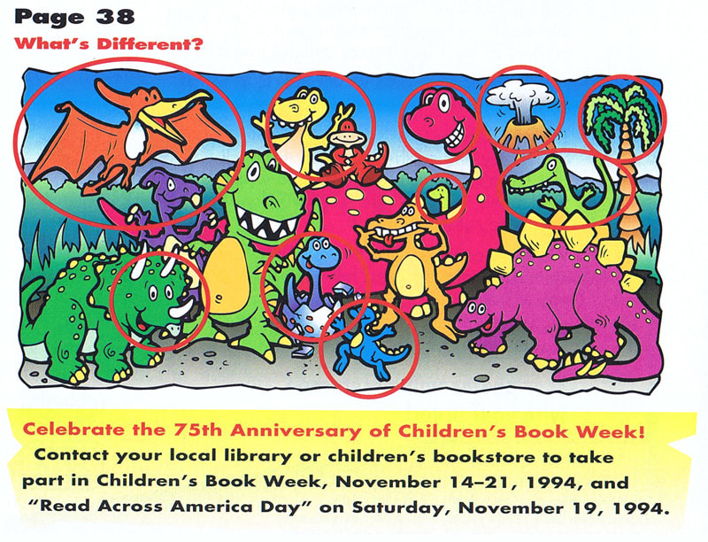
Let's Go Digital! Print magazines were having a digital revival in the '90s. Crayola Kids Magazine, published bi-monthly by Meredith Corporation, offered a variety of art styles, games and stories for young readers. It was my first foray into this type of publication and I absolutely loved it! Every couple months, I worked on anywhere from one to three activities, spot illustrations or promotional web items. It was also my first step into the world of digital art. I remember the day I walked into the Crayola offices and saw all the drafting tables, drafting arms and markers being pulled out and replaced with computers. I was very young and out of school, but thought, "Uh, oh... this looks like trouble." I asked everyone I worked with, "Would you like it if I got a computer and started going digital?" Crayola said "YES!", Fisher-Price said, "YES!" I thought about it and then Bob Riley, the art director at Crayola Kids called. My phone conversation with him went something like this, "You can do the art any way you want, as long as it looks good, but we'd prefer digital if you can do it, and we need it in one month." I said, "Sure! I can do it digitally." I hung up the phone and went out and bought a Macintosh Quadra 605 computer, Photoshop, Freehand and Adobe Streamline. I had one month to figure all this out. The game was What's Different? to be included in the upcoming dinosaur issue. Hand inked on vellum, scanned and converted to vector. The art was very simplistic compared to the art I am doing today, but at the time, there were so many obstacles, beyond frequent computer crashes, tube-styled monitors and using a mouse. On top of this, I couldn't email the file and the file had to fit on a 1.4MB floppy disc (Syquest and ZIP Drives were still out of reach). And these limitations went on for quite a few years. It was a golden age for FedEx. The job got done, I figured out how to make an illustration in the computer, I sent off my invoice, and more digital work rolled in soon after. 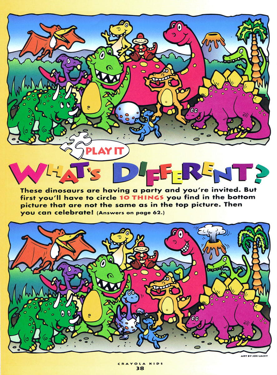
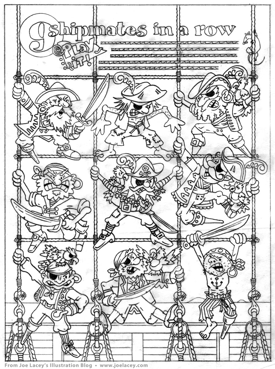
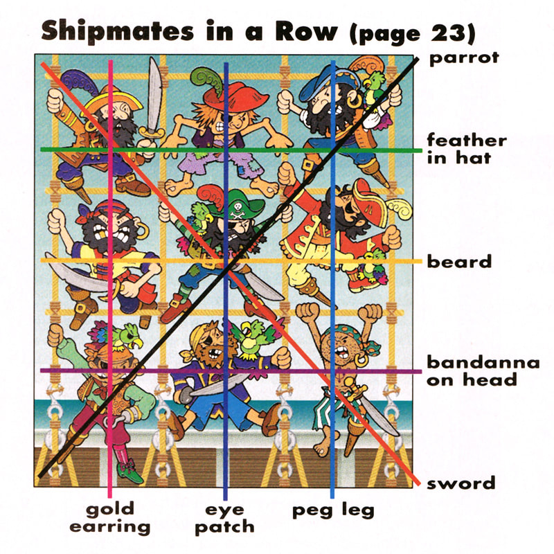
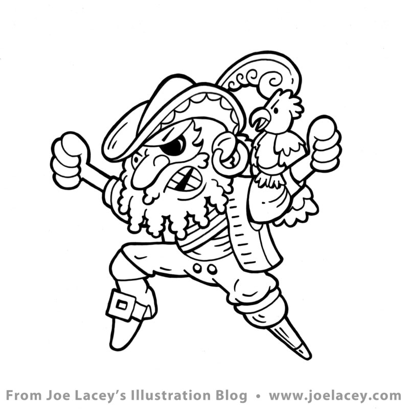
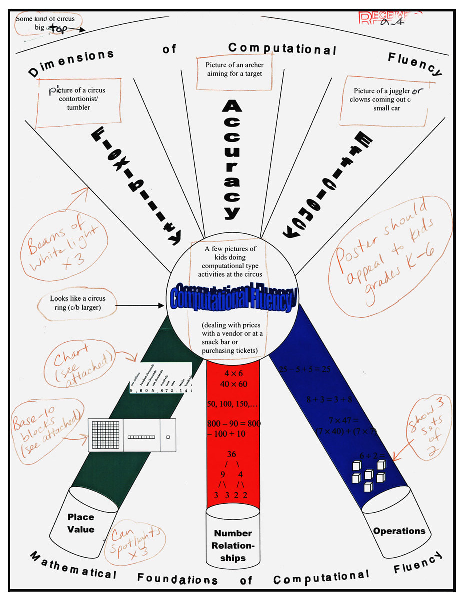
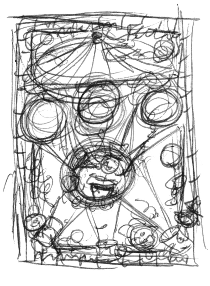
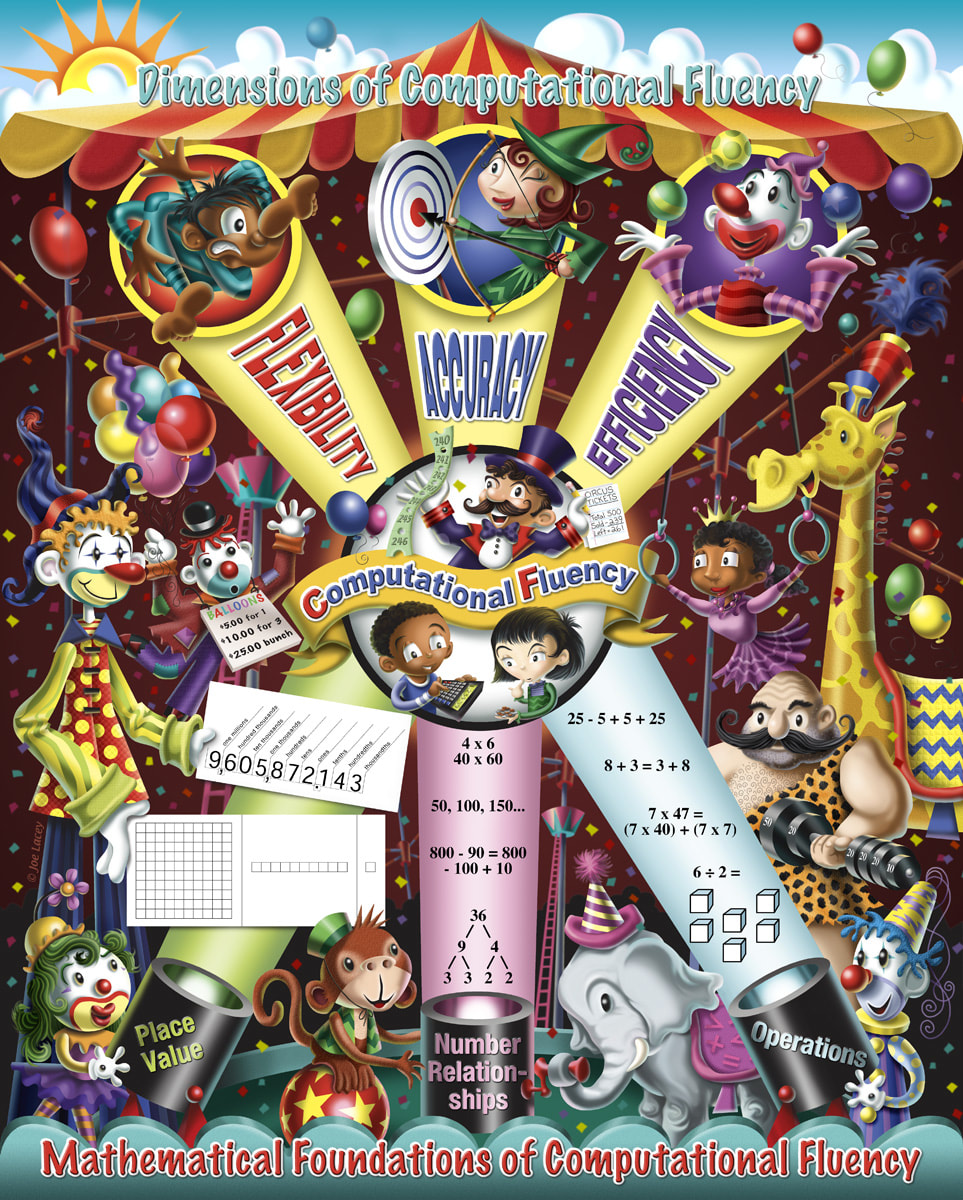
Bigger And Better Things! I worked on the magazine for about five years, writing and illustrating games. Multiple computers and programs later, the illustrations were getting more complex. Some being built entirely in the computer. Many, still being hand-inked, scanned and added on from there. The ROW, ROW, ROW series as we referred to them, were some of my favorites. I became the "go-to-guy" for these, writing and illustrating about twelve in all. Here's one I always liked, 9 Shipmates In A Row. Eventually, I began getting commissions from Sesame Street Magazine, Kid City, Scholastic, Better Homes & Gardens, and even Esquire to write and create children's magazine activities. It became the stepping stone for my future work with corporate promotional books and kids restaurant menus. 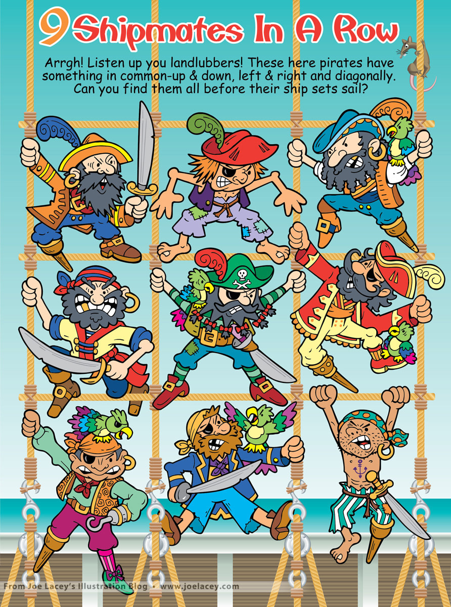  I remember the day I received an email inquiring if I would be interested in taking on an assignment to illustrate a poster about "the dimensions of computational fluency". At first I thought, "What is this?" and then I thought, "There's no way I want to take this job!" But then I read further and discovered that the poster was going to be a circus tent with clowns, animals and performers! How cool! A chance to take a very serious and often dry subject such as math and make it visually appealing to grade school kids. Of course I accepted the job! The poster is a 16" x 21" stapled pull-out inside a quarterly classroom magazine for the National Council Of Teachers Of Mathematics. The basic layout for the poster was supplied by the client and followed an established design for computational fluency. Sometimes, it's really nice to have a structure in place while working out the look of an illustration, especially when it involves technical issues. Other times, it can be challenging or even burdensome. In this case, it just made my work a lot easier, so I was grateful to have it.  I started with a very small thumbnail sketch just to get thinking about it. I often do more thinking than rough sketching and like to have a solid visual in my head before I start any serious sketching. Next I did a rough sketch on tracing paper in marker. Marker? It's one of the few times I ever did a rough sketch using marker. Not sure why, but there it is! I sent the marker sketch to the Senior Designer at The Magazine Group in Washington, D.C. and it was approved with a few minor changes, primarily the banner at the top. I thought a big waving banner with the words FLEXIBILITY, ACCURACY, and EFFICIENCY would look neat being hit by the spot lights. This was nixed, for good reasons. The new layout with each word inside the light beams was a lot better! There were a few character changes, clowns were to be less "hobo" looking, and gender and racial representations were discussed. I was ready to work on the tight pencil sketch. The tight pencil sketch went through with no changes that I can recall and I was ready to create the flat color layout in vector using Adobe Illustrator. I make flat vector art for two reasons: 1) It gives me a close to finished look in color and layout that I can send to the client for approval, prior to starting the painting. 2) I can create each piece of the illustration in layers and easily move or scale things as needed without any destruction of the images that can occur in Adobe Photoshop when painting with pixels. The final art was digitally rendered using Photoshop. You can click through the gallery of images below to see the progression of the art. I was really happy with the final production. The printing came out spot-on and the colors were incredibly accurate. The Dimensions Of Computational Fluency math poster was a big challenge, but a very rewarding project to work on and I'm not clowning around, either! • Publisher: The Magazine Group of Washington, D.C. • Senior Designer: Janelle Welch. • Poster front design: Janie Schielack and Tim Boerst. • Illustration: Joe Lacey. On a side note, shortly after I had completed the poster, I was contacted by a music band in Spain called La Herejia asking if they could use one of my clowns for their new CD "Malabares". Since I owned the rights to the images, I agreed. Funny where things end up. A veces, la vida es un circo ambulante. Harcourt Books Robot Illustrations
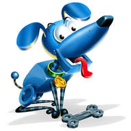
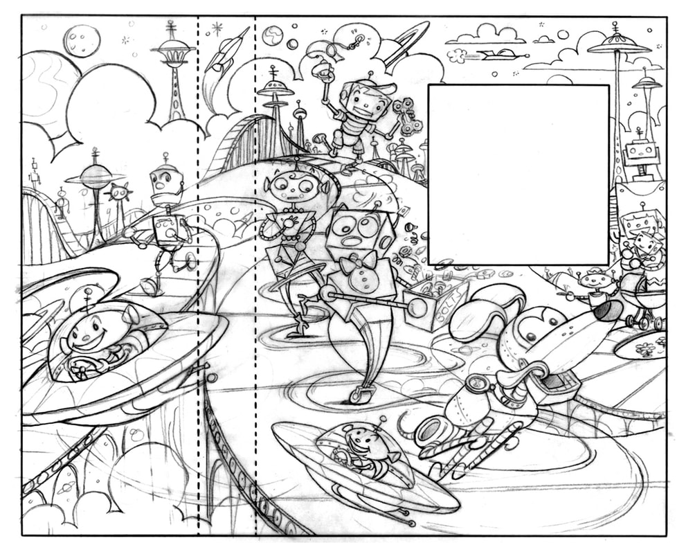
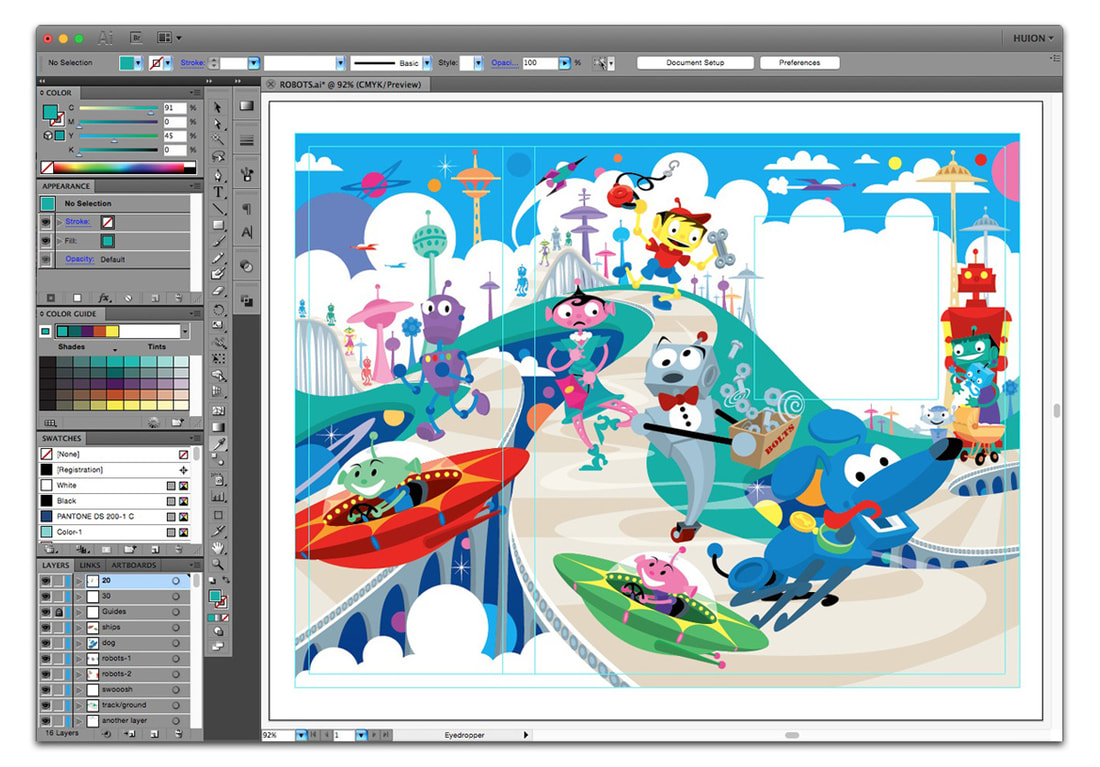
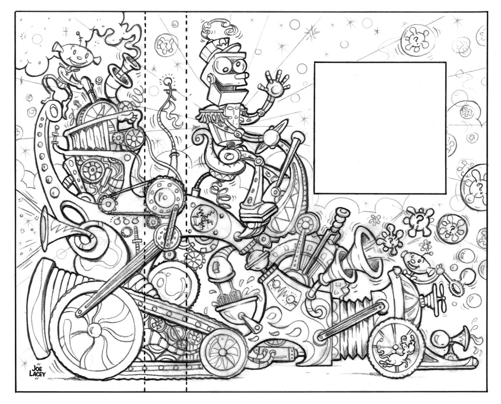
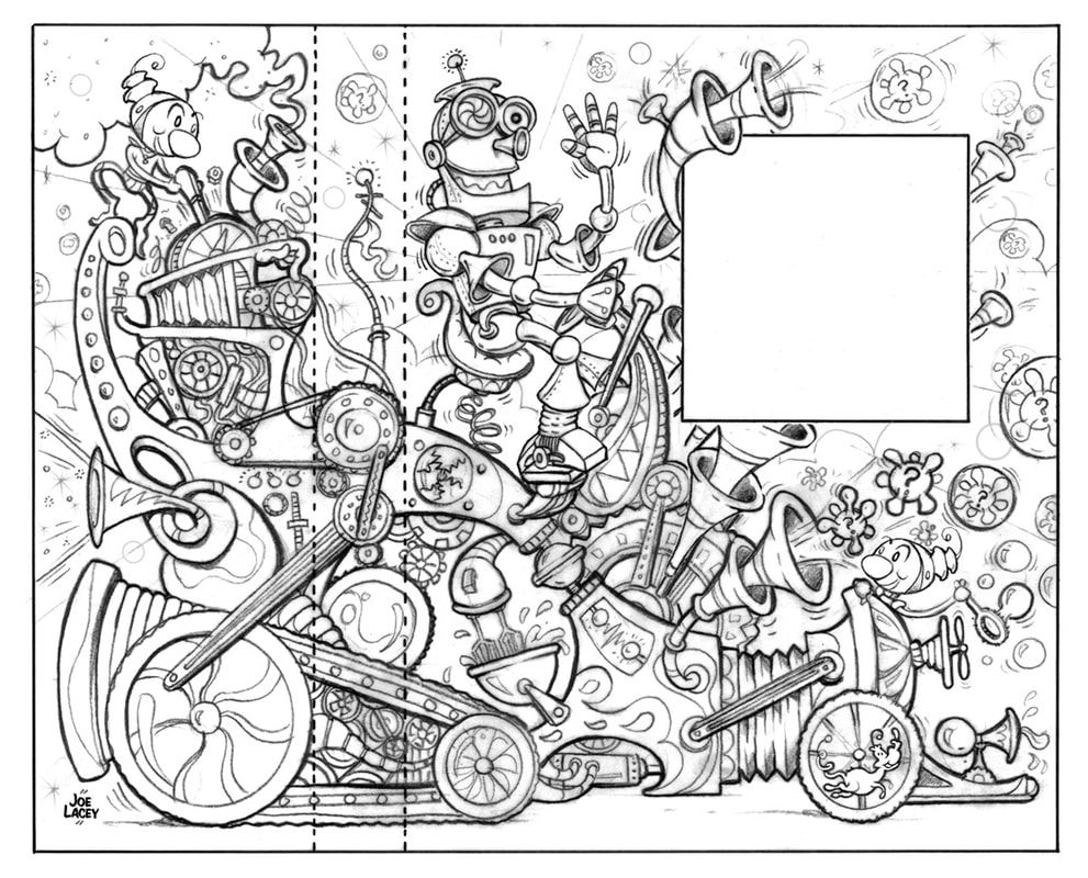
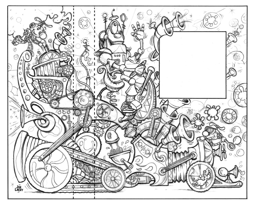
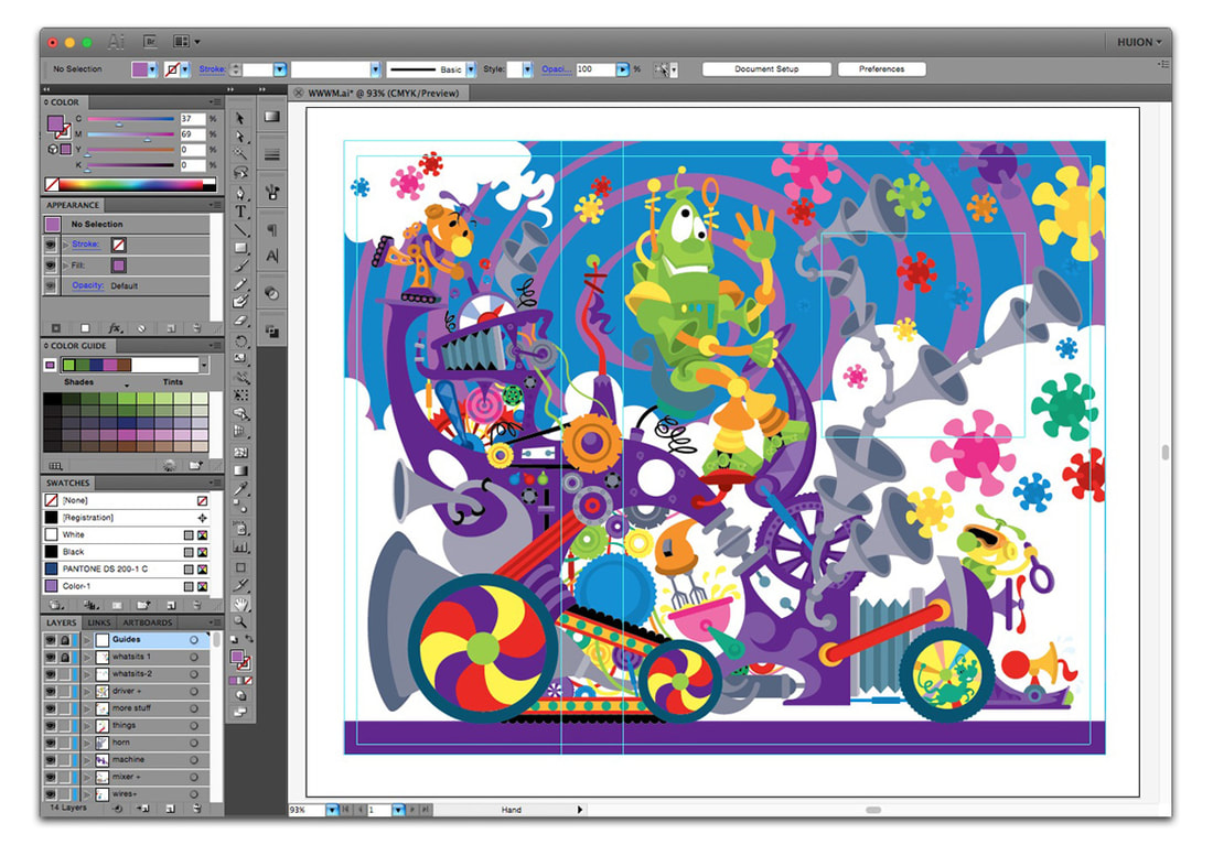
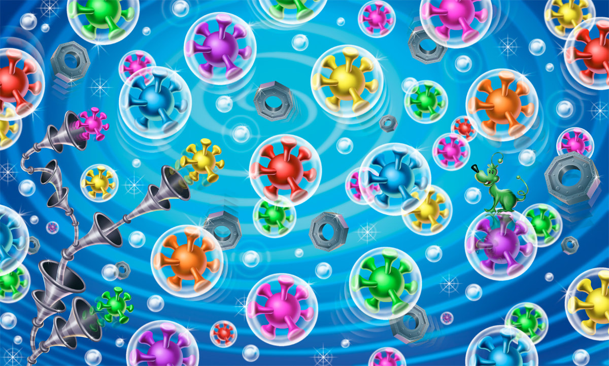
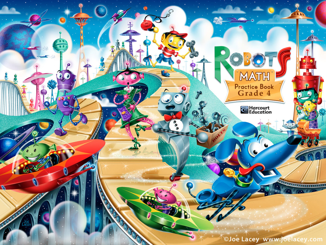 ROBOTS illustrated by Joe Lacey for Harcourt Education Book Publishers. © Joe Lacey THE PROCESS Each picture started out with rough thumbnail sketches. The book covers were 3/4 page wraps - a full cover with spine and about 1/3 of the art wrapping around the back of the book. This always adds a challenge, as I can't let important elements fall off the main page, I have to be aware of the title placement and the spine needs to be kept clean of detail. When the thumbnails are approved, I draw tight pencil sketches. I like sketching by hand on paper. It's often quicker than trying to sketch on a digital tablet (although, depending upon the illustration, I sometimes do just that). The sketch is scanned and used as a guide to make the flat color vector art in Adobe Illustrator. I send a screenshot to the art director to see what the colors will be, but more importantly the positioning of the illustrated elements. Sometimes, there are unexpected changes in size or direction. It can be very easy to move or scale the vector art to correct these changes. The final art is painted digitally using Adobe Photoshop. For these illustrations I used a WACOM digital tablet. It would be near impossible to this kind of art using a computer mouse, never mind the damage you will do to your hands and wrists! Today, I use an interactive pen display and "paint" directly on the screen. Digital painting is a lot like traditional airbrush. I select areas to paint, adjust spray pressure, and manually apply the digital paint using a stylus. I try to avoid using too many preset textures and effects, trying to keep the art looking as hand painted as possible. The art is either sent of flat or with editable layers still intact, depending upon the client's needs. INSPIRATION 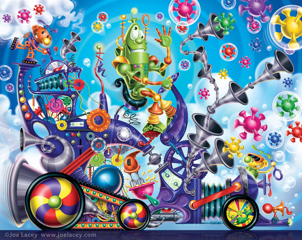 THE WACKY WHAT'S-IT MACHINE illustrated by Joe Lacey for Harcourt Education Book Publishers. © Joe Lacey Nothing beats a robot that looks like it was made out a tin can or three cardboard boxes! This is why so much of my inspiration comes form older toys, movies and TV shows. The trick is to make it look updated without being derivative. My original vision for The Wacky What's-It Machine was inspired by Ideal's Mr. Machine with little alien helpers. I loved it! The art directors did not. I was sad. So, the second one was more of a Wizard Of Oz inspired robot with munchkin styled aliens. I loved it! They did not. Again, I was sad. OK, third time's the charm. Let's think Robbie The Robot from Forbidden Planet. Yay! That one worked! They loved it! Everyone was happy and I was able to go onto the finished painting. The machine is a Dr. Seuss Meets The Wacky Races with a touch of Rube Goldberg sc-ifi tossed in for good measure. I wish this had been turned into a toy! Illustrating all these crazy and colorful gears and gadgets got me ready for the Crayola factory themed Maker Kits that I illustrated several years later. 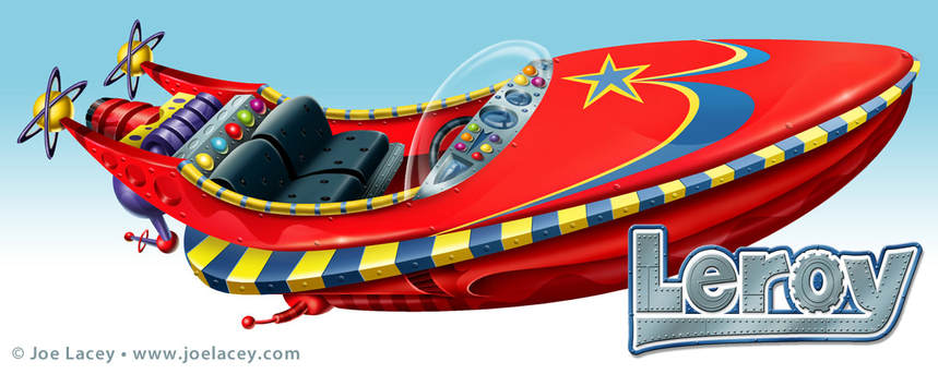 LEROY. Original boat design for one of a series of sci-fi short stories for kids. Harcourt Education. © Joe Lacey  |
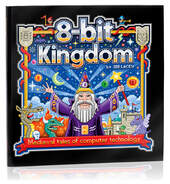
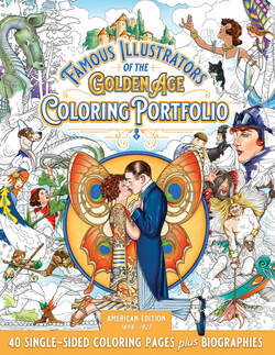
BOOKS
by Joe Lacey 
Categories
All
IllustratorsLinksArchives
May 2023
|


 RSS Feed