|
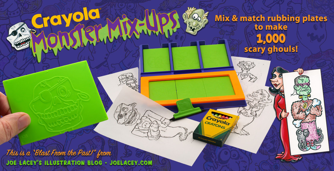
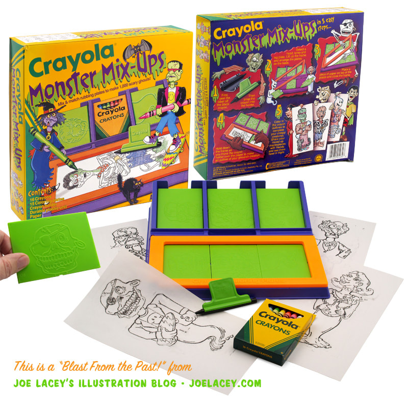
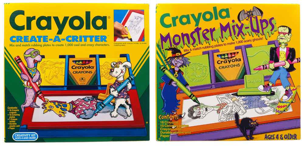
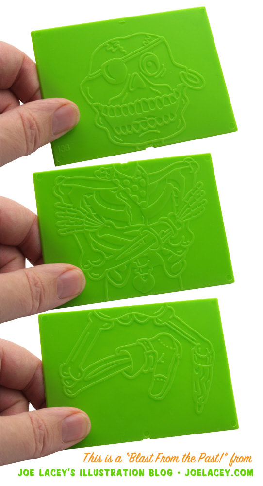
Monster Mix-Ups was the second of two rubbing plate creativity kits I worked on for Crayola. It's identical to another kit of theirs that I designed two years earlier – Create-A-Critter, but this time with monster-themed plates and new toy colors. The design of product components (stickers, stamps, rubbing plates,) and packaging for the Crayola Creative Development kits was the responsibility of Crayola Art Director Kathy Buckley. Kathy and I had known each other from college and working with her on these types of projects was always fun.
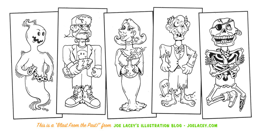
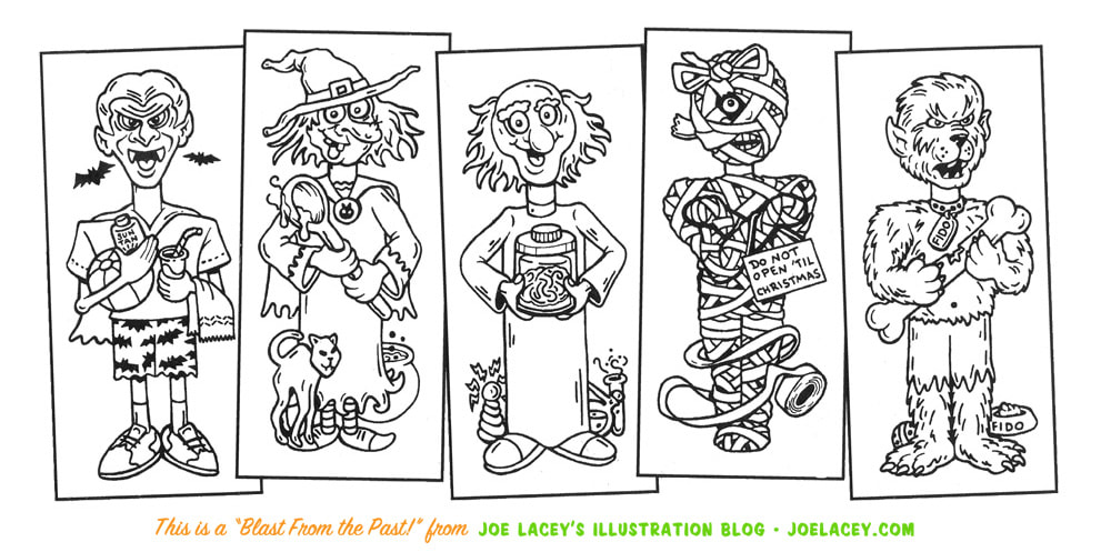
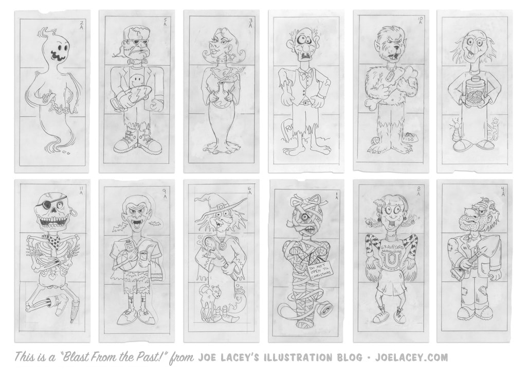
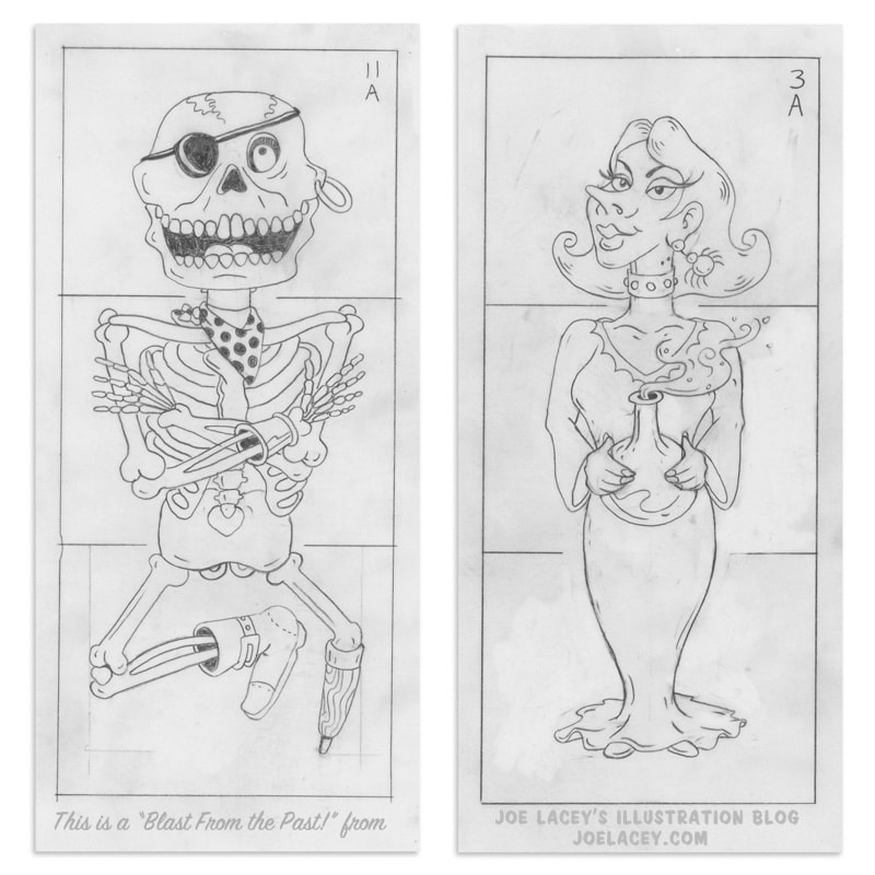
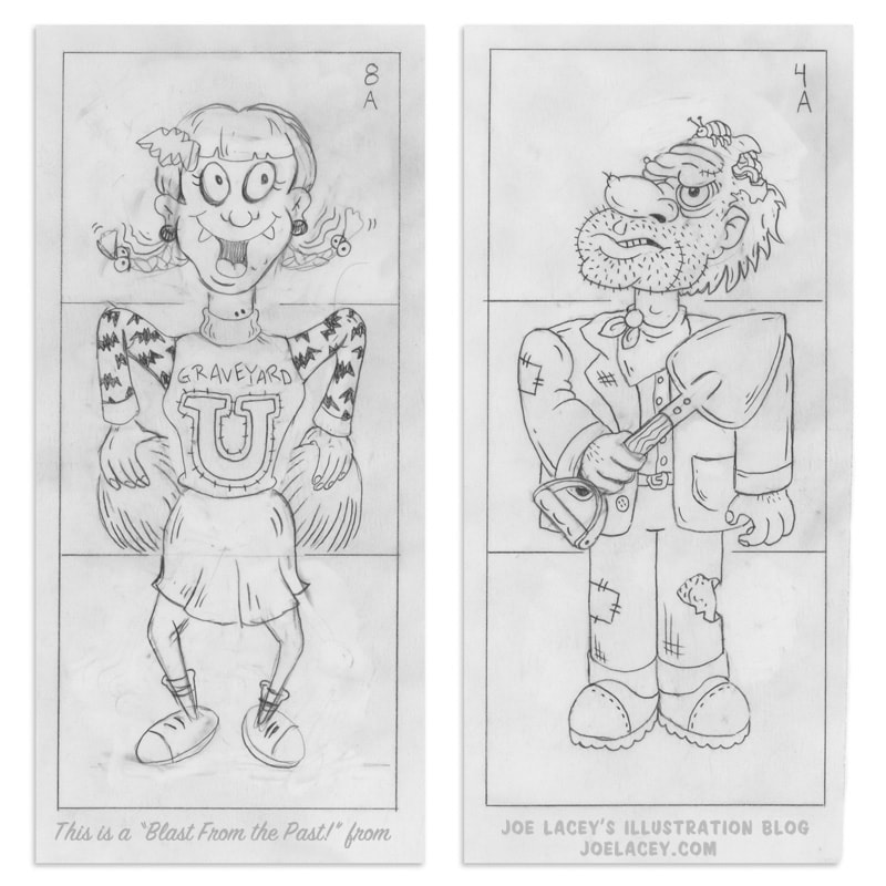
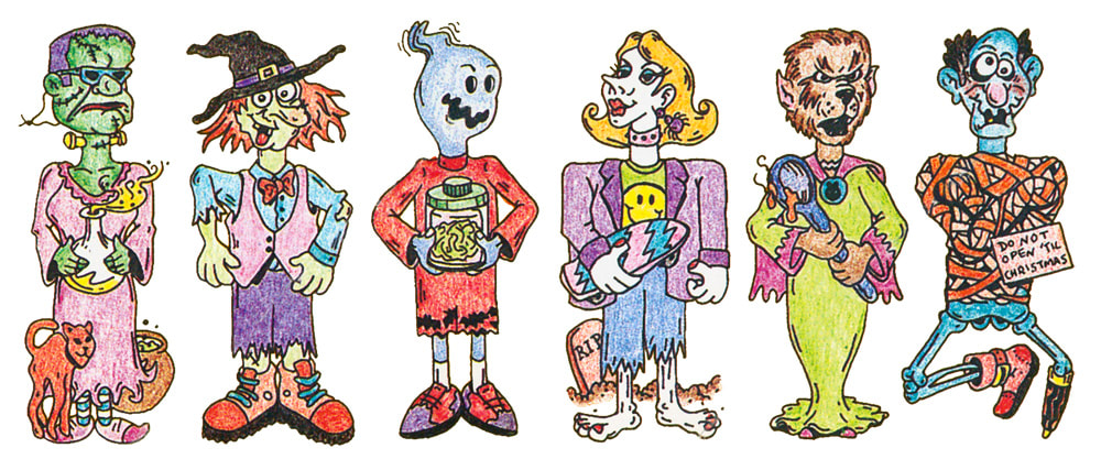
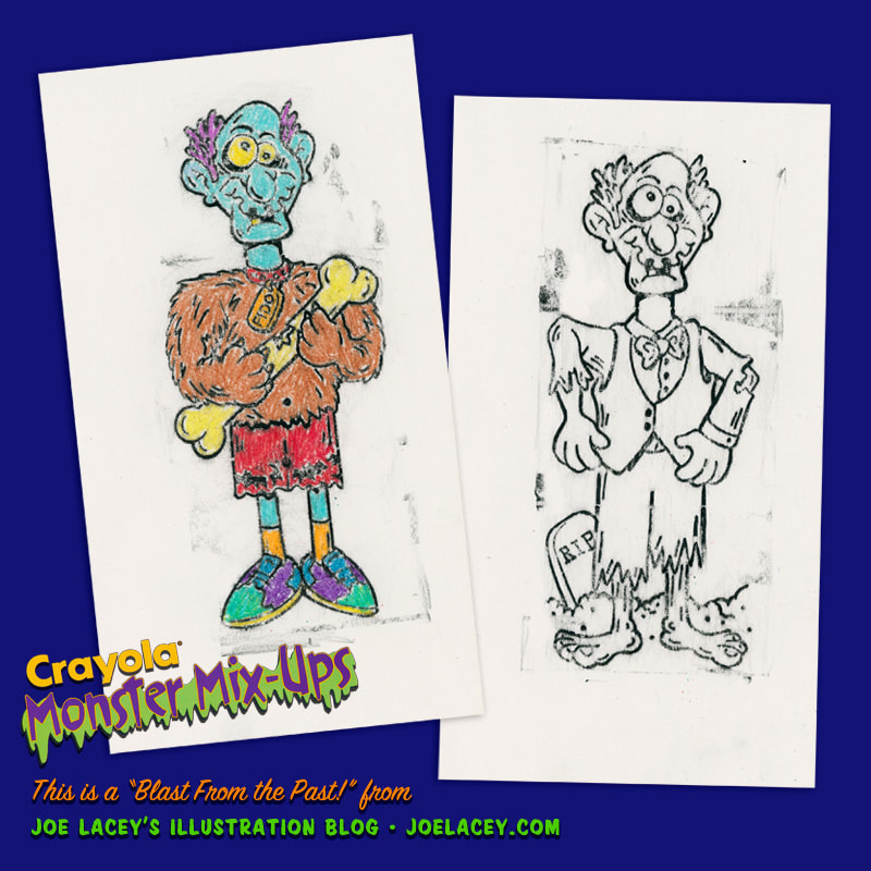
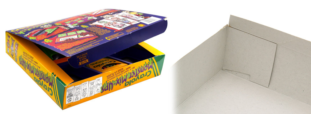
I submitted twelve different characters knowing that ten would be chosen. I kind of think of it like The Gong Show. I send my wacky characters out to be judged and someone's gonna get "gonged!". This time, the cheerleader and the gravedigger got the mallet. I wanted this Halloween theme to be done with a lot of humor. Kathy recalls, "I didn't have to tell Joe that Frankenstein should be holding a skateboard (and honestly it wouldn't have occurred to me to do so), but Frankenstein showed up holding a skateboard. A mummy tied up with a gift tag warning not to open before Christmas? Yes, please. Joe delivered so much more than what we asked and that is why we kept asking him to deliver more.” It's pretty impressive that a kid could actually make 1,000 "scary ghouls." I haven't done the math, but I'll take Crayola's word for it. I no longer have the original line art used to make the plastic rubbing plates. If they weren't returned to me, they have most likely been destroyed. Luckily, the side panels of the box have small, but very crisp, reproductions of each character. This was back when I would do the final inkings on graphics paper and markers. Later, I typically used a brush and ink on this type of project to get crisper lines. Today it's almost always computerized vector art. They both have their pros and cons.
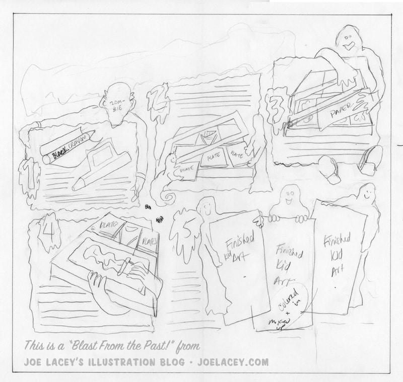
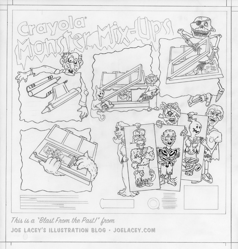
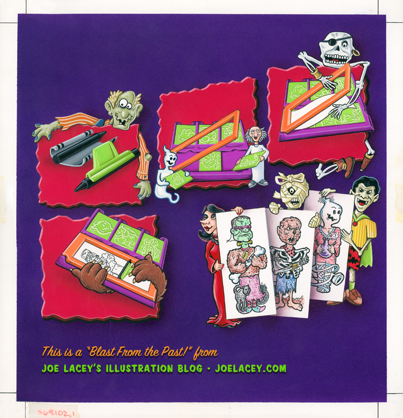
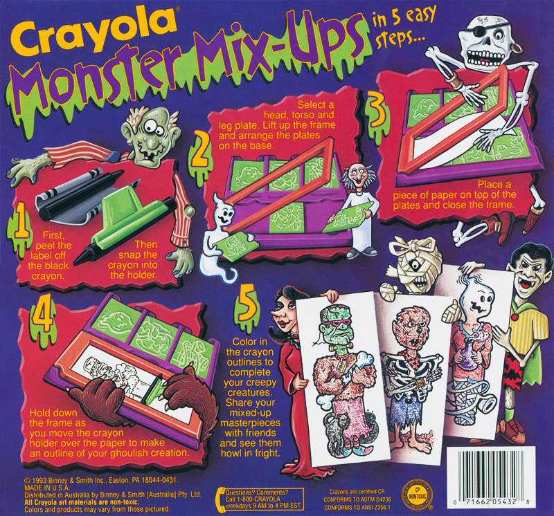
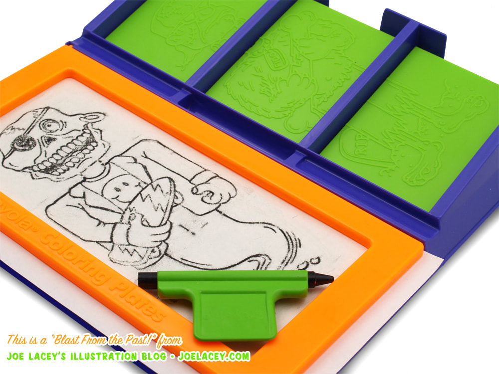
I get a kick of seeing these drawings molded on to plastic plates. I often illustrated stickers that would be applied to a toy, but when the illustrations are the toys – well, that's even cooler! The combination of bright lime green, orange, and purple was a popular color scheme of the early 90s. The illustration for the back of the box turned into a fun and creative way to show the step-by-step instructions. Kathy Buckley drew a very precise layout for me to follow. This was all pre-computer, so precision was important, and this illustration was going to get a lot of text wrapped around it. Following her design I drew a tight pencil version at 100% size. I used photocopies of the three characters shown as "works of art." I lightly transferred the sketch to a piece of bristol board using graphite paper. The drawing was covered with a plastic film which was cut with an X-Atco knife, revealing only the background. I airbrushed the background purple and sprayed black for the drop shadows, both with acrylic paint. I then cut new film to cover everything except the red boxes, which were also sprayed with acrylic paint. The rest of the painting was completed with gouache. I used colored pencils to give a crayon look to the three finished pictures in the lower right corner. I primarily worked on content and less on packaging. This always frustrated me, but it does make sense from a product line point of view. Typically, the same artist will work on the same parts of a product line. I got to design and illustrate the toy's art, while another artist illustrated the box covers. I was often given the job of illustrating the backs of the boxes, but I always approached them with the same enthusiasm as if they were the covers. The sides of the box featured six crayon-colored "mixed-up" monsters as well as the B&W line art.
1 Comment
|
BOOKS
by Joe Lacey 
Categories
All
IllustratorsLinksArchives
May 2023
|

 RSS Feed