|
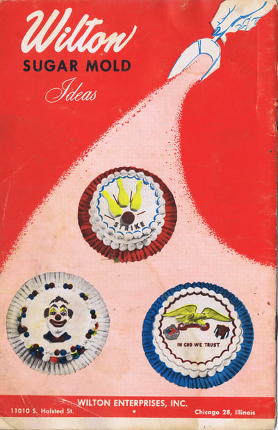
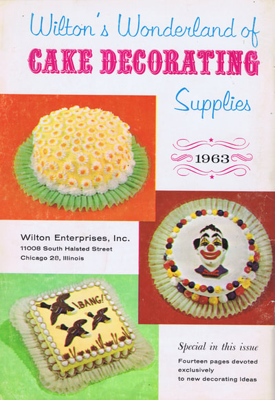
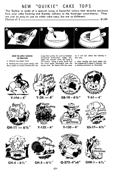
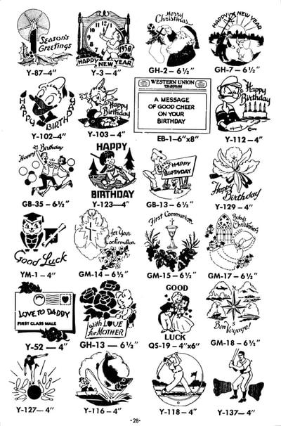
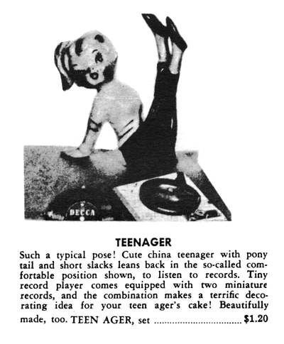
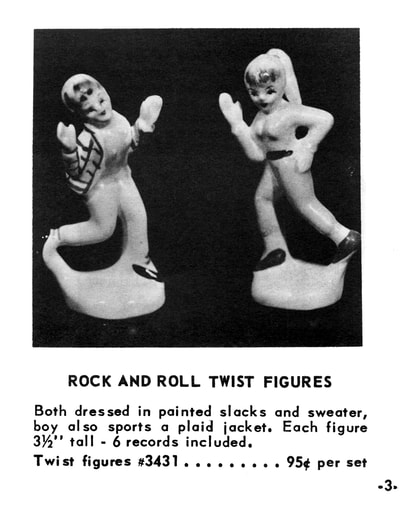
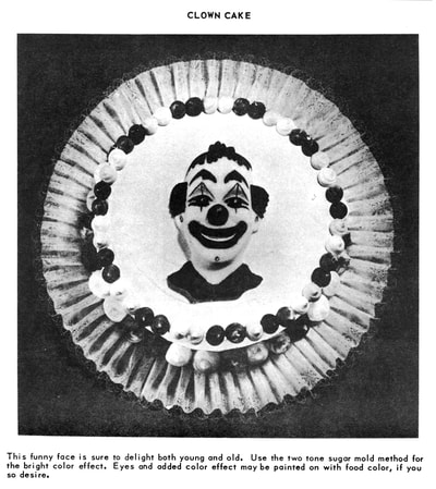
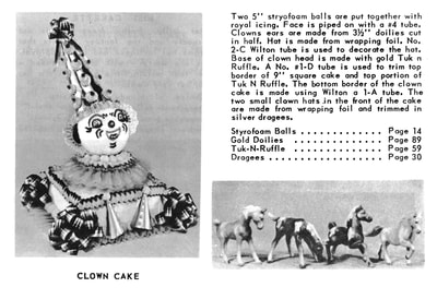
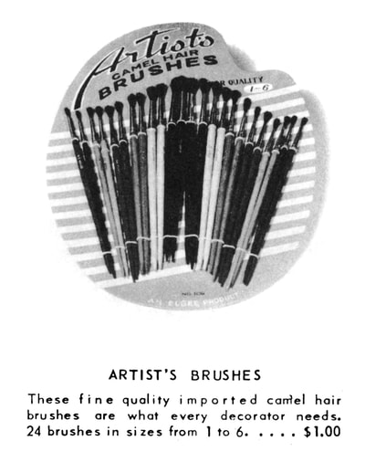
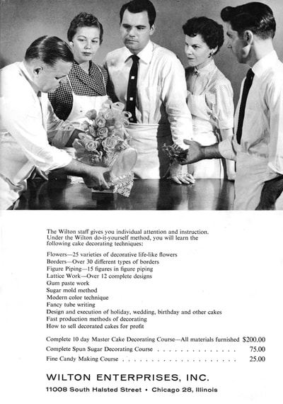
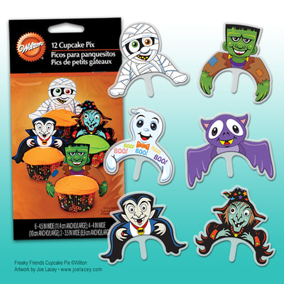
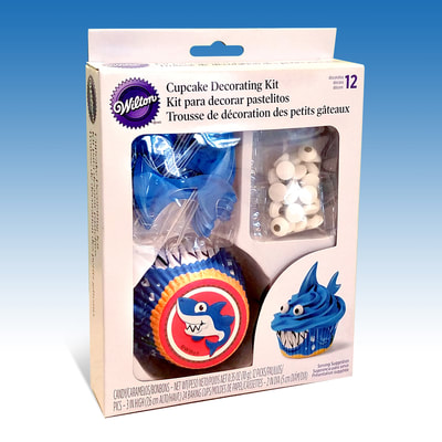
Whenever I work with a client, I like to pick up old product catalogs to see what they were making years ago. It's a nice way to make a connection to the past and see where my work fits into the company's history. These two books, Wilton Sugar Mold Ideas and Wilton's Wonderland of Cake Decorating Supplies were gifts I sent to the Creative Director at Wilton. I may have to get my own copies. What was I thinking?! There's so much fun art in these books! I could post every page, but here's a few of the ones that really impressed me. My services with Wilton over the years have been in product development, creative exploration and production design. Much of my work has made it into production as single items or as major parts of full product lines. I'll be posting more of my work for Wilton at a later date, but in the meantime, here's a couple cupcake products that I designed.
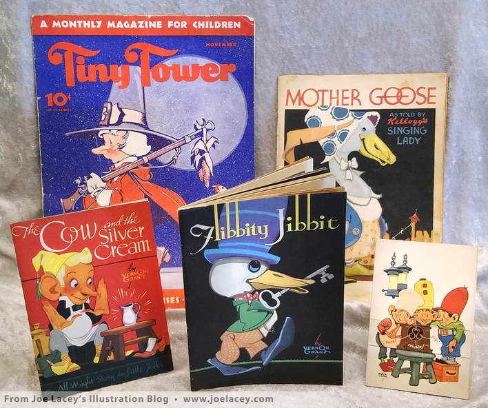
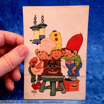
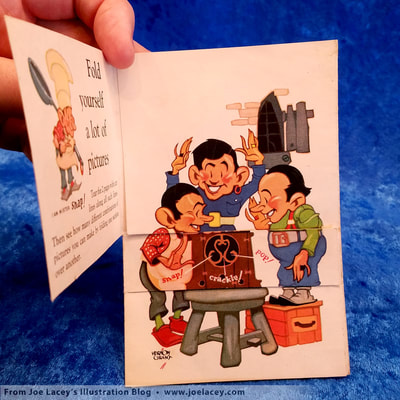
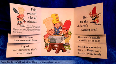
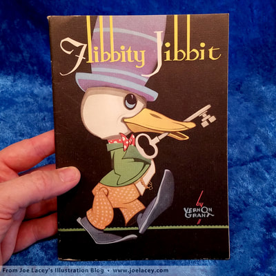
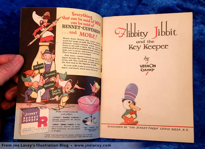
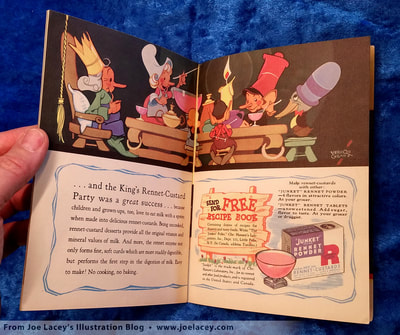
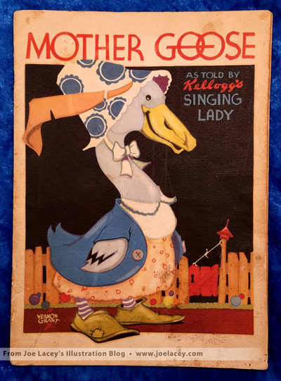
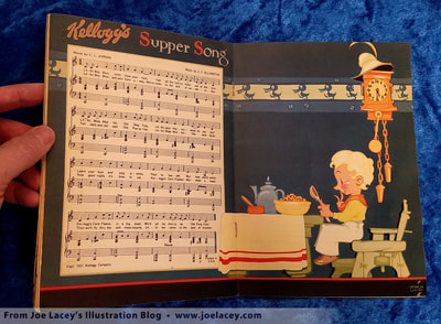
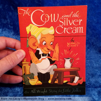
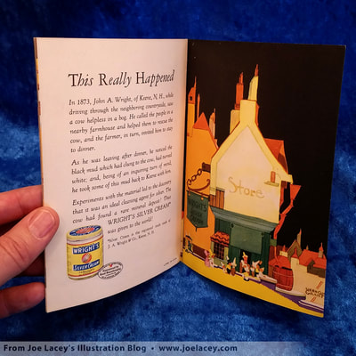
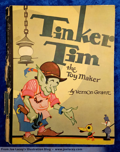
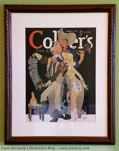
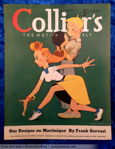
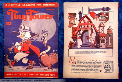
To see more of my art, please visit my website. A Look at Vernon Grant's Promotional Books for KidsYou may not know him by name, but you know his work. Vernon Grant (April 26, 1902 – July 9, 1990) is the creator of the Kellogg’s characters Snap! Crackle! and Pop! In 1938, Life magazine called him "America's favorite children's artist." Throughout the 1930s and 1940s, his illustrations appeared on major magazines, cereal boxes, advertising and collectible premiums such as posters and books. It's these premiums which first made me aware of this great illustrator. I hope you enjoy this very brief introduction to the art of Vernon Grant. Years ago I found a small Kellogg's Rice Krispies flip book at an antique market. "Fold yourself a lot of pictures" it read. It delivered on that promise. I was impressed by the whimsical art and the cleverness of the booklet. I bought it. There was a very distinctive signature on it - "Vernon Grant". I thought, "This is a guy I need to see more of." I love promotional giveaways and Grant's are among the best. Since then, I have added to this collection and am always looking for more of Grant's premiums. Then I found Flibbity Jibbit, a promotional kids book that told the tale of a key-keeper, a king, and a little bird named Flibbity Jibbit. Their journey to find the key to unlock the door that held Junket's Rennet Powder for the king's custard party is told by Grant in an illustrated 32 page fairy tale. It was adorable! It also made me want to make some custard. I guess advertising really does work! Grant's style is very economical and not overly rendered. He often makes use of three color tones to create volume with a dark, middle, and light. But more importantly, his drawings have character. A lamp is not just a lamp, it's full of personality. It feels as if even a shoe can be your friend in Vernon Grant's world. His compositions make use of circles and solid shapes. Buildings and backgrounds can be bold and abstract in nature, similar to the German Expressionist movement of the 1920s and 1930s, creating a world full of dream-like twists and turns. He utilizes classic design principles of color and tone to keep the viewer focused on the center of interest. A signature look of his work is the use of solid color backgrounds, often black. Today, these commercial premiums are in the form of activity books, not story books, with puzzles, games and coloring pages replacing story driven themes. I'll be posting an article and samples of my work in this field of illustration sometime soon. In the meantime, to see a small selection of my illustrated kids premiums and books, please visit my website. BOOKS I RECOMMEND
All the images are from my personal collection.
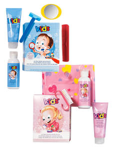
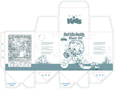
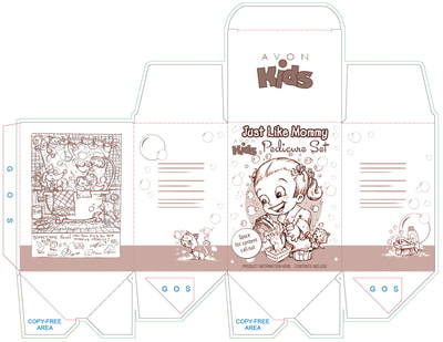
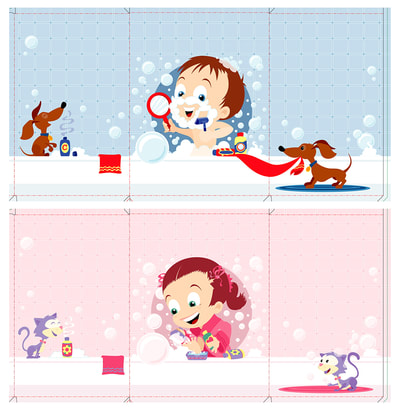
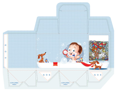
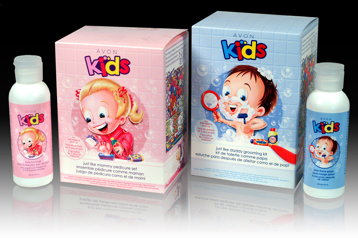
Just Like Daddy & Mommy
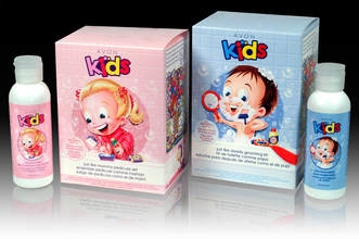
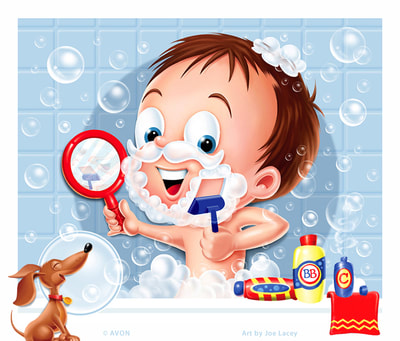
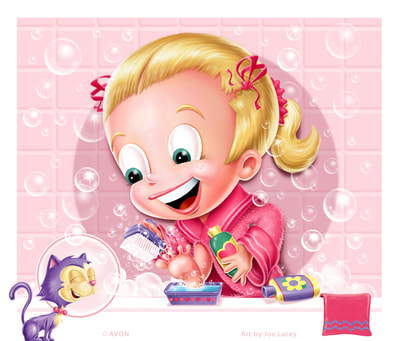
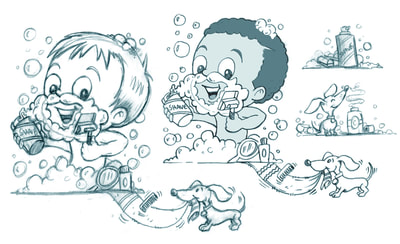
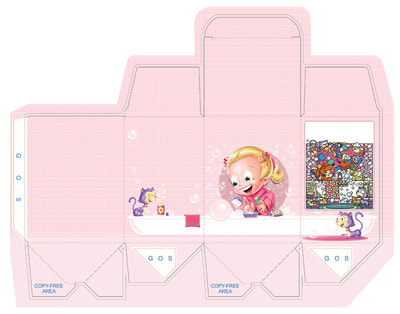
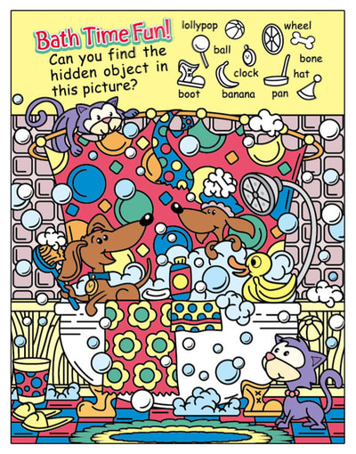
The box sizes, shapes and general layouts were all pretty much determined prior to me working on the sketches. The project moved along smoothly and I did not have to do too many explorations for the look of the kids. The girl was by far the most challenging. She had to scrub her toes, wear a robe, be in the bath and still read very similar to the boy. I think the whole job was done in about two to three weeks. Bath Time Fun! Hidden Picture Game
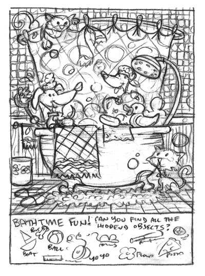
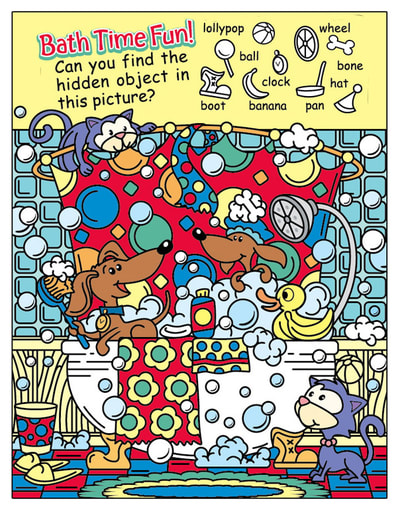
The boxes were a pretty good size, so I suggested that a picture game would work nicely on each box. The layout really lent itself to this. It also gave added play value to each kit. I designed a bathtub themed hidden picture game that would be appropriate for little kids. Each has the same game, but the games are color coordinated to match the boxes. And, whenever I get the chance, I like to put a dachshund or two into my illustrations! |
BOOKS
by Joe Lacey 
Categories
All
IllustratorsLinksArchives
May 2023
|
 RSS Feed