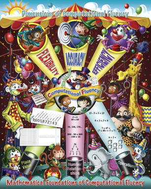
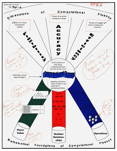
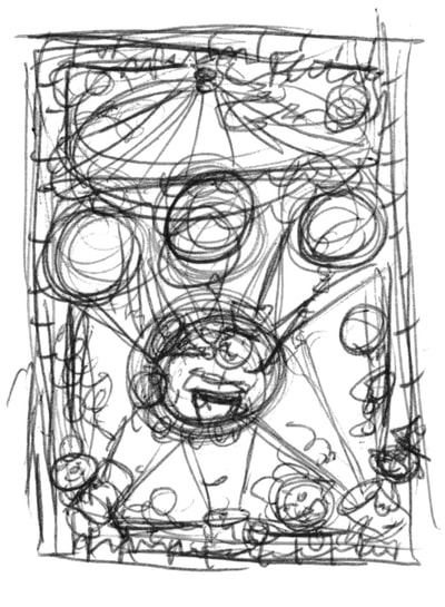
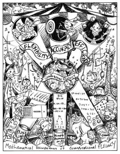
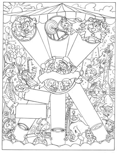
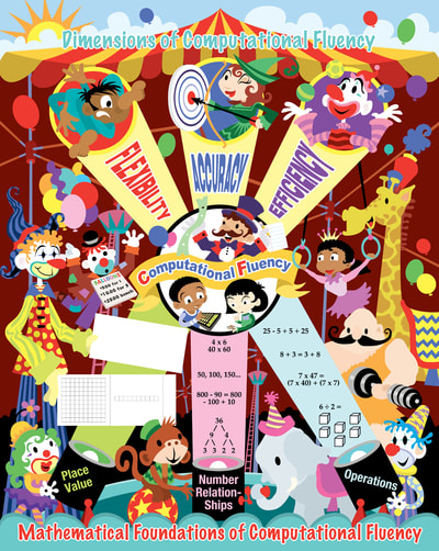
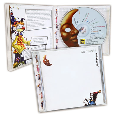
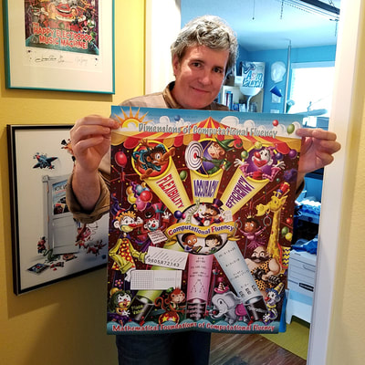
 I remember the day I received an email inquiring if I would be interested in taking on an assignment to illustrate a poster about "the dimensions of computational fluency". At first I thought, "What is this?" and then I thought, "There's no way I want to take this job!" But then I read further and discovered that the poster was going to be a circus tent with clowns, animals and performers! How cool! A chance to take a very serious and often dry subject such as math and make it visually appealing to grade school kids. Of course I accepted the job! The poster is a 16" x 21" stapled pull-out inside a quarterly classroom magazine for the National Council Of Teachers Of Mathematics. The basic layout for the poster was supplied by the client and followed an established design for computational fluency. Sometimes, it's really nice to have a structure in place while working out the look of an illustration, especially when it involves technical issues. Other times, it can be challenging or even burdensome. In this case, it just made my work a lot easier, so I was grateful to have it. I started with a very small thumbnail sketch just to get thinking about it. I often do more thinking than rough sketching and like to have a solid visual in my head before I start any serious sketching. Next I did a rough sketch on tracing paper in marker. Marker? It's one of the few times I ever did a rough sketch using marker. Not sure why, but there it is! I sent the marker sketch to the Senior Designer at The Magazine Group in Washington, D.C. and it was approved with a few minor changes, primarily the banner at the top. I thought a big waving banner with the words FLEXIBILITY, ACCURACY, and EFFICIENCY would look neat being hit by the spot lights. This was nixed, for good reasons. The new layout with each word inside the light beams was a lot better! There were a few character changes, clowns were to be less "hobo" looking, and gender and racial representations were discussed. I was ready to work on the tight pencil sketch. The tight pencil sketch went through with no changes that I can recall and I was ready to create the flat color layout in vector using Adobe Illustrator. I make flat vector art for two reasons: 1) It gives me a close to finished look in color and layout that I can send to the client for approval, prior to starting the painting. 2) I can create each piece of the illustration in layers and easily move or scale things as needed without any destruction of the images that can occur in Adobe Photoshop when painting with pixels. The final art was digitally rendered using Photoshop. You can click through the gallery of images below to see the progression of the art. I was really happy with the final production. The printing came out spot-on and the colors were incredibly accurate. The Dimensions Of Computational Fluency math poster was a big challenge, but a very rewarding project to work on and I'm not clowning around, either! • Publisher: The Magazine Group of Washington, D.C. • Senior Designer: Janelle Welch. • Poster front design: Janie Schielack and Tim Boerst. • Illustration: Joe Lacey. On a side note, shortly after I had completed the poster, I was contacted by a music band in Spain called La Herejia asking if they could use one of my clowns for their new CD "Malabares". Since I owned the rights to the images, I agreed. Funny where things end up. A veces, la vida es un circo ambulante.
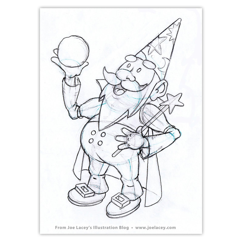
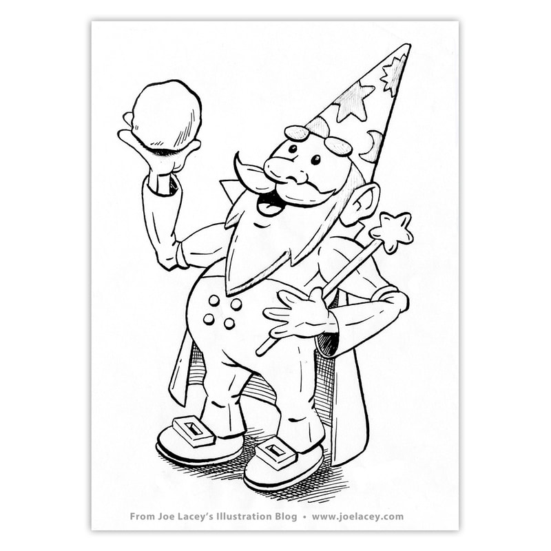
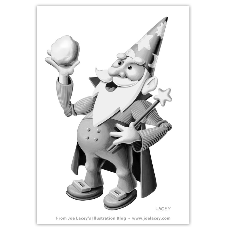
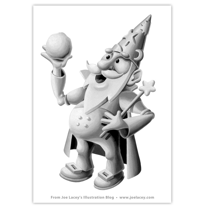
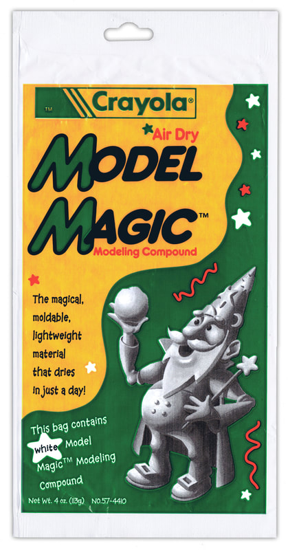
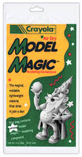 Model Magic™ Model Magic™ The Model Magic™ Wizard was designed for Crayola's Air Dry Model Magic™ Modeling Compound. I wanted him to be very whimsical with a "chunky" look as if he were sculpted from clay. I first intended to make him out of real clay and have him photographed, but the art director said that wouldn't work. I'll talk more about that later. I looked at a lot of older illustrators for inspiration. Andrew Loomis, who wrote many art instruction books, and Vernon Grant, the illustrator famous for his gnome characters as well as the creator of Kellogg's Snap!, Crackle! and Pop!® were two obvious influences. I didn't go though a lot of exploration and he sort of "magically" happened and was approved with no changes. Wow! that was easy! Or at least that's what I thought. So, why not make him out of clay? It is Model Magic™ after all? Well, the package was produced quite a few years ago and the flexographic printing process had it's limitations. Printing the art onto a plastic/foil bag and with limited colors was the reason he became a painted illustration. I ended up painting him twice. The first painting had more tones and textures and felt more like a basic character. The art director felt he needed to look like he was made out of solid white clay with more dimensional elements on his hat. Even with this direction, I pushed it a bit to include a few more darks around the face just to keep the character from fading out. Below is the original packaging and a digitally restored version using a scan of the second unused painting. Despite all the concerns about the limited printing capabilities, the new wizard printed still ended up printing a bit dark and murky.
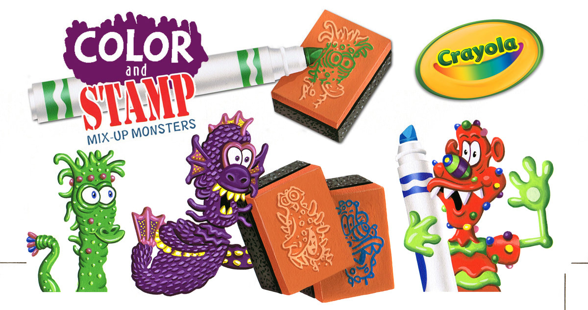
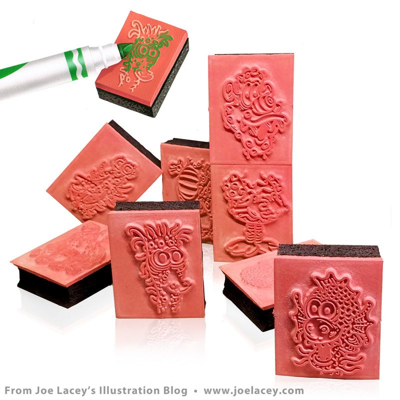
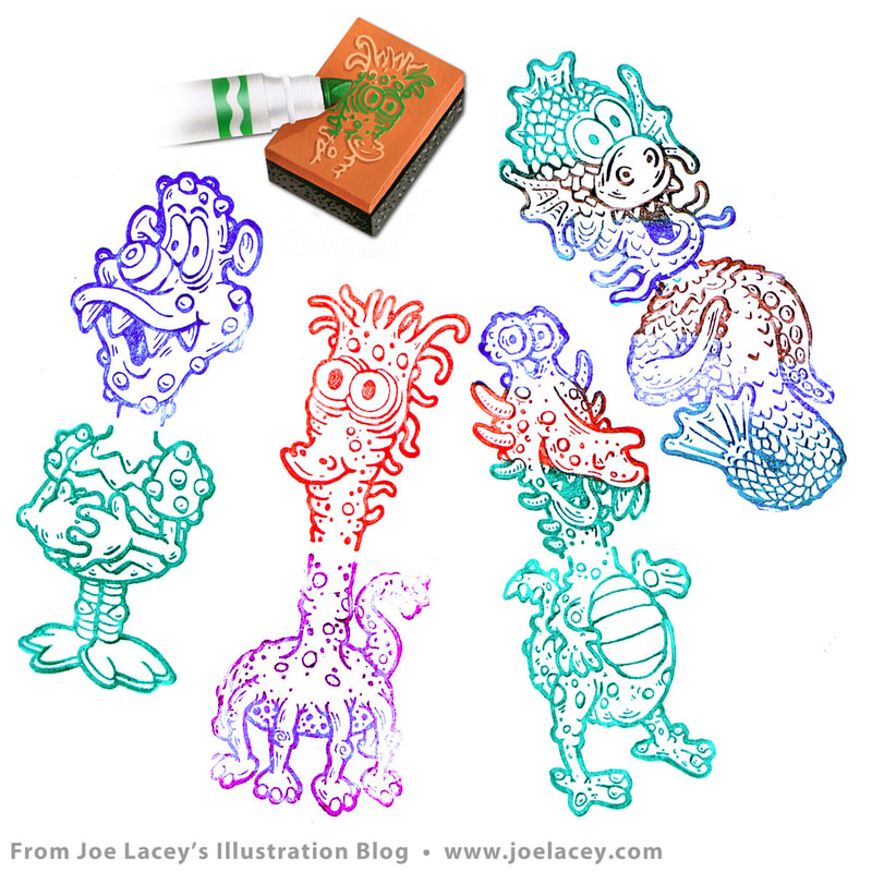
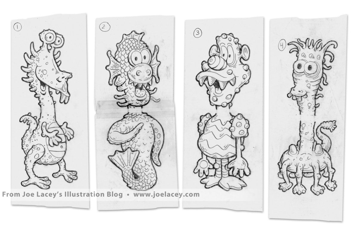
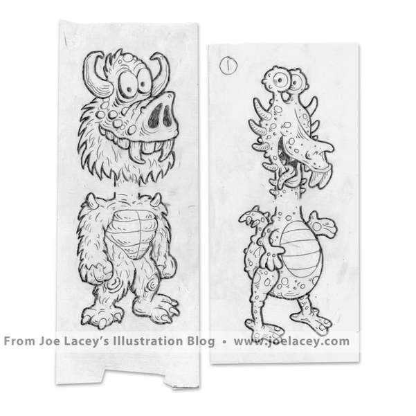
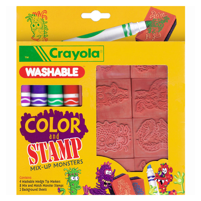
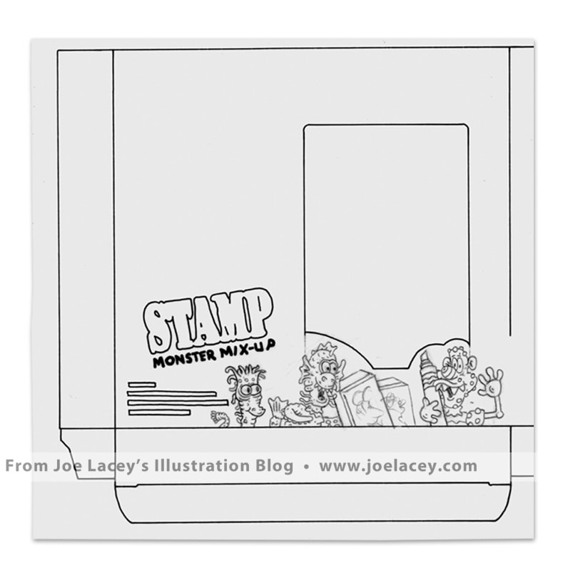
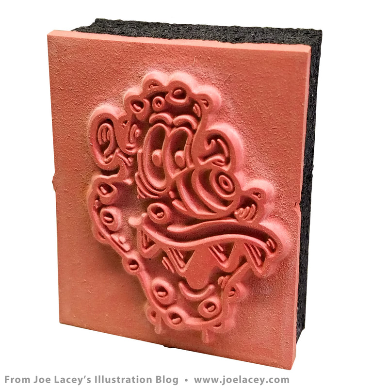
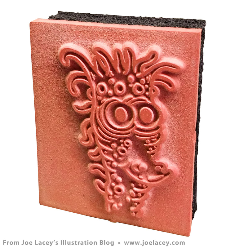
I was hoping that he would become the official Model Magic™ mascot. But he was used only once and for a very brief time. His debut opened and closed on this one package. Still, he holds a good place in my heart and the job was a lot of fun. It's nice to finally see him looking his best in this restored version! He's a happy little guy. To see more of my art, please visit my website. This is a product I designed and illustrated for Crayola quite a few years ago. It's one that I really like and had a lot of fun working on. Color and Stamp Mix-Up Monsters was small rackable set of eight high quality rubber stamps featuring zany monsters with interchangeable heads and bodies. The set also came with four washable markers and two background sheets for stamping. Everything was hand illustrated. The box art above was done in gouache on bristol board. The inkings for the stamps were probably done on vellum with brush or maybe an art pen. I can't remember, and they don't appear to be in my possession anymore. The set was always planned with four characters, but I designed five of them. Surprised I didn't have to design twelve! Depending upon the project, I either do one design or quite a few. All the extra concept work is used for market testing or simply to have a variety to pick from. And, of course, my favorite character, a burly-looking pig monster with horns and fur was not chosen. *Insert sad-faced emoji here. Oh, well, seems that's the way it goes! Most of the characters made it through with few changes. You can see the original sketches below. I also designed and illustrated a matching set called Color and Stamp Dinosaurs.
Don't confuse Crayola's Color and Stamp Mix-Up Monsters with Crayola's Monster Mix-Ups, a big rubbing plate kit. I designed that one too and will be posting it for Halloween. To see more of my art, please visit my website. |
BOOKS
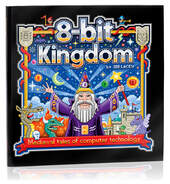
by Joe Lacey 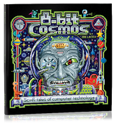
Categories
All
IllustratorsLinksArchives
May 2023
|



 RSS Feed