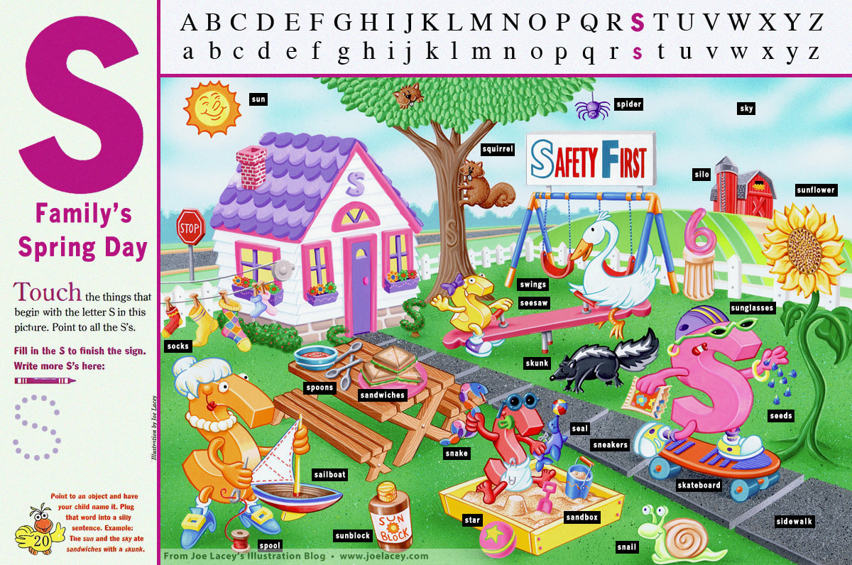
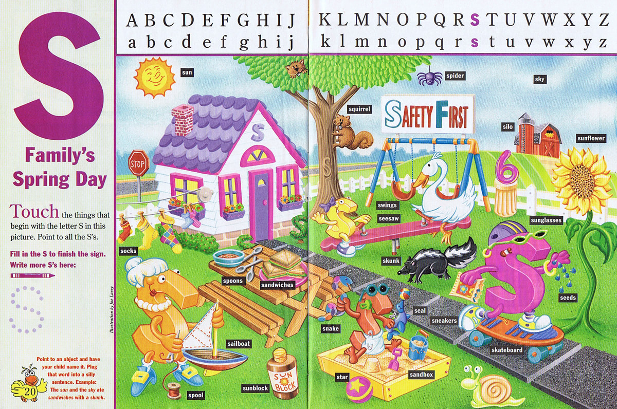
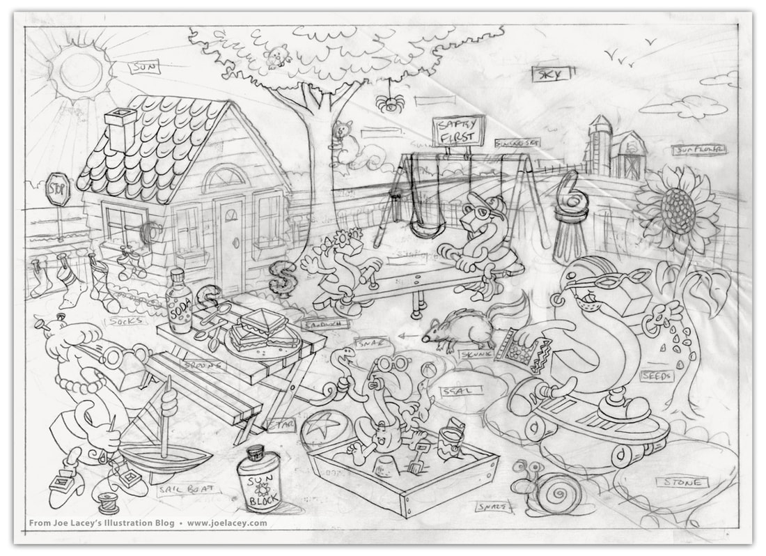
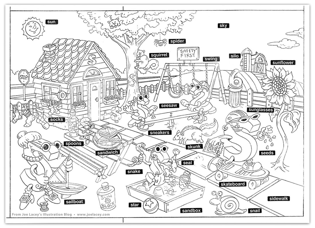
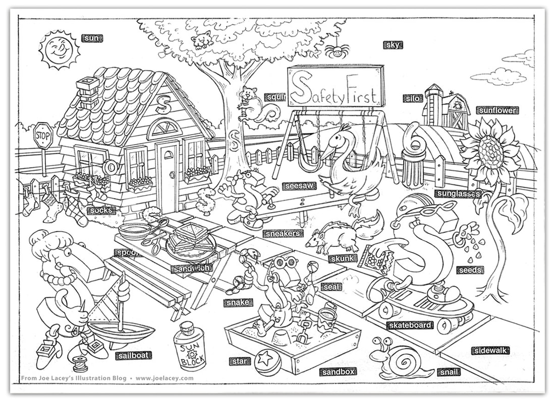
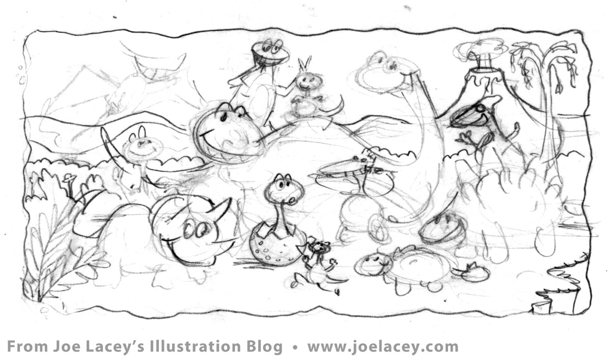
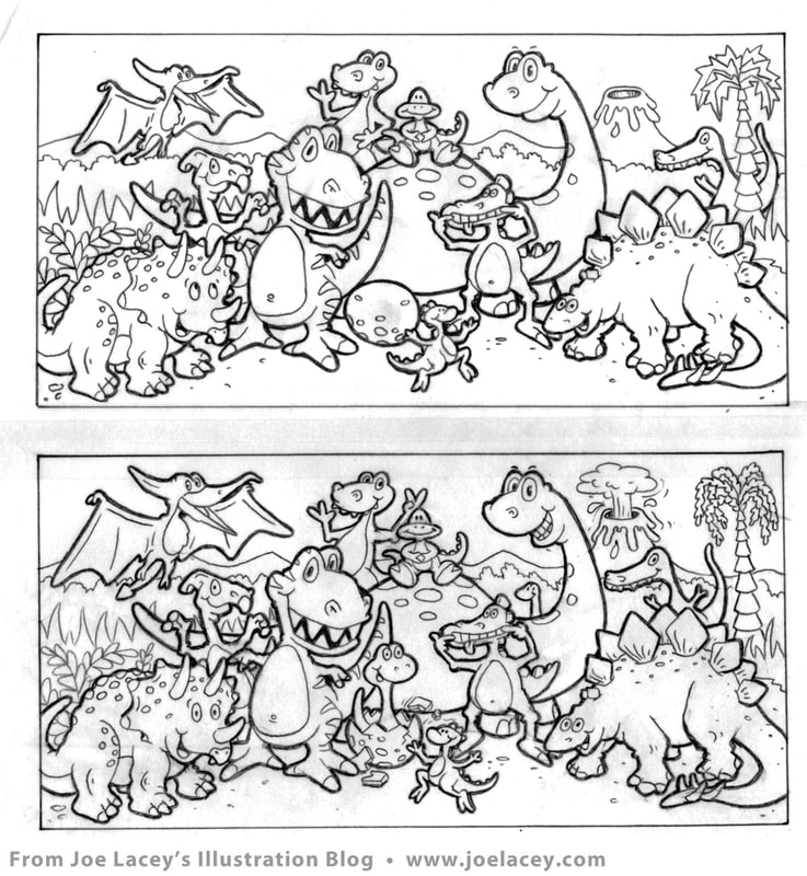
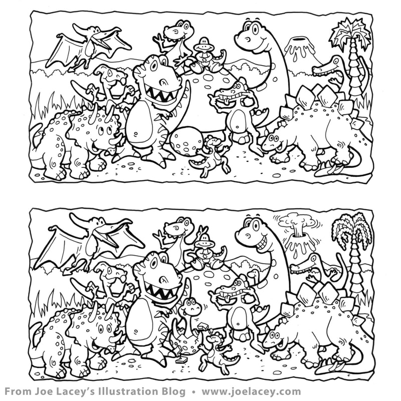
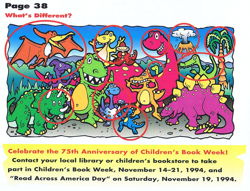
 "S" Family's Spring Day. Illustration by Joe Lacey. Children's Television Workshop  Here's one from the vault that has always held a sentimental place in my heart - a full page spread that appeared in Sesame Street Magazine entitled S Family's Spring Day for Children's Television Workshop. I had just begun work as a regular contributor to Crayola Kids Magazine and had a few jobs under my belt. Around this time, the magazine stands at bookstores and grocery stores were filled with kids magazines. With a pen in hand, I jotted down the names and addresses of the art directors from the magazines I liked. Next, I did what every illustrator is told NOT to do. I went home, folded an 8.5" x 11" color photocopy of an activity page I had done for another magazine and stuffed it into a white envelope with nothing more than the addresses on the outside and my name on the inside. When doing promotional mailers, artists should, for the most part, always send postcards. Art directors don't want to waste time opening envelopes. Most of the time they never even look at your post cards! One week later, I get a phone call from the art director at Sesame Street Magazine in New York City. I was expecting to be commissioned for a small spot illustration or some supporting art, not a full two-page spread. Not a bad return on investment for a stamp and envelope! My contract arrived with the most whimsical cover letter: "Sesame Street Magazine is guaranteed to be a smash hit now that you've agreed to do an illustration for it!" There were little to no changes to the art, but there were some changes to the content as the sketches evolved. Since it's an educational magazine, the games and activities are developed and reviewed long before they reach my desk. I received a very detailed list of what to include in the illustration and how the overall feel of the page should be presented. Beyond that, the characters and style were up to me. The art was hand-painted with airbrush and gouache on bristol board. At this time, I was transitioning into digital art, but still producing a fair number of illustrations in traditional mediums. It's cute little illustration, and I hope it made the kids happy. Original hand-painted art and the printed page as it appeared in the magazine. Pencil sketch stages.  Let's Go Digital! Print magazines were having a digital revival in the '90s. Crayola Kids Magazine, published bi-monthly by Meredith Corporation, offered a variety of art styles, games and stories for young readers. It was my first foray into this type of publication and I absolutely loved it! Every couple months, I worked on anywhere from one to three activities, spot illustrations or promotional web items. It was also my first step into the world of digital art. I remember the day I walked into the Crayola offices and saw all the drafting tables, drafting arms and markers being pulled out and replaced with computers. I was very young and out of school, but thought, "Uh, oh... this looks like trouble." I asked everyone I worked with, "Would you like it if I got a computer and started going digital?" Crayola said "YES!", Fisher-Price said, "YES!" I thought about it and then Bob Riley, the art director at Crayola Kids called. My phone conversation with him went something like this, "You can do the art any way you want, as long as it looks good, but we'd prefer digital if you can do it, and we need it in one month." I said, "Sure! I can do it digitally." I hung up the phone and went out and bought a Macintosh Quadra 605 computer, Photoshop, Freehand and Adobe Streamline. I had one month to figure all this out. The game was What's Different? to be included in the upcoming dinosaur issue. Hand inked on vellum, scanned and converted to vector. The art was very simplistic compared to the art I am doing today, but at the time, there were so many obstacles, beyond frequent computer crashes, tube-styled monitors and using a mouse. On top of this, I couldn't email the file and the file had to fit on a 1.4MB floppy disc (Syquest and ZIP Drives were still out of reach). And these limitations went on for quite a few years. It was a golden age for FedEx. The job got done, I figured out how to make an illustration in the computer, I sent off my invoice, and more digital work rolled in soon after. 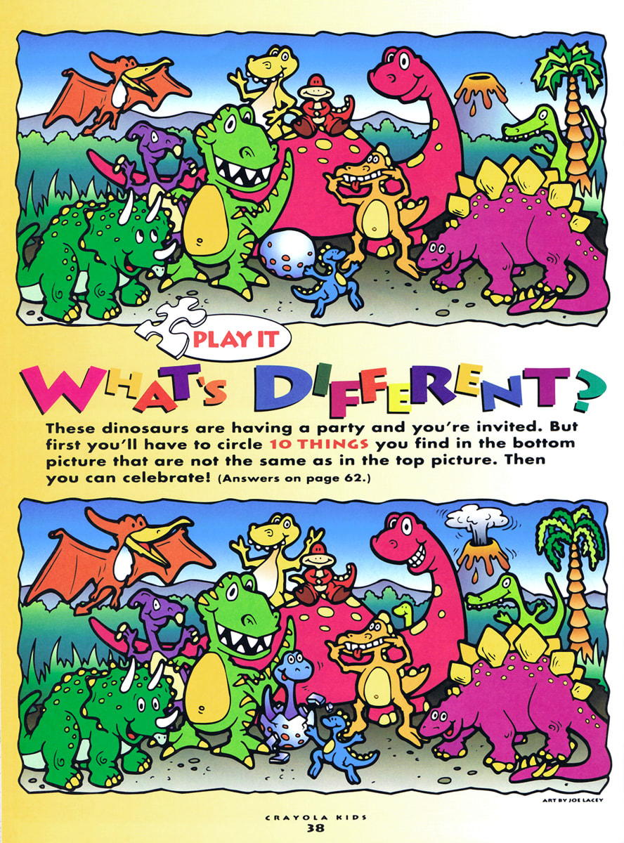
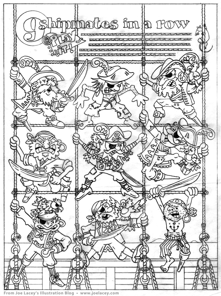
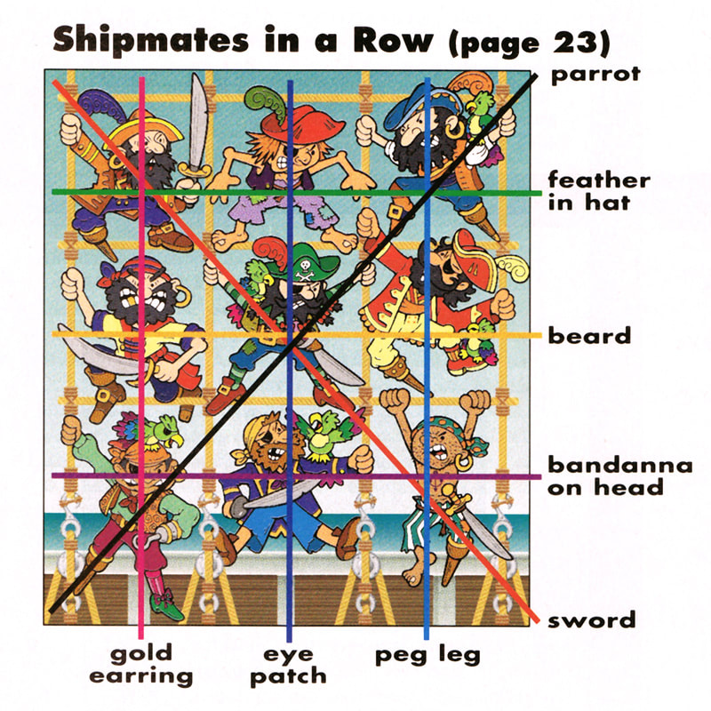
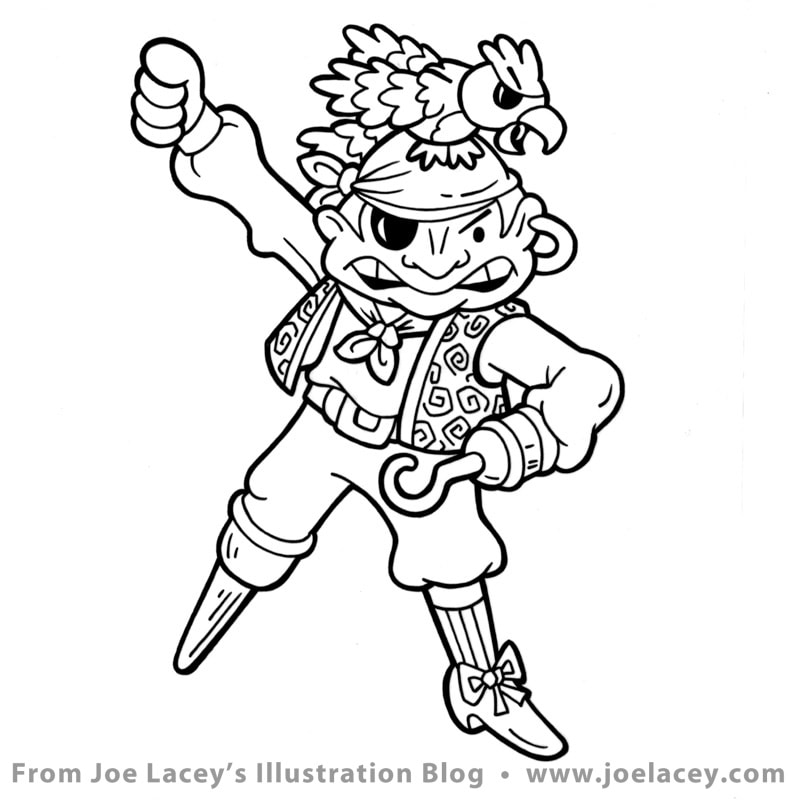
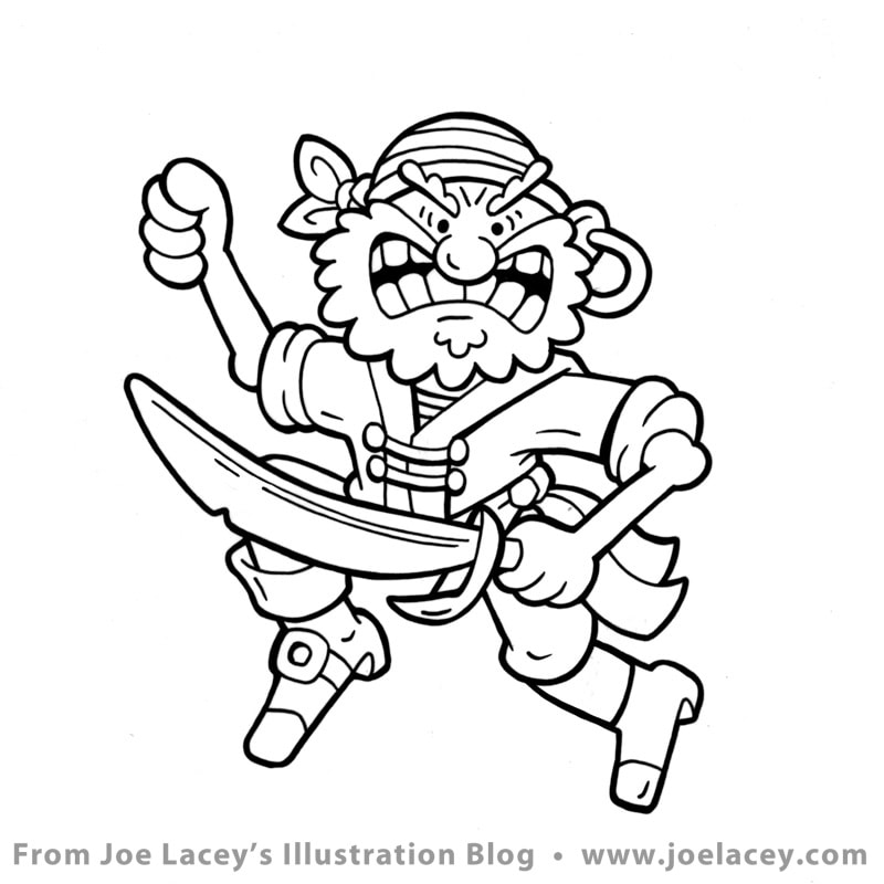
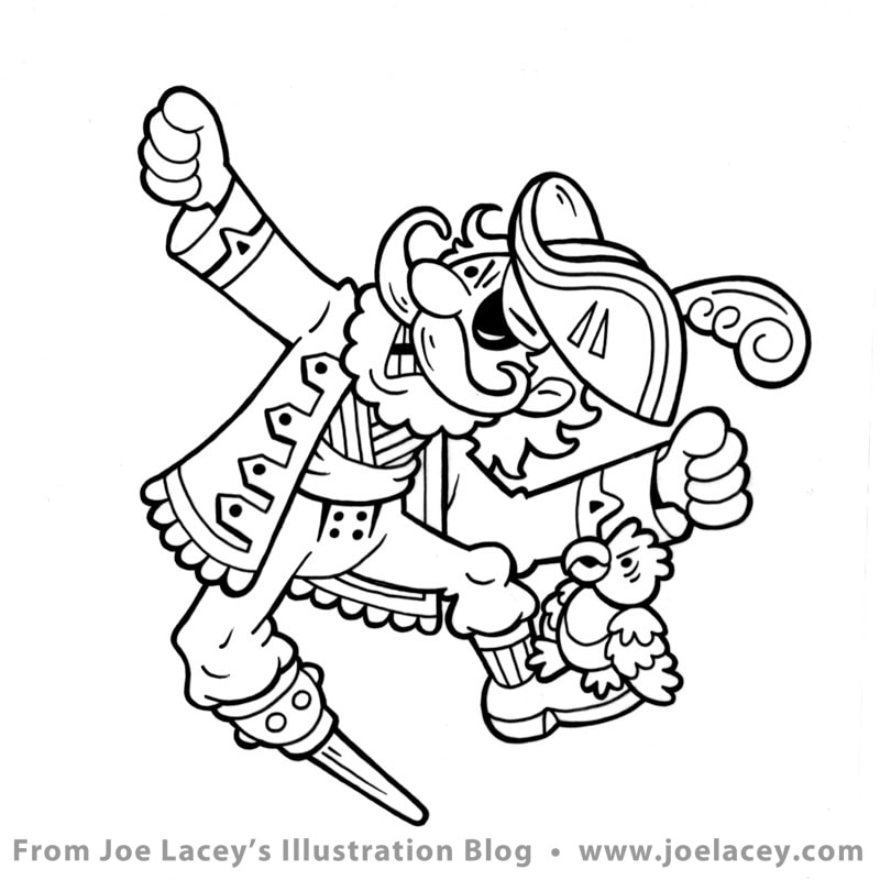
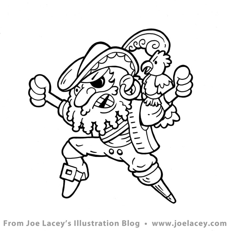
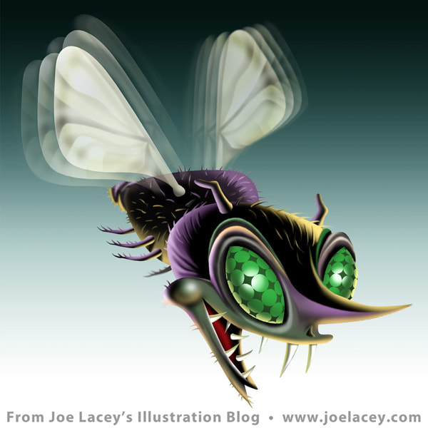
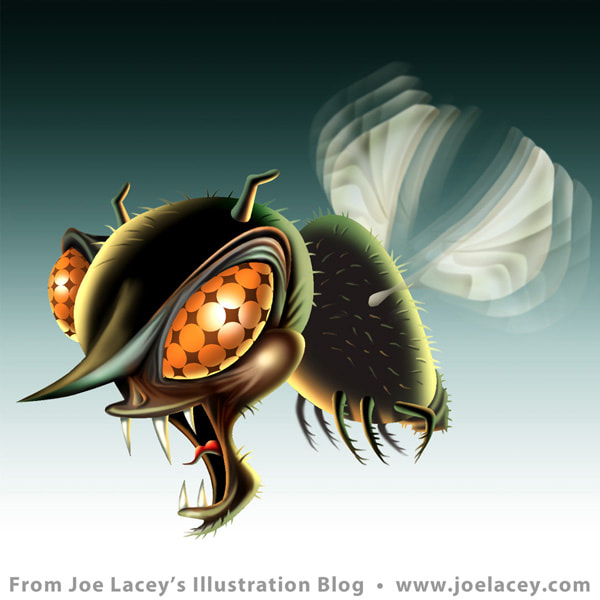
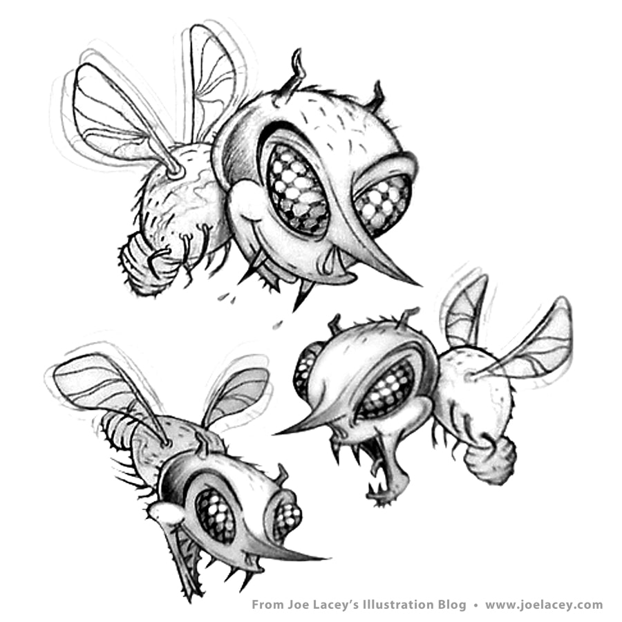
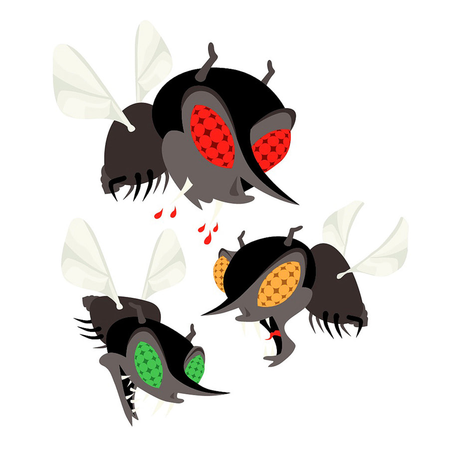
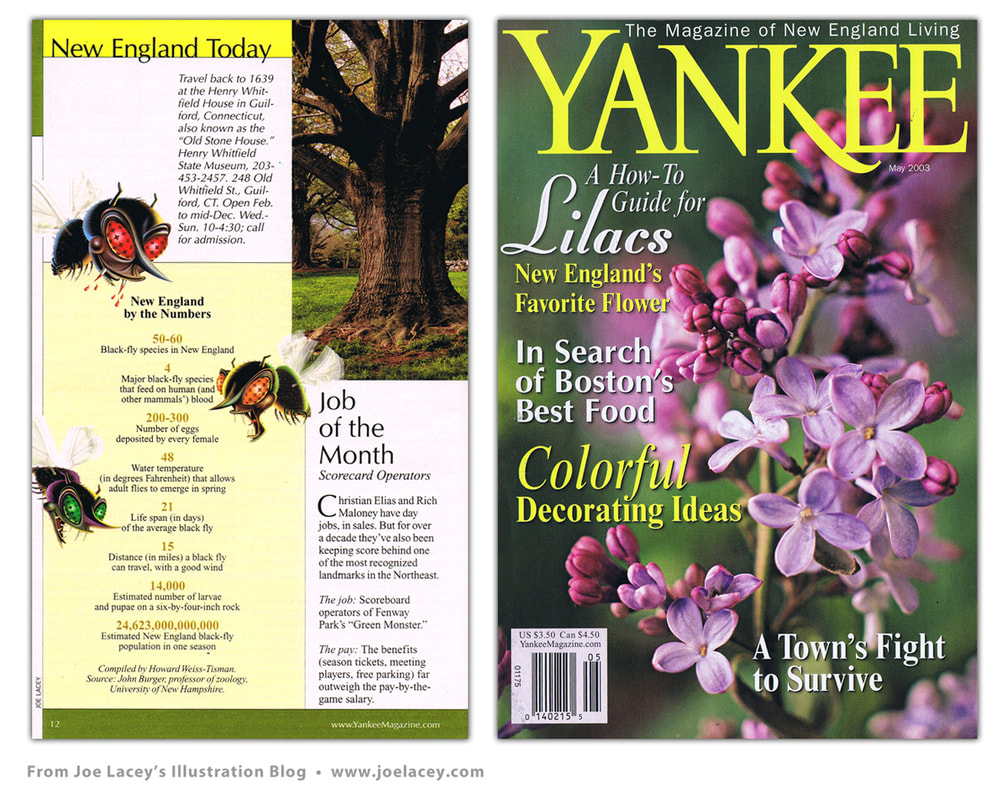
Bigger And Better Things! I worked on the magazine for about five years, writing and illustrating games. Multiple computers and programs later, the illustrations were getting more complex. Some being built entirely in the computer. Many, still being hand-inked, scanned and added on from there. The ROW, ROW, ROW series as we referred to them, were some of my favorites. I became the "go-to-guy" for these, writing and illustrating about twelve in all. Here's one I always liked, 9 Shipmates In A Row. Eventually, I began getting commissions from Sesame Street Magazine, Kid City, Scholastic, Better Homes & Gardens, and even Esquire to write and create children's magazine activities. It became the stepping stone for my future work with corporate promotional books and kids restaurant menus. 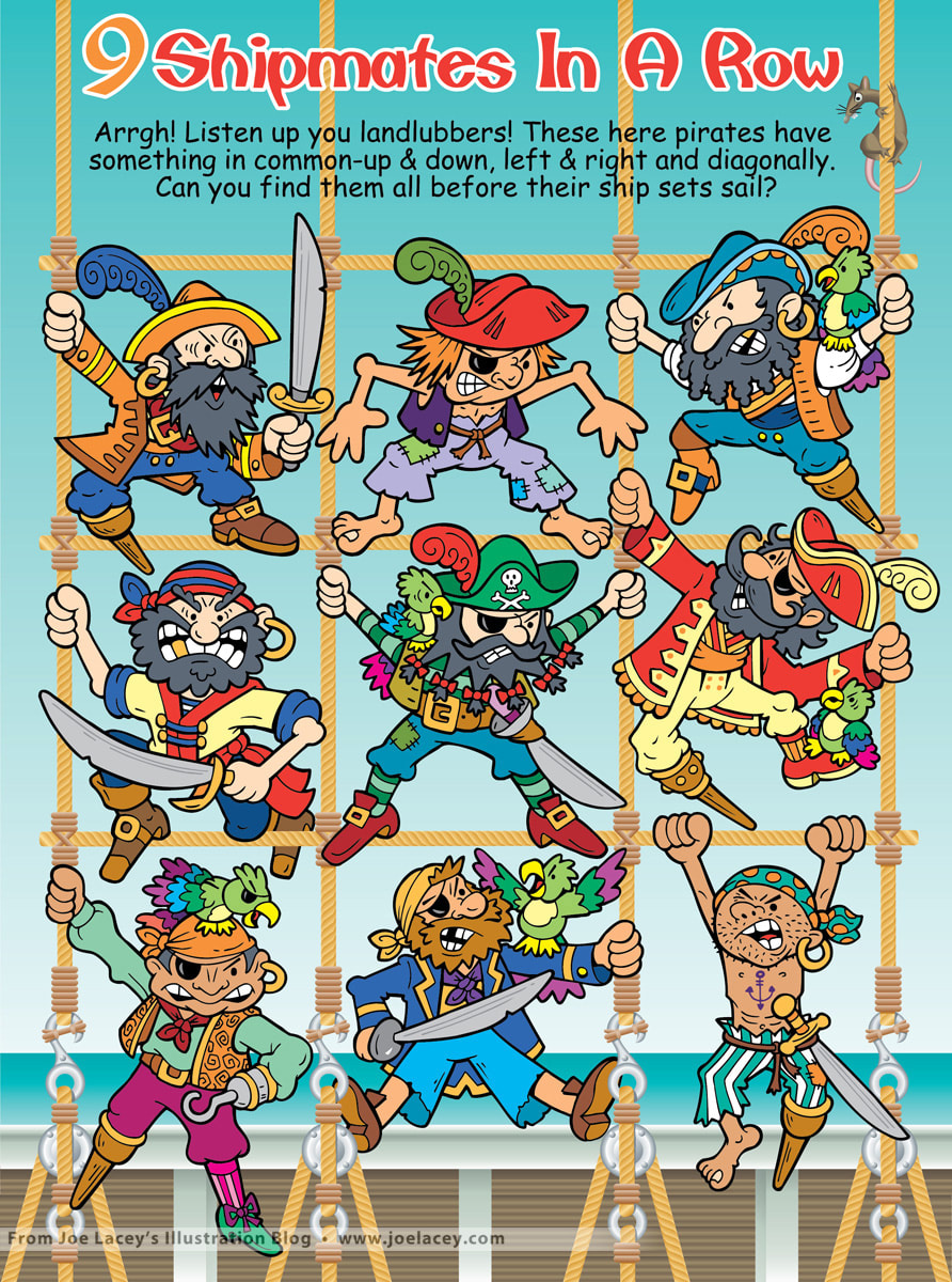 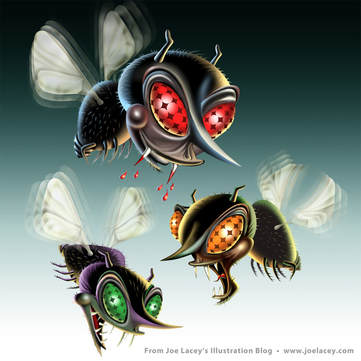 Early in my career, I did some editorial illustrations for magazines. This one was for Yankee Magazine which devoted it's pages to life in New England. The art director had seen my work on a series of Halloween illustrations and wanted three black flies that resembled vampires. Cool! As a kid living near Upstate New York, I was more than familiar with the nuisance of little black gnats that would swarm around everyone's heads. Summer happiness was dictated by the outbreak or lack thereof of these horrible little monsters. Kids pretty much wore baseball caps all summer. The best solution, besides spraying yourself with insect repellent, was to burn punks. Punks were basically incense on long thin sticks that resembled pond water cattails. I used to light two or three of them and stick them on top of my baseball cap where they would burn and encircle my head with a fine smoky mist that created an impenetrable barrier against the flying gnat armies! I thought I looked pretty darn cool! But, then, I was just a dopey little kid. The only time I have ever seen them mentioned in print was in the autobiography Moe Howard & The Three Stooges. Moe talks about "burning punk" to keep away the gnats. Moe knew what he was doing. Well, finally onto the art! It was commissioned as three small spot illustrations for a side article called "New England By The Numbers". The article listed numeric facts about the black fly population in New England. Seems they have a problem with gnats, too. Maybe they just need to burn some punk? |
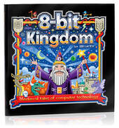
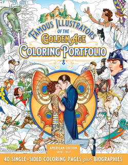
BOOKS
by Joe Lacey 
Categories
All
IllustratorsLinksArchives
May 2023
|


 RSS Feed