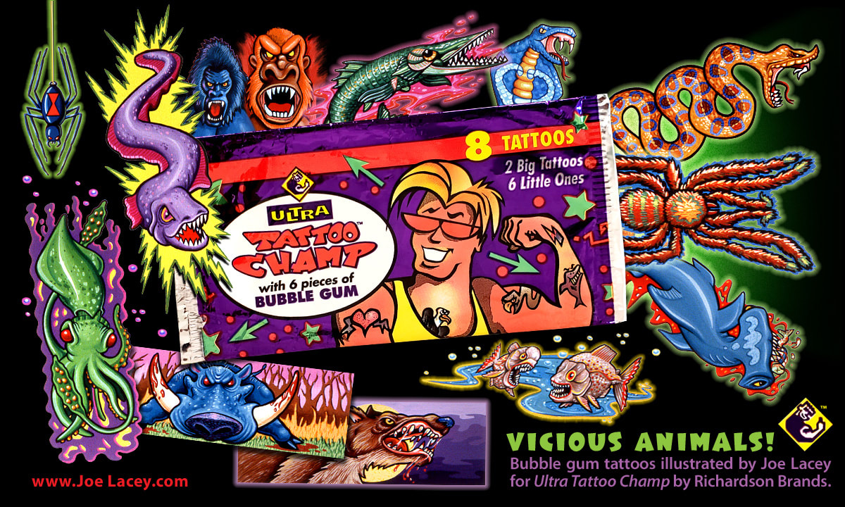
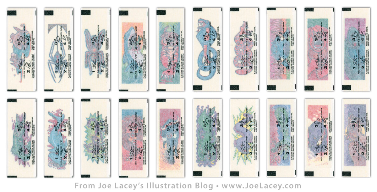
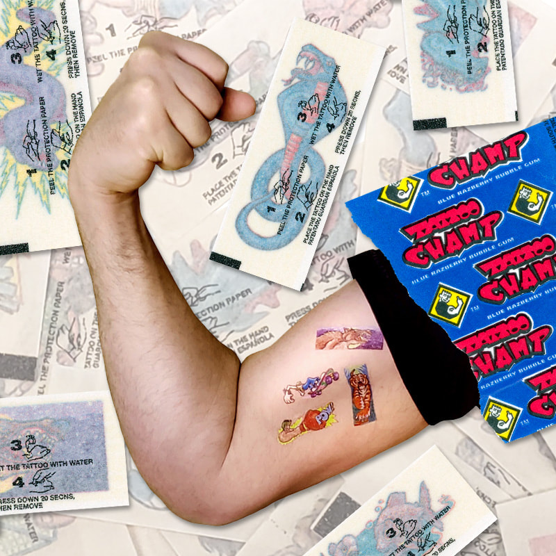
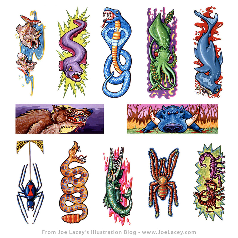
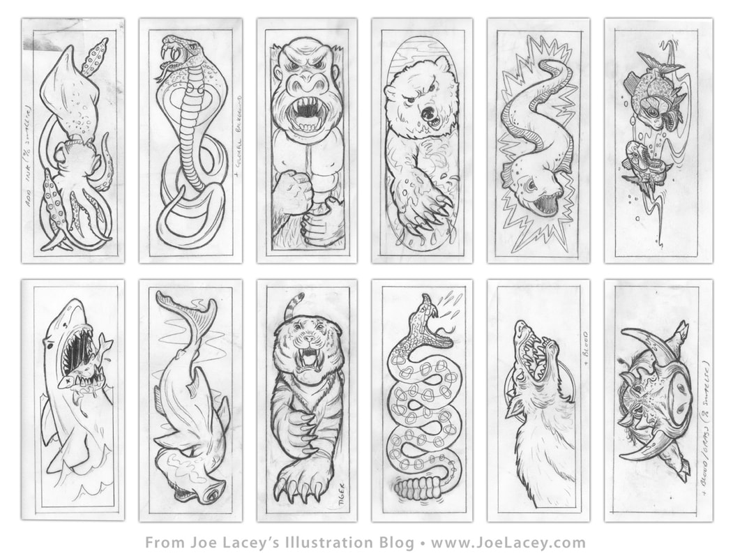
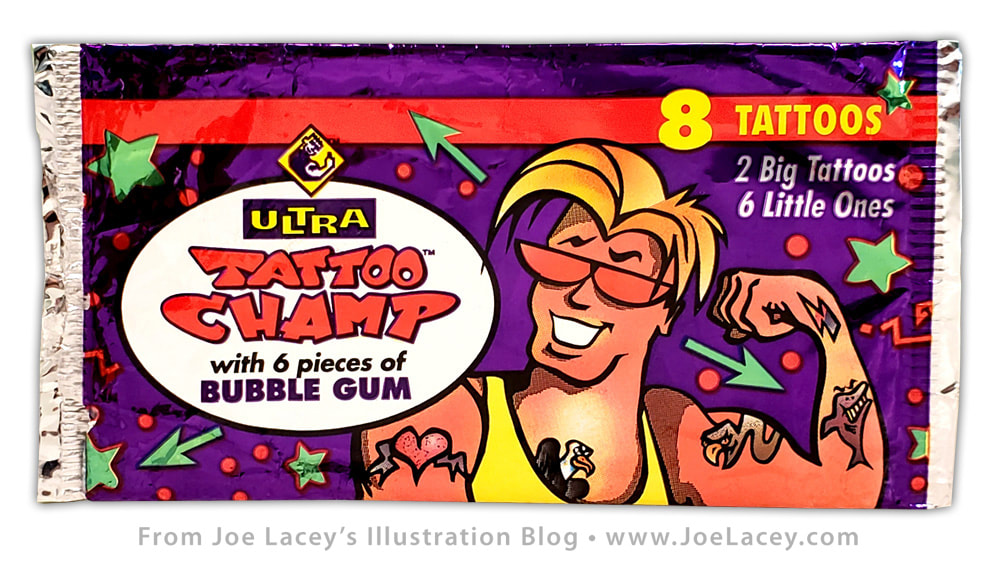
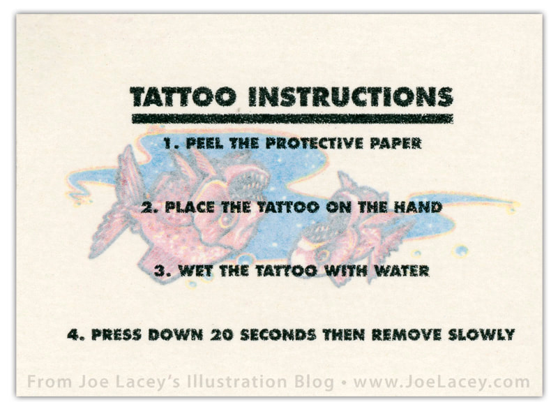
Bubble Gum Tattoos With a Bite!I've been on a bit of a nostalgia kick the past few months. Probably from watching old episodes of Beverly Hills 90210. You see, Brandon just broke up with Kelly, Donna is still with Ray and Dylan is...oh sorry! Back to the point of this article -- Ultra Tattoo Champ was another one of my very early commercial projects from the 90s for Richardson Brands, best known for Beechies Gum*, Richardson Mints and rock candy. During this time, they manufactured a sizable series of these temporary tattoo packs. Sold in foil packs and in large 180 piece tubs for individual purchase at 5¢ each, the tattoos were wrapped around a piece of gum inside a wax wrapper. The gum had another selling point for kids beyond the tattoos — purple gum turned the mouth purple, green gum turned the mouth green, and... you get the idea. I illustrated two lines for this series, Vicious Animals and Sports. For this article, I'm showing my favorite of the two, Vicious Animals! *Beechies Gum was originally made by the Beech-Nut Company and introduced in 1933. Richardson Mints have been made sine 1893. They also make a product called Gravy Master which has nothing to do with bubble gum or candy, although, a gravy flavored gum would probably be a big seller! There's my free million dollar idea. This is the complete set of Vicious Animals tattoos. Each tattoo is roughly 2.5 inches tall and 1 inch wide. I don't recall exactly how Richardson Brands had contacted me, but I do remember driving to their office in Bala Cynwyd, Pennsylvania twice, once to show my portfolio and once to deliver the art. I met with the art director, was given samples of previous tattoos, and some gum that I chewed on my drive back home. Over 25 years later, these tattoos still work and still look pretty cool! No, I did not eat the gum. The original art was painted with gouache on bristol board at 300% reproduction size. They worked really well at the tiny 1 inch tattoo size and were remarkably bright and colorful! The original art is owned by Richardson Brands and all I have are 35mm slides. I had enough sense to have taken shots of most of my work back then as I never liked sending the art away, never to see it again. It was a lot tougher to keep good records of my artwork prior to digital scans and photos. It took A LOT MORE TIME but it was well worth it! I did quite a few sketches for project. They were done pretty quickly as I remember in order to meet the deadline. The art director sent a good amount of them back asking for "more blood" and everything that went along with it, which made me really happy! I look at these today and only wish I could do them all again! I'd add EVEN MORE GORE! C'mon Topp's, give me a call! I can do this! Here he is — the Tattoo Champ! ready to chew gum and kick butt! Kinda looks like Steve Sanders! The foil packs came with an XL big tattoo 3.5 inches by 2.5 inches. I bought about five or six packs to get one of my illustrations. Glad it was the piranha, they're cute!
2 Comments
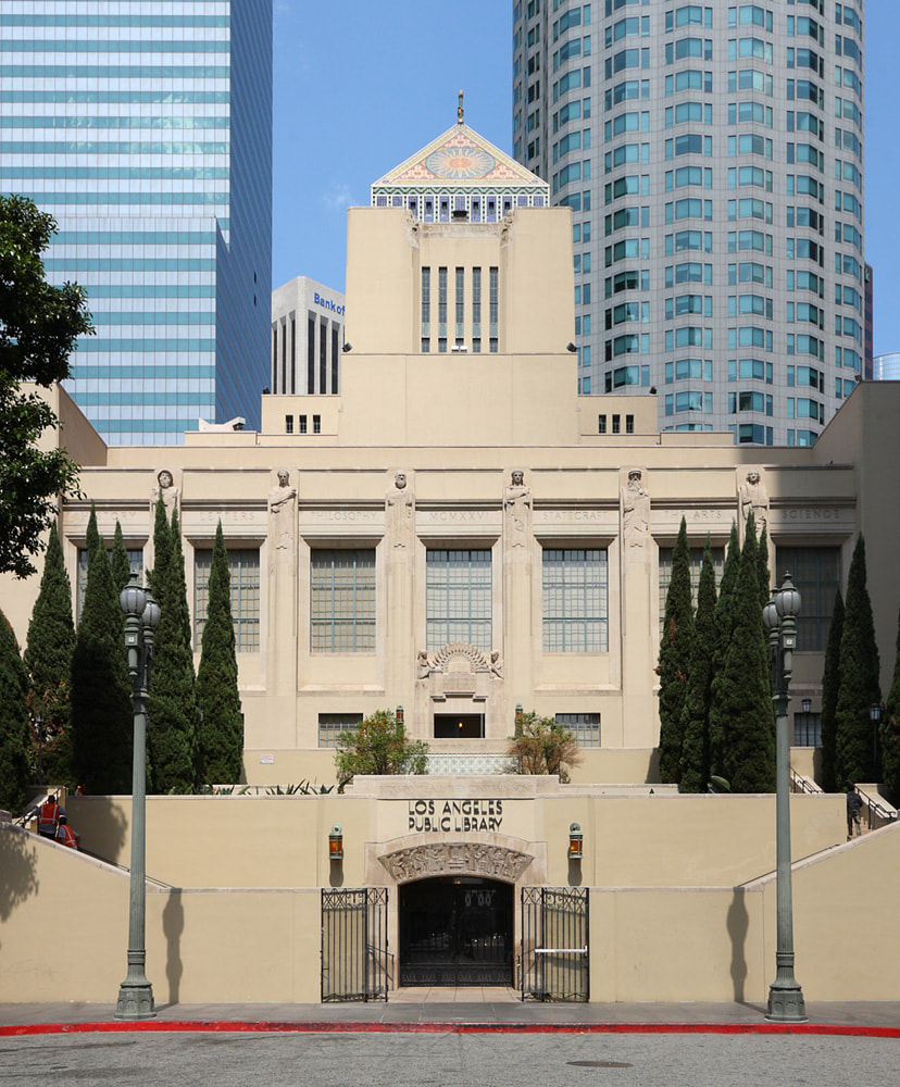
How PEZ sparked a romance and ended up in the Getty Gallery at the Los Angeles Central Library. 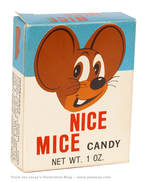
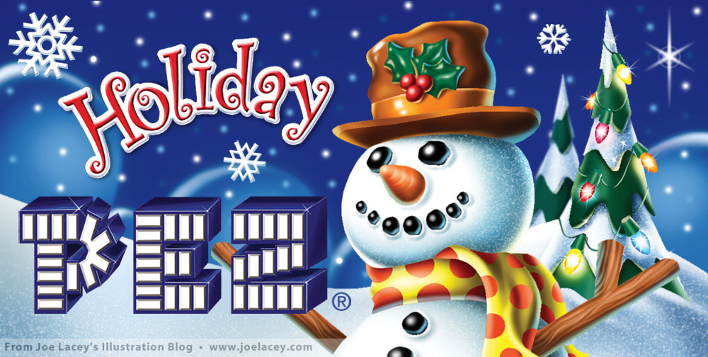
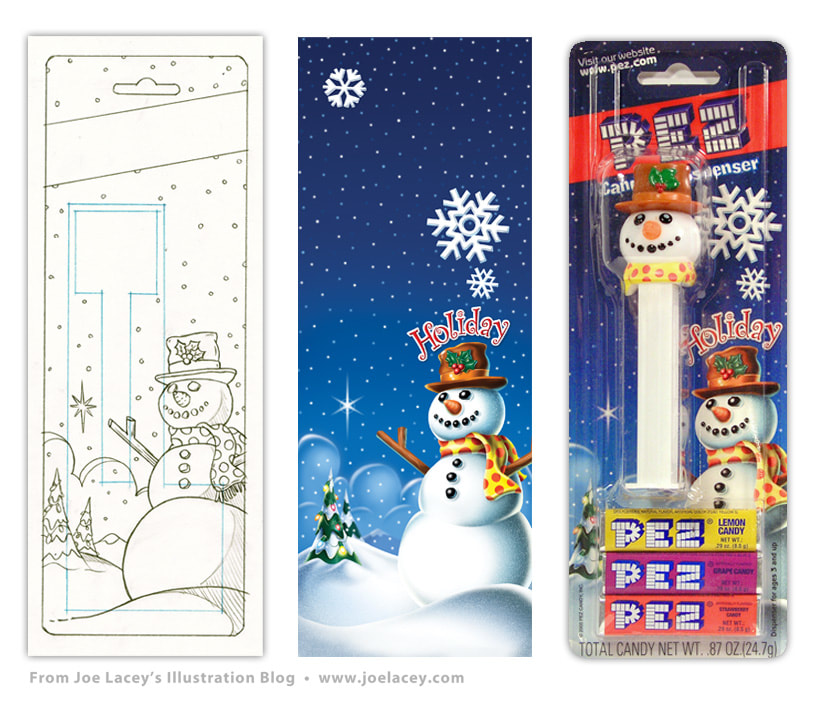
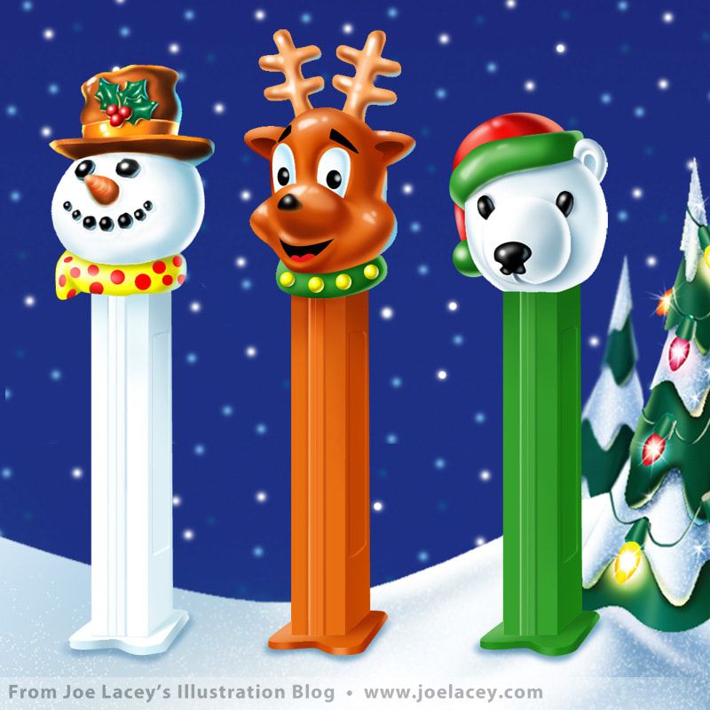
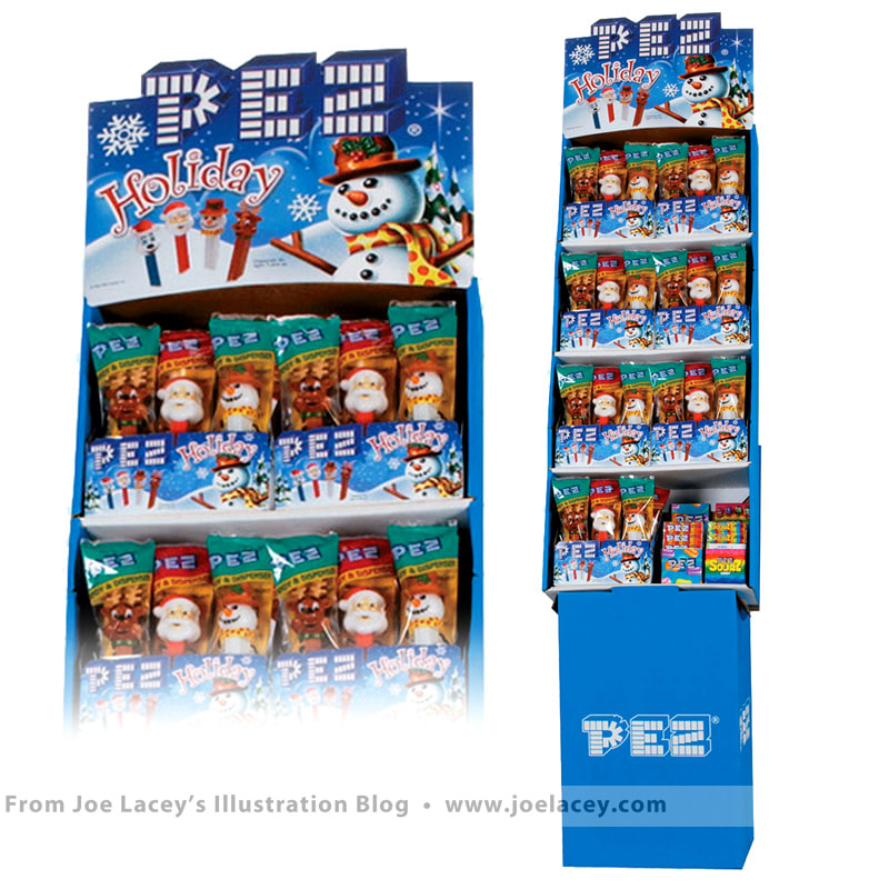
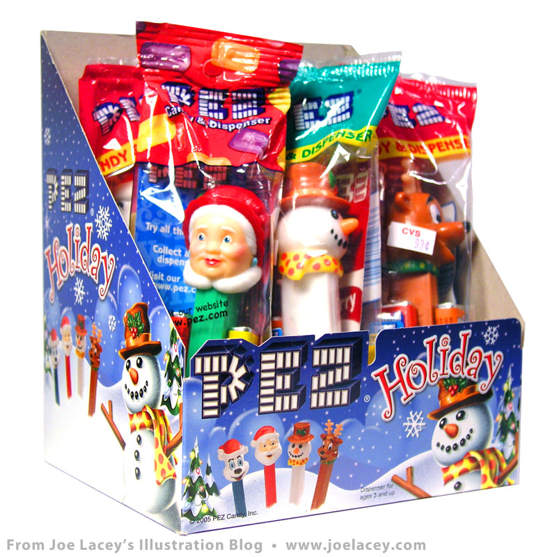
This was my first job for candy manufacturer, PEZ. It was a major commission and I was thrilled for a number of reasons. One, well, it's PEZ. Who wouldn't want to make art for this iconic candy company? Two, it was the first time I illustrated a candy package. And three, it was pretty much the catalyst which created a friendship that led to marriage.
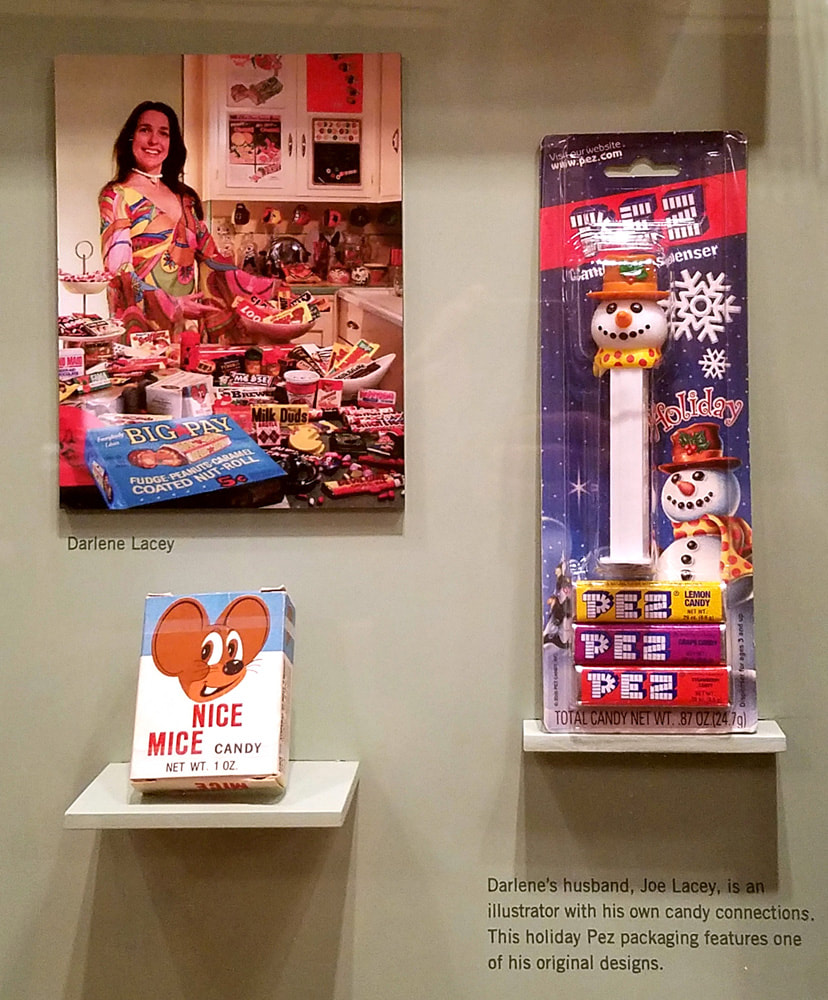
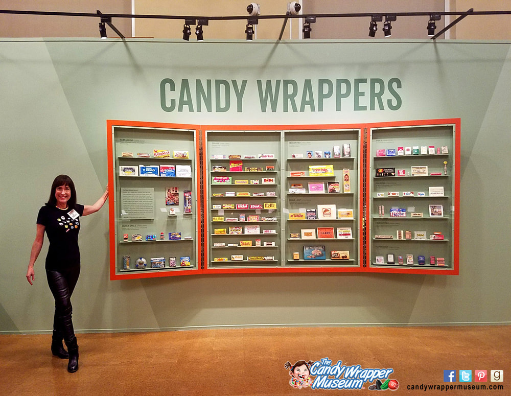
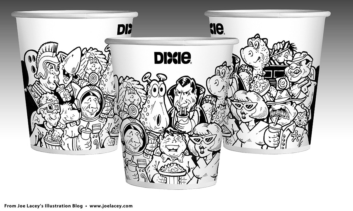
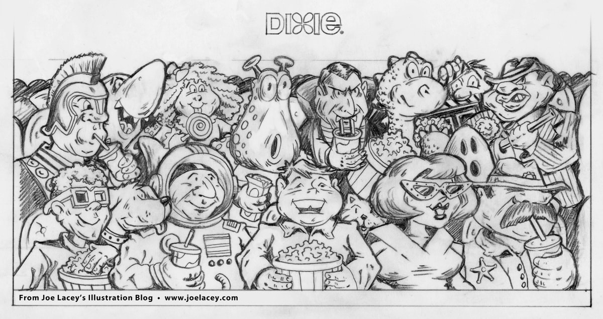
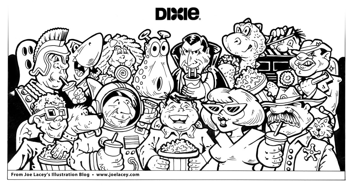
I have to go back to 1975. I was a kid growing up in Sayre, Pennsylvania. A very small town near Upstate New York. There was a store called Jordan's News Stand. It was also the bus stop and the place to buy candy, Wacky Packages, and rubber monsters. Of all the candies I bought there, and there were a lot, Nice Mice by Stark Confections was one that carved itself into my memories. All throughout the 80s and 90s I had looked for it. When the internet thing happened, I searched online, hoping just to find a picture of it. Then one day, it happened! There it was, in The Candy Wrapper Museum, a newly launched website for showcasing the candy collection of Darlene Waddington. As it turns out, Nice Mice was the first piece she had collected in 1975 when she thought of creating her museum in Los Angeles, California, the same year I was buying the candy 3,000 miles away. Of course I had to write to her. We exchanged pleasant emails and things were nice and professional. Then, I get an email from PEZ asking if I would be interested in working on the new Holiday packaging. I was so excited! When I had the art done, I emailed Darlene a screenshot of it, figuring she would write back right away. I heard nothing for almost two months. Well, I guessed she wasn't impressed. Little did I know (or Darlene), my email got sucked into her spam folder! Good for me, because she felt so guilty, we started writing to each other more seriously. Over a year of sending emails, then a couple phone calls, and now we're happily married for almost 14 years! Selected pieces from Darlene's candy wrapper collection (along with Holiday PEZ) are now part of a major art exhibit — 21 Collections: Every Object Has a Story at The Getty Gallery in Los Angeles' Central Library. The thesis of the exhibition is that personal collections create stories of our world that traditional history has not told. It was an honor for Darlene's collection to not only be included, but to be the first one selected. However, more importantly, Nice Mice and Darlene now reside in my house. Not a bad deal! You can visit The Candy Wrapper Museum here. A few years back, I designed some rough concepts for the Dixie Cup Corporation. Dixie is now one of the brands owned by Georgia-Pacific, makers of Brawny, Sparkle, and numerous janitorial supplies. This is the only example I have of the work I made for Dixie. About 13 years ago, a major computer crash caused the loss of quite a bit of my digital art, my Fisher-Price work was hit the hardest. The crash even wiped out my back-up drive! I believe I did three or four designs, two with characters and two without, all meant to be produced in full color. Because the work was conceptual, I simply did pencil sketches and some quick inkings by hand to show the basic ideas. The inkings were scanned, colored, and then mocked-up to took like cups. I wanted to do something that looked like a MAD Magazine comic book from the 1950s or novelty candy packaging from the 1970s. It kind of got there. Dixie never took these concepts any further, but I wish they had. I wanted it to be a series of five-ten cups with different genres of movies or decades. A silent movie cup, the 1950s, science fiction, and a bigger tub for popcorn or maybe some plates. Probably too much of a targeted subject for home purchase, but it would have been cool! |
BOOKS
by Joe Lacey 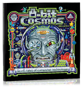
Categories
All
IllustratorsLinksArchives
May 2023
|
 RSS Feed