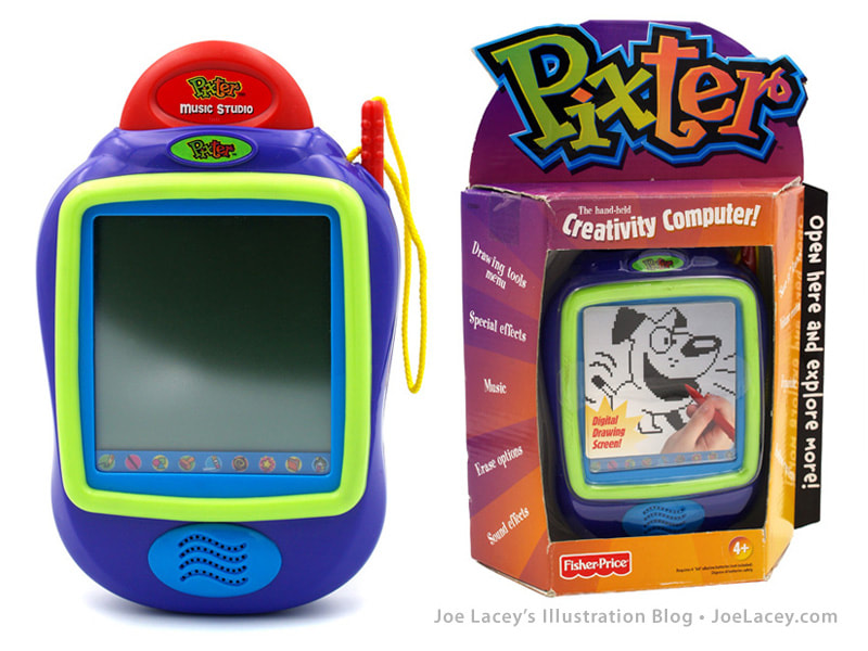
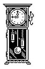
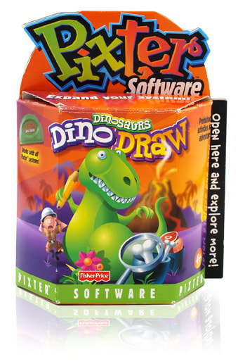
  Time to talk about Pixter, the hand-held Fisher-Price creativity system; a digital art studio, music machine, camera, and video game console all in one. Manufactured from 2000-2007, Pixter is the first and only handheld gaming console produced by Fisher-Price. It's also the first digital touch screen toy for kids, making it an important addition to the world of digital art. Controlled with a tethered stylus, Pixter, is pre-loaded with drawing activities and games, and offers a number of additional cartridges, both licensed and original. As a contract artist, I helped design some of the base unit's activities, cartridge games, and 8-bit animations.  REVISED EDTION ON SALE JANUARY 2, 2023 The first Pixter was a B&W unit with limited memory storage. All the artwork, or art assets, had to be simple and easily recognizable. That can be tough when you are trying to make a dinosaur using a 19x13 pixel area! That's exactly 247 pixels, which sounds like a lot, but it's really not. When you consider a small 800x600 pixel photograph is 480,000 pixels, 19x13 is pretty small! For each job I would receive a highly detailed art matrix to follow. The matrix contained specs on sizes, colors, and functionality for each art asset. If the image did not move, it was "static." If it had limited two-frame animation, it was a "toggle image." Larger full screen animations were simply defined as "20 frame animation" and so on. Within these tight guidelines, there was still room for for me to make adjustments to the sizes as long as they did not effect the gameplay. These art assets were created in an 8-bit format. If you're familiar with early video games like Pac Man and Donkey Kong, their art assets are comprised are individual squares known as pixels which give a jagged edge to perceived lines and curves in 8-bit art. I'm not a computer programmer, so I'll give you the Wiki definition:
  All B&W Pixter images are displayed in 2 colors – black and white (the white being the empty space of the view screen) on an 80x80 working area. When early digital games moved into color, the palette would often be very limited, sometimes only 8, 16, or 32 colors, with some of these colors being almost identical. My early 8-bit art was done this way, and I can tell you, it could be tough sometimes to make it all look nice. Luckily, by the time Fisher-Price released the Color Pixter, we were using 128 colors with a 160x160 working area. The artwork was a lot easier to make. But, despite the increased size and color of the working area, I particularly love B&W 8-bit animation. One pixel to the left or right could be the difference between a happy bunny or a sad bunny. Over the course of eight years Fisher-Price released six variations of Pixter: Pixter B&W 80x80 screen. Pixter Plus 10 additional activities and 20x storage. Pixter 2.0 Wirelessly send images to another Pixter 2.0. Color Pixter 128 colors 160x160 screen. Pocket Pixter Keychain-sized B&W 80x80 screen. Pixter Multi-Media Now with video editing. Over the course of ten years, I worked on a number of Fisher-Price 8-bit animated games, not all Pixter. While working on these games, I developed the standard practice that was adopted by Fisher-Price for fast review of animated assets. This meant a bit more work on my end as I had to construct each animation frame into a single file that was playable with just one click. This came in handy not only for simple animations, but to mock up a non-interactive version of the actual gameplay for the programmers to review. It greatly increased the speed of the review process, allowed me to see how the animations would look, and allowed me to make adjustments.
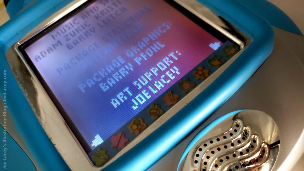
 I shot this video to show you the consoles and some highlights from three games. I decided to use the COLOR PIXTER game unit as it has a brighter screen with better contrast. It just looks better when shooting a video. But, despite this, I still prefer the original B&W PIXTER. There are over 24 B&W Pixter game cartridges. Along with other artists, I helped out on several of them, supplying art support for specific game segments. Here are a few of them: 
1 Comment
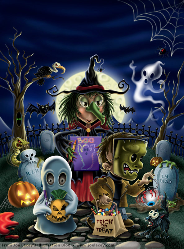
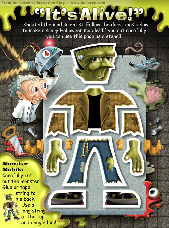
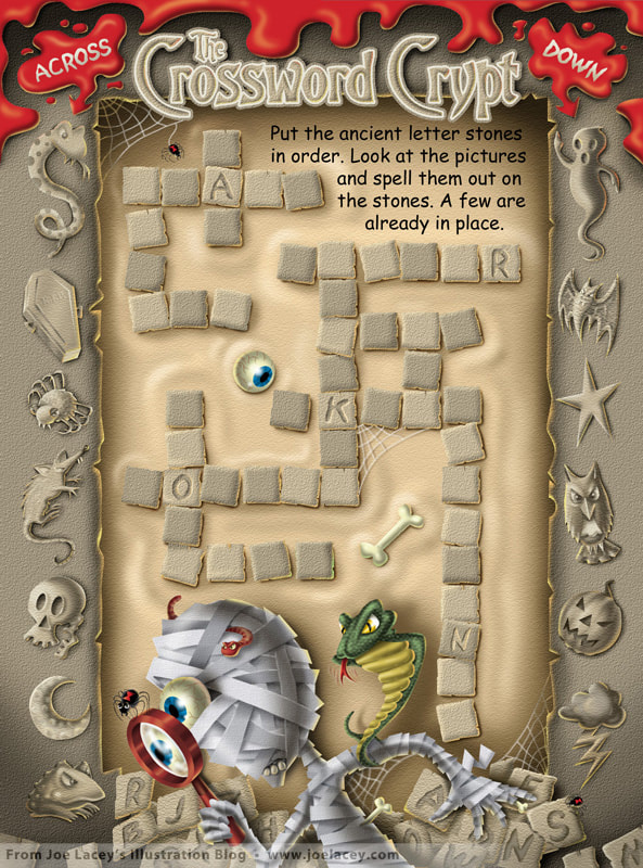
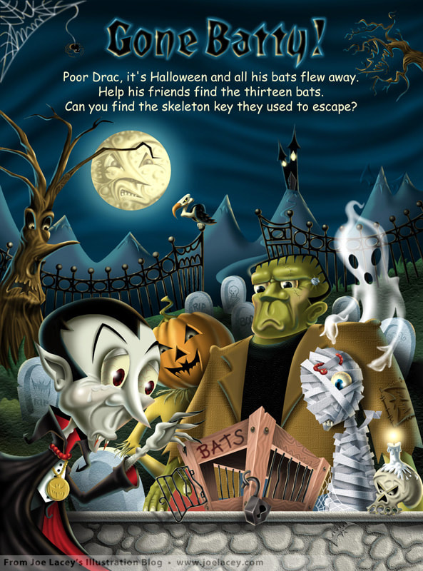
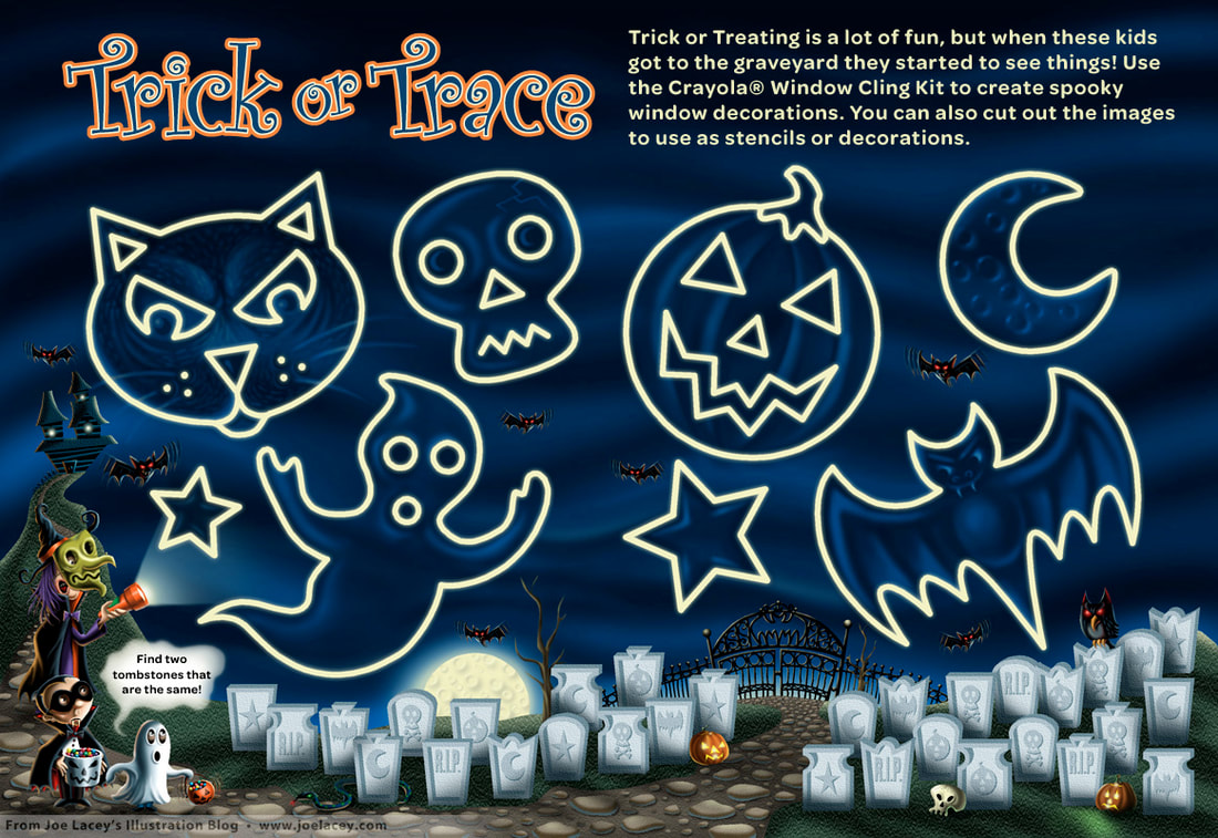
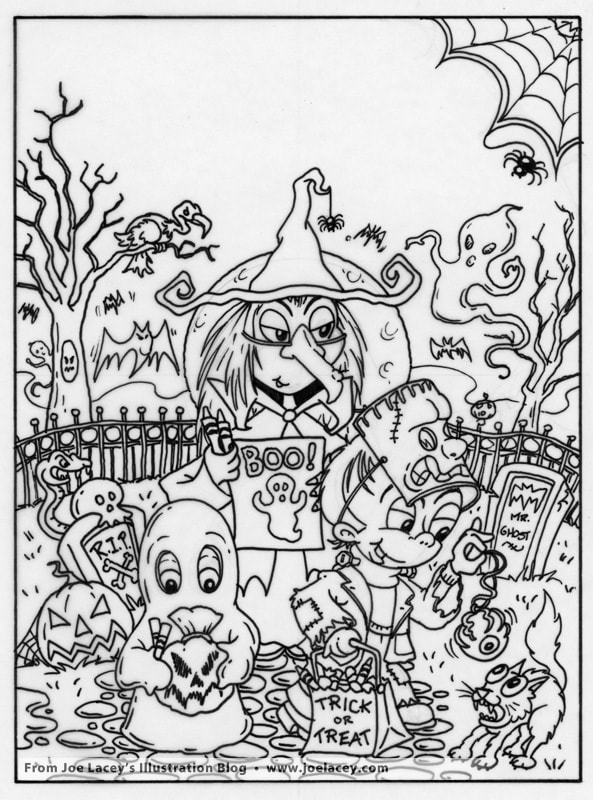
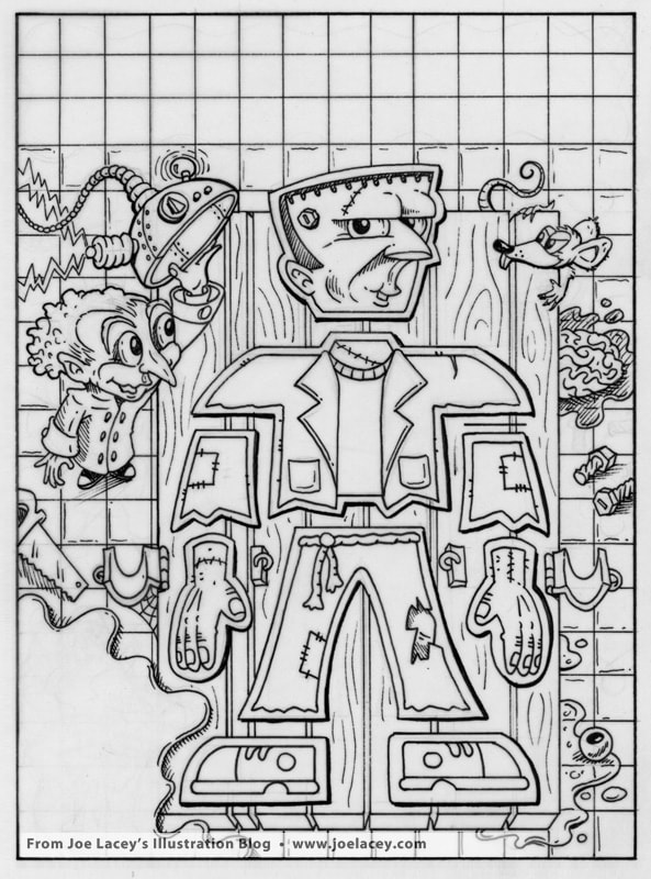
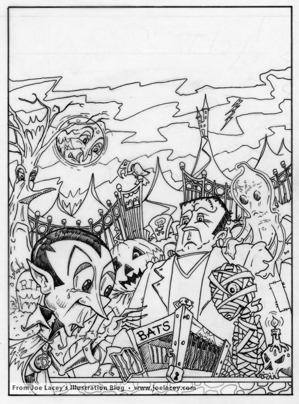
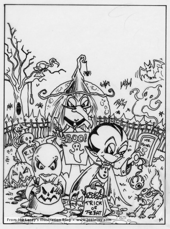
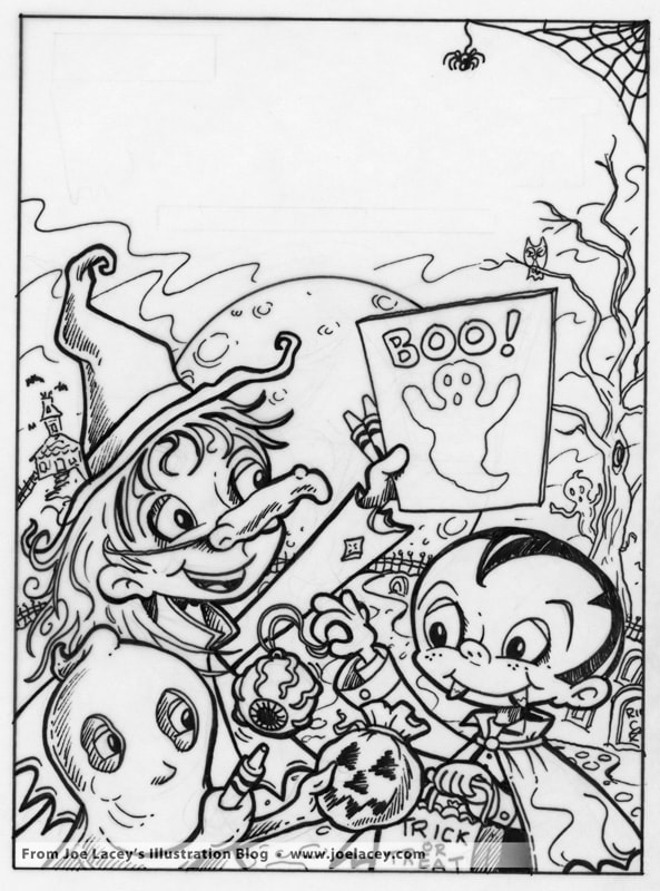
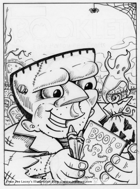
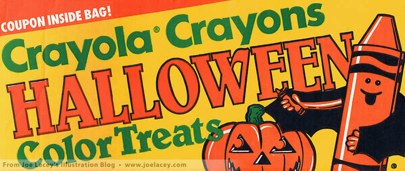 Crayola Halloween Color Treats Store Display 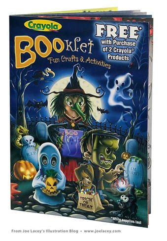 Just in time for Halloween! The Crayola BOOklet was the first time my digital artwork started to look the way I saw it in my head. Before this, I was doing mostly vector art and traditional painting - primarily airbrush. BOOklet was a crash course in digital art and an incredible rush to finish. I started on the 5th of March and finished on the 25th of March, 2002. That's twenty days to write all the activities, design the pages, and finish the art. Usually, I was designing and painting the covers for Crayola coloring books. So, to get get my hands on all the interior illustrated pages was really nice. But today, I often work on the coloring book covers and interiors. BOOklet was a free in-store giveaway with the purchase of two Crayola products. Fourteen pages of craft projects and five pages of activities I wrote and illustrated, plus the cover, and a store riser display. My favorite page is "It's Alive!", a cut-out mobile dangler of Frankenstein coming to life on a laboratory table. I can't say it was my idea, however. In grade school, one of our class projects at Thanksgiving was to make a scarecrow dangler out of construction paper and yarn. I loved it then, so why wouldn't kids love it today! I still have my scarecrow dangler. He makes me happy. So, here's the art, the sketches and some stuff that never made it in the book. Happy Halloween!
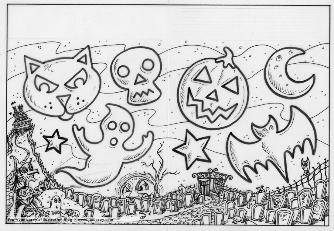
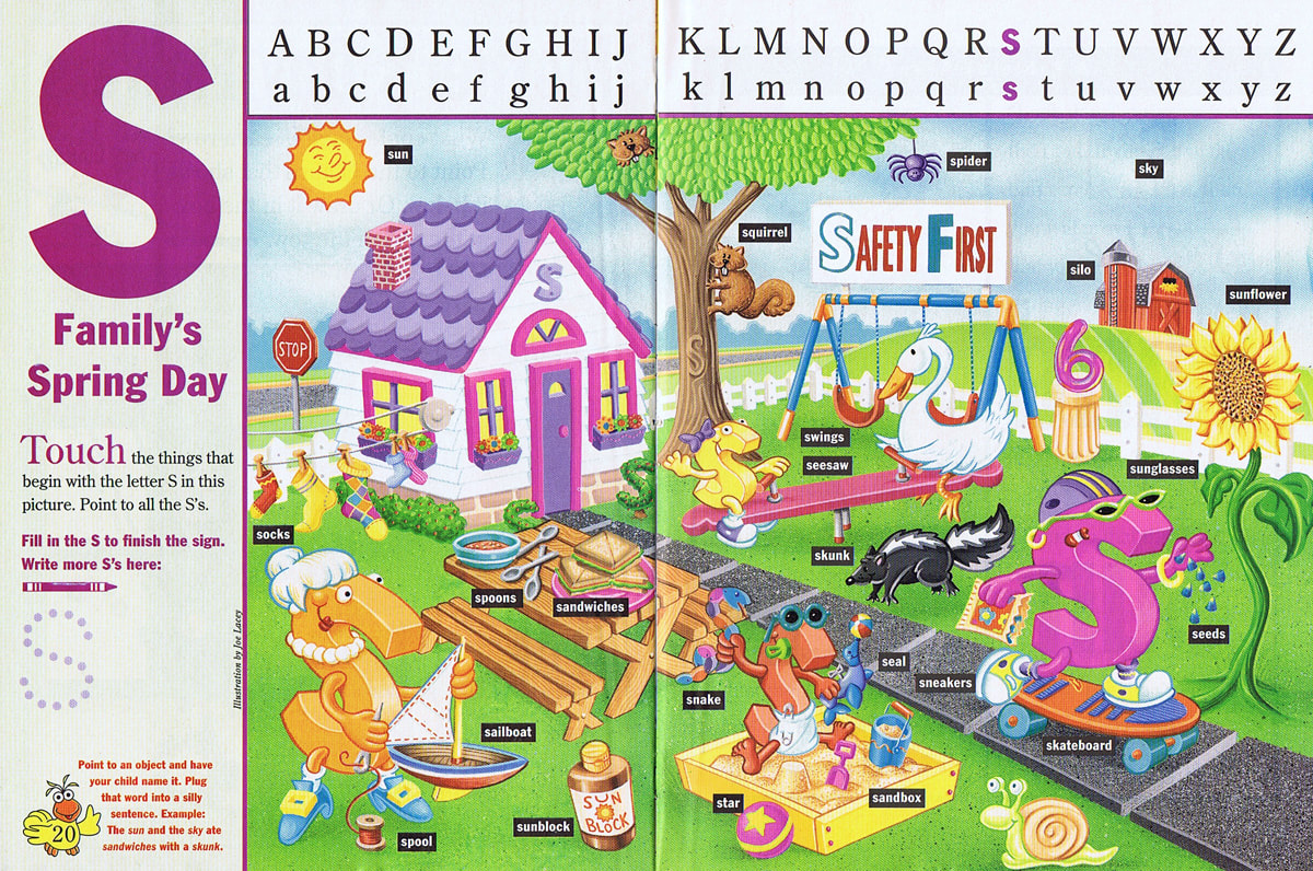
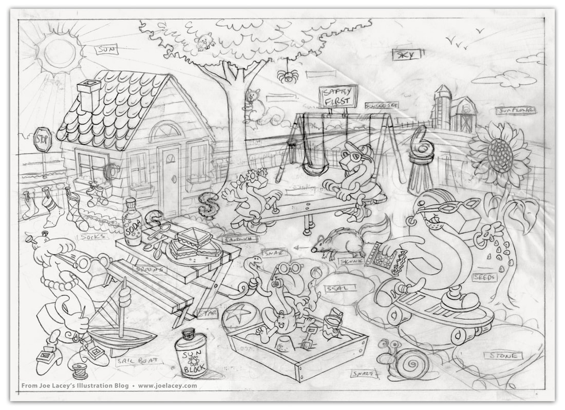
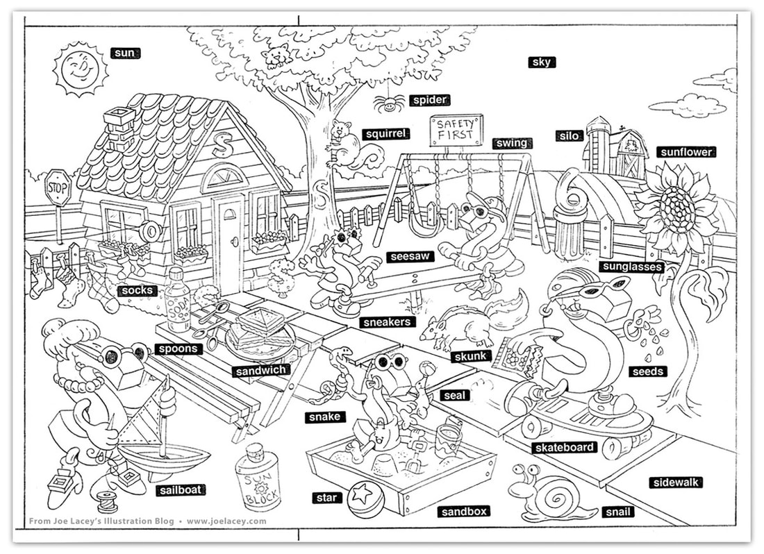
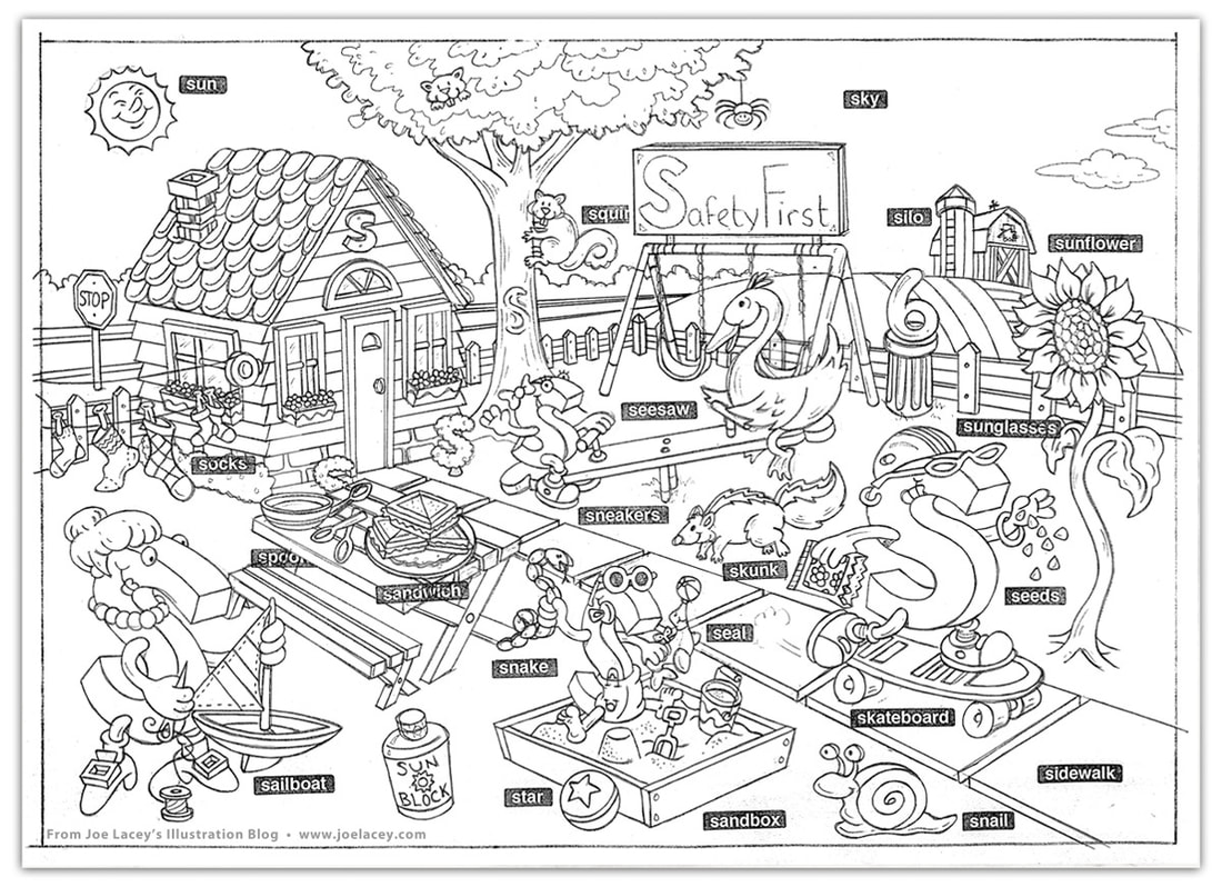
Digital ArtworkIn-Store Riser Display 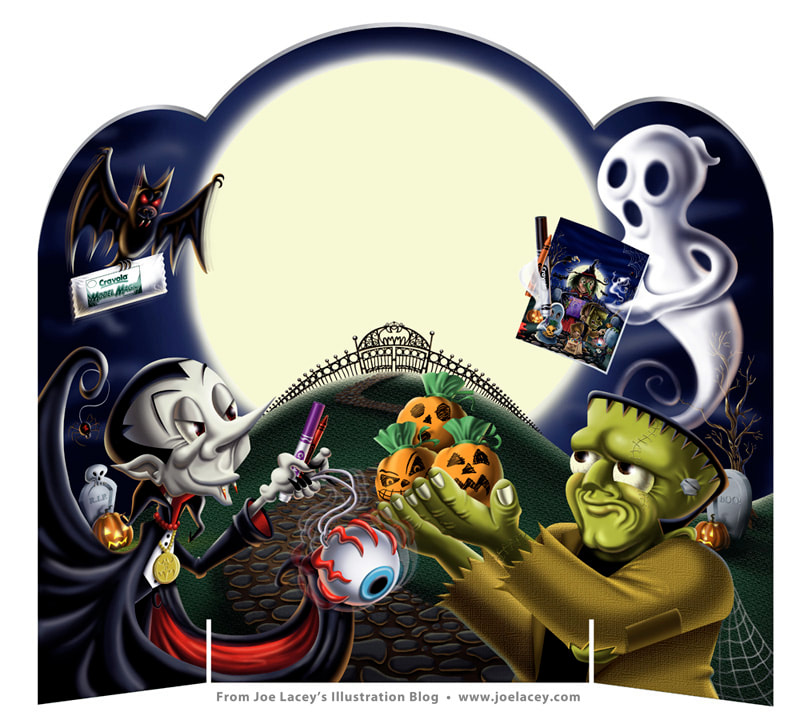 Crayola BOOklet in-store riser display. The riser was placed above a display of selected Crayola products, Model Magic, Gel Clings, crayons, and markers. I never saw this in the store and I don't have a printed copy of it. Always wanted one. The moon was left blank for the art department to fill with text, probably something like this — FREE BOOklet! While Supplies Last! The book had instructions on how to make the "Bouncing Eyeball" that Dracula is holding and Frankenstein's "Paper Bag Pumpkin Patch". There were also "Ghostly Goodie Bags", "Creepy Spider Web Doorways", and "Jolly Jack-O'-Lantern" craft ideas. Sketches Alternate Unused Sketches 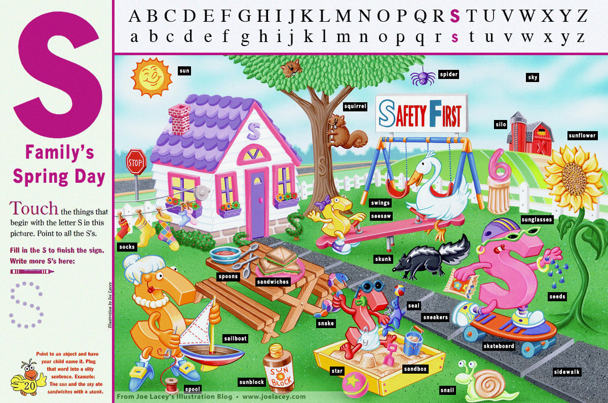 "S" Family's Spring Day. Illustration by Joe Lacey. Children's Television Workshop  Here's one from the vault that has always held a sentimental place in my heart - a full page spread that appeared in Sesame Street Magazine entitled S Family's Spring Day for Children's Television Workshop. I had just begun work as a regular contributor to Crayola Kids Magazine and had a few jobs under my belt. Around this time, the magazine stands at bookstores and grocery stores were filled with kids magazines. With a pen in hand, I jotted down the names and addresses of the art directors from the magazines I liked. Next, I did what every illustrator is told NOT to do. I went home, folded an 8.5" x 11" color photocopy of an activity page I had done for another magazine and stuffed it into a white envelope with nothing more than the addresses on the outside and my name on the inside. When doing promotional mailers, artists should, for the most part, always send postcards. Art directors don't want to waste time opening envelopes. Most of the time they never even look at your post cards! One week later, I get a phone call from the art director at Sesame Street Magazine in New York City. I was expecting to be commissioned for a small spot illustration or some supporting art, not a full two-page spread. Not a bad return on investment for a stamp and envelope! My contract arrived with the most whimsical cover letter: "Sesame Street Magazine is guaranteed to be a smash hit now that you've agreed to do an illustration for it!" There were little to no changes to the art, but there were some changes to the content as the sketches evolved. Since it's an educational magazine, the games and activities are developed and reviewed long before they reach my desk. I received a very detailed list of what to include in the illustration and how the overall feel of the page should be presented. Beyond that, the characters and style were up to me. The art was hand-painted with airbrush and gouache on bristol board. At this time, I was transitioning into digital art, but still producing a fair number of illustrations in traditional mediums. It's cute little illustration, and I hope it made the kids happy. Original hand-painted art and the printed page as it appeared in the magazine. Pencil sketch stages.  |
BOOKS
by Joe Lacey 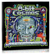
Categories
All
IllustratorsLinksArchives
May 2023
|


 RSS Feed