|
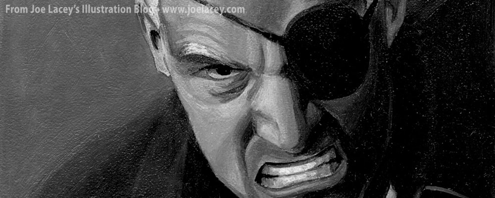
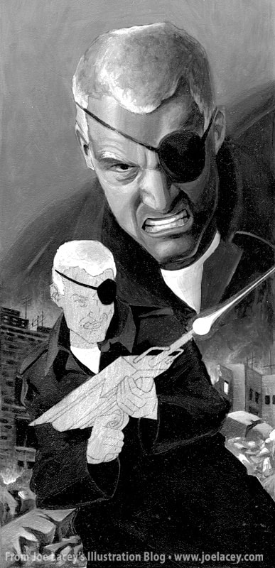
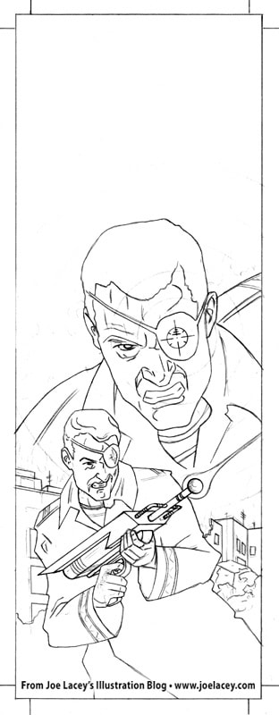
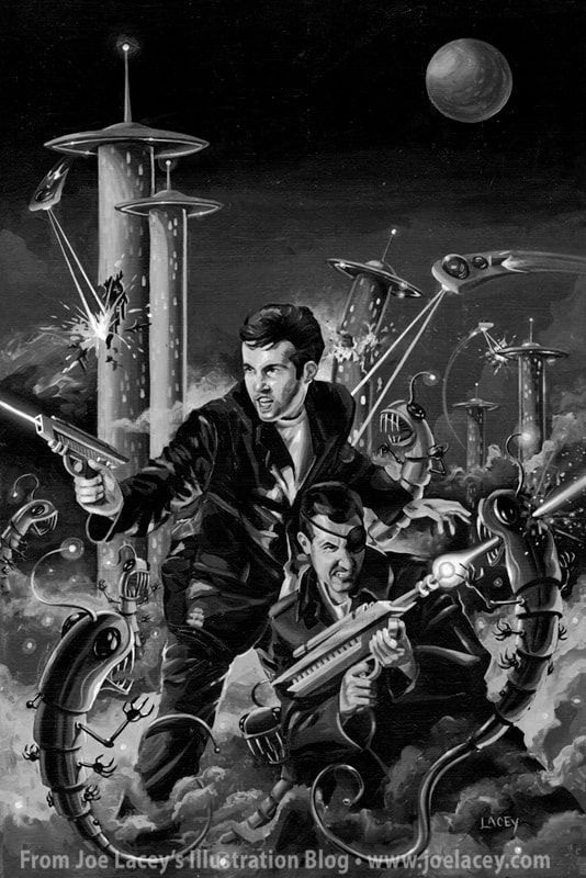
Like every artist and illustrator, I have a wealth of unfinished work and unfulfilled visions of characters and worlds that might have been. Beyond commercial jobs that get "killed" mid stream or never make it into production, there's all the personal work that has sat in folders and boxes for years. I look back on some of this stuff and wonder why I abandoned them. So, here's a short-lived vision that only made it to the rough concept stages - Spy Guy.
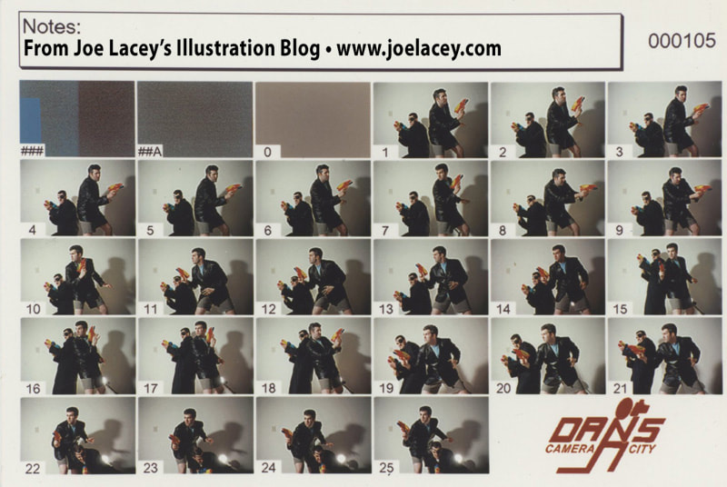
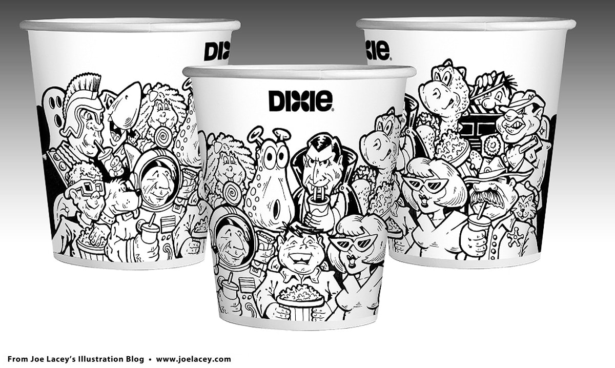
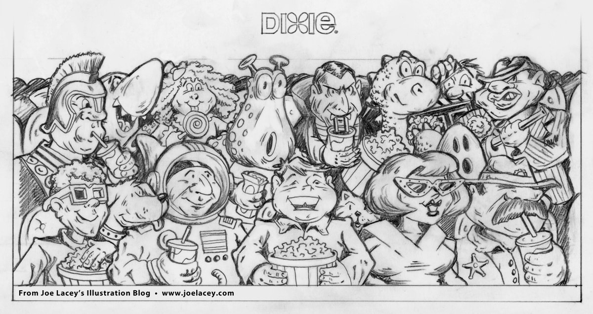
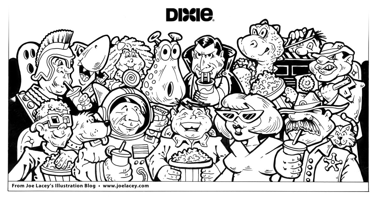
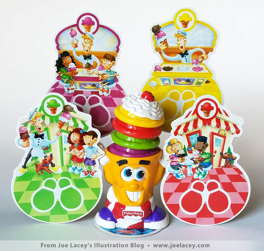
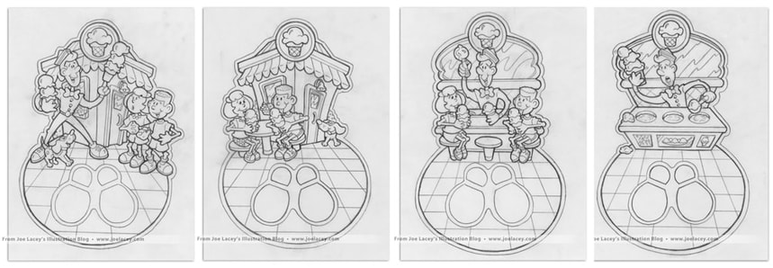
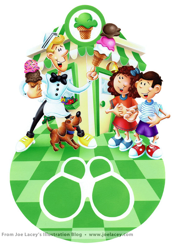
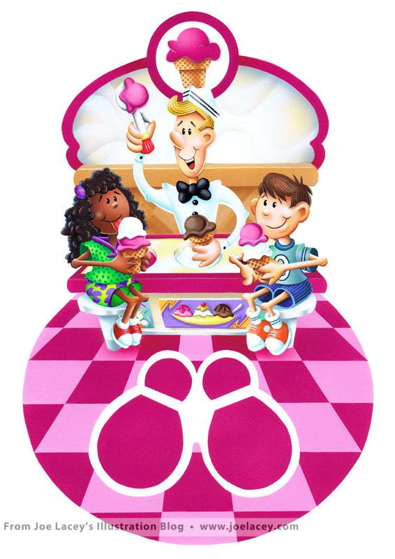
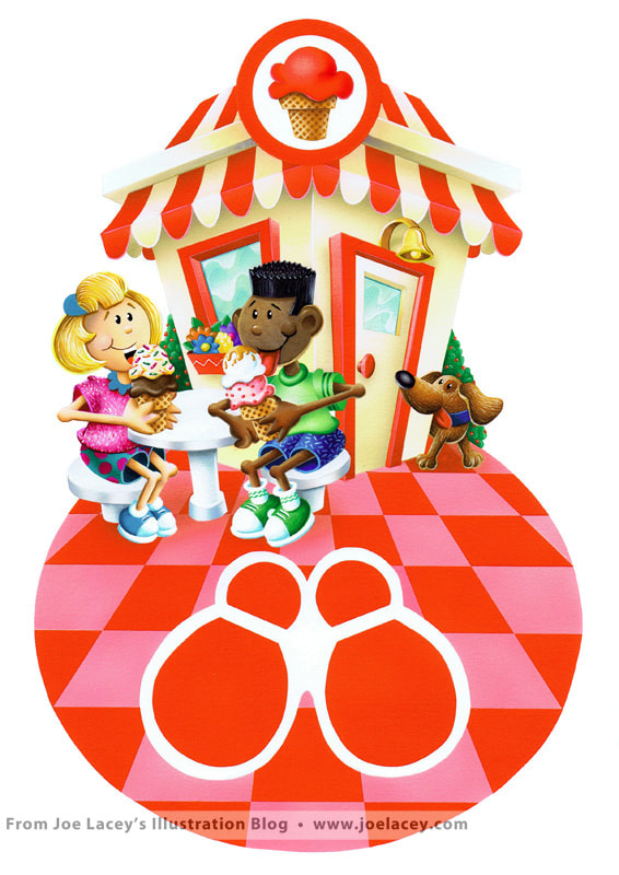
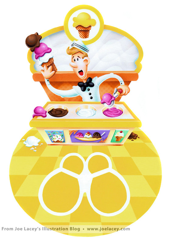
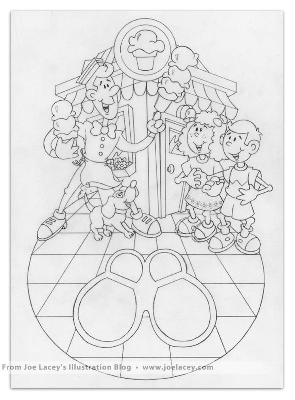
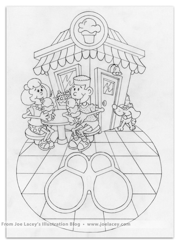
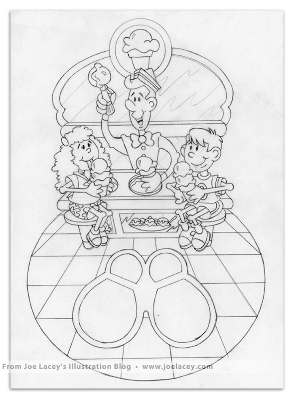
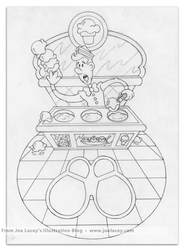
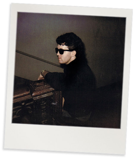
About eighteen years ago, I had planned to do five toy boxes and two scene illustrations for a character called Spy Guy, but they never got past the preliminary tonal studies. I was watching a lot of Gerry Anderson puppet TV shows at the time (Captain Scarlet and Stingray). I was also collecting quite a few vintage 1970s G.I. JOE Adventure Team toys by Hasbro. The cool ones with the fuzzy hair and Kung-Fu Grip™! I was also thinking of them as science fiction book covers. But in any case, they were always meant to be concept work and a chance to try something different. I posed myself and my brother John with trench coats and toy water guns. I worked out quite a few concepts, but only have one sketch and two tonal studies left. I think I threw the ones I didn't like away. I need to stop doing that! So, I get the art to this point but wasn't getting a lot of positive feedback on the idea and most people were confused as to why I wanted to even do this style of art. I was also busy with paid commercial work and, well, life gets in the way and my focus moved to something else. The Spy Guy series is one of these personal projects I regret never completing. The lesson I learned is, stick to your vision no matter what anyone else says. I don't know if I will ever revisit this concept again as I have more than enough OTHER unfinished paintings to finish! I'll try to get them done soon. A few years back, I designed some rough concepts for the Dixie Cup Corporation. Dixie is now one of the brands owned by Georgia-Pacific, makers of Brawny, Sparkle, and numerous janitorial supplies. This is the only example I have of the work I made for Dixie. About 13 years ago, a major computer crash caused the loss of quite a bit of my digital art, my Fisher-Price work was hit the hardest. The crash even wiped out my back-up drive! I believe I did three or four designs, two with characters and two without, all meant to be produced in full color. Because the work was conceptual, I simply did pencil sketches and some quick inkings by hand to show the basic ideas. The inkings were scanned, colored, and then mocked-up to took like cups. I wanted to do something that looked like a MAD Magazine comic book from the 1950s or novelty candy packaging from the 1970s. It kind of got there. Dixie never took these concepts any further, but I wish they had. I wanted it to be a series of five-ten cups with different genres of movies or decades. A silent movie cup, the 1950s, science fiction, and a bigger tub for popcorn or maybe some plates. Probably too much of a targeted subject for home purchase, but it would have been cool! Shiverin' Scoops Game Cards 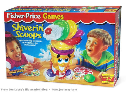 Fisher-Price Games: Shiverin' Scoops packaging. Fisher-Price Games: Shiverin' Scoops packaging. "We all scream for ice cream, especially when it's this much fun!" And... when it's a really fun project to work on! I designed and illustrated four place cards for Fisher-Price Games Shiverin' Scoops. The game included a motorized cone that shakes when you pick it up. Each player tries to add a scoop, balance the cone while placing it on the game card of the next player. The player who adds the last scoop wins! The cards were to be one design with the only change being the color of the floor, and that would be done with an overlay. But the art department wanted to see four concepts in order to pick from one. I submitted my designs using the two kids shown on the red card. They liked them all, and instead of illustrating one card, I got to illustrate four cards and add a few more kids to the scenes. I don't recall any major problems working on these illustrations. For once, the airbrush didn't accidentally spatter paint all over the board and there were no re-dos. This is one of the last physical airbrush pieces illustrated prior to going all digital. There really isn't a major difference in the look of my later airbrush paintings and my early digital paintings. The best advice I received concerning digital paintings came from an art director at Mattel. He said "Avoid using Photoshop filters unless you have to. Make your art look hand painted." It's advice I still use to this day. Despite the fact that I like seeing the original art and holding it in my hands, I'm really happy that today all my airbrushing is digital! Package designs, product art... it all changes so quickly. The ability to easily edit the artwork is something I've grown fondly accustomed to. I've illustrated and worked on quite a few games from Fisher-Price, including: Spin-Yo, The Lion Sleeps Tonight, Animal 2x2, Saucer Scramble, just to name a few. All of it now, of course, digital. Much of this work is in product development and interactive animations, which is why Fisher-Price seems a bit under represented in my portfolio. So many games and toys that never made it out into the world. But, I plan on posting a lot more of my work for Fisher-Price on this blog soon. |
BOOKS
by Joe Lacey 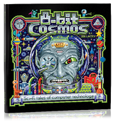
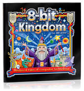
Categories
All
IllustratorsLinksArchives
May 2023
|

 RSS Feed