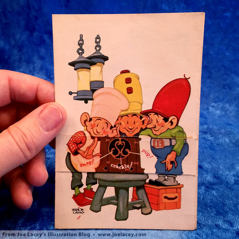
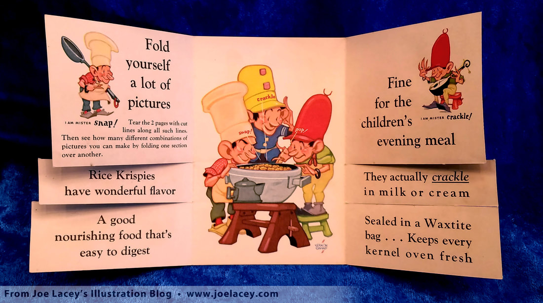
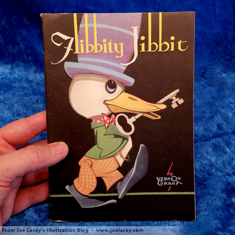
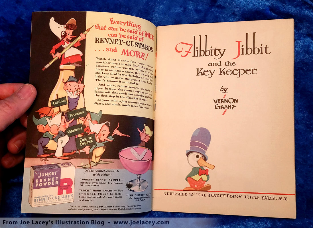
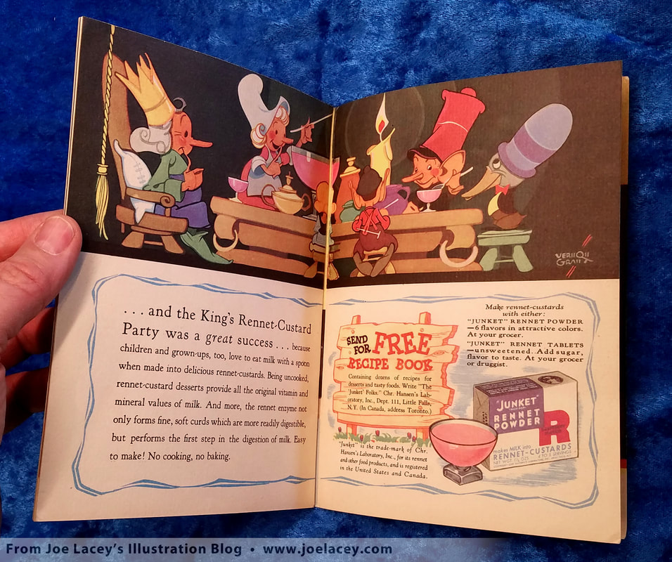
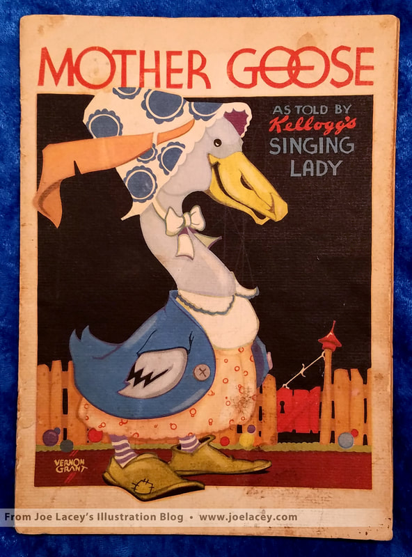
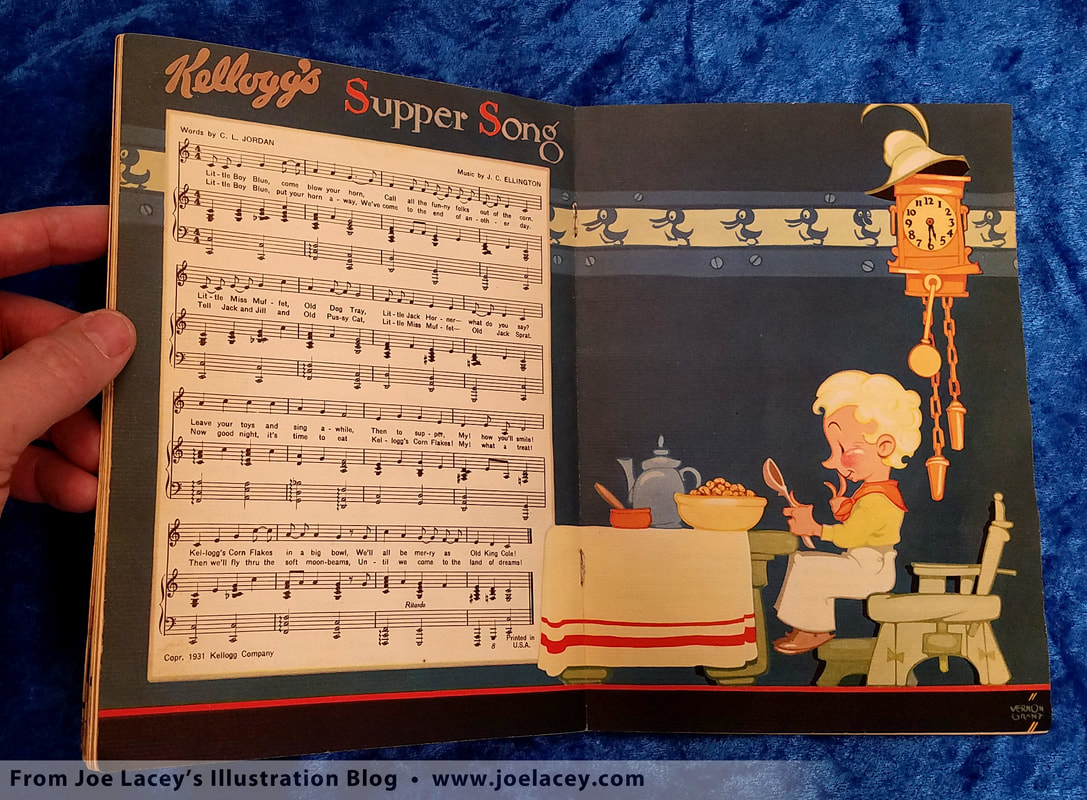
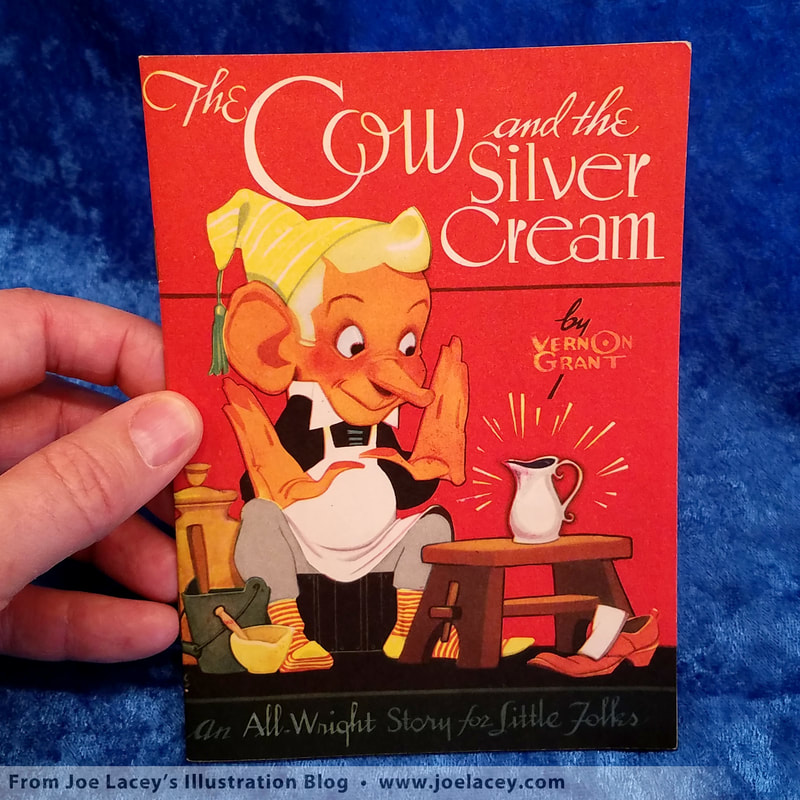
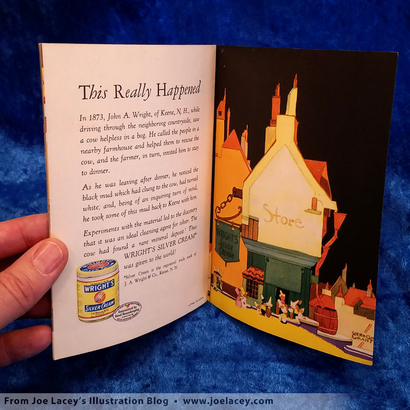
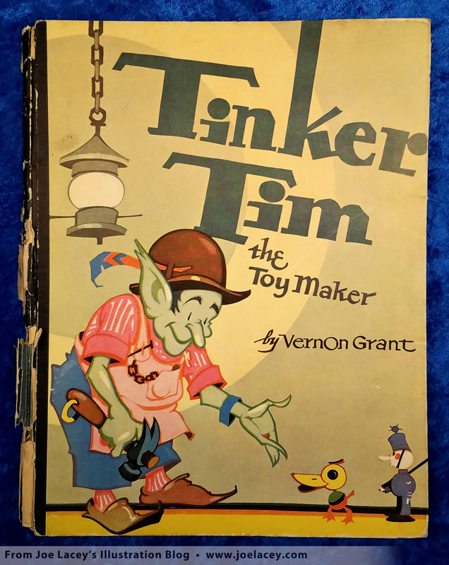
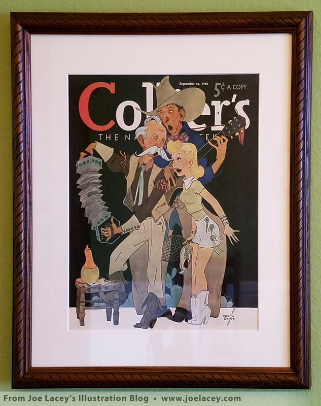
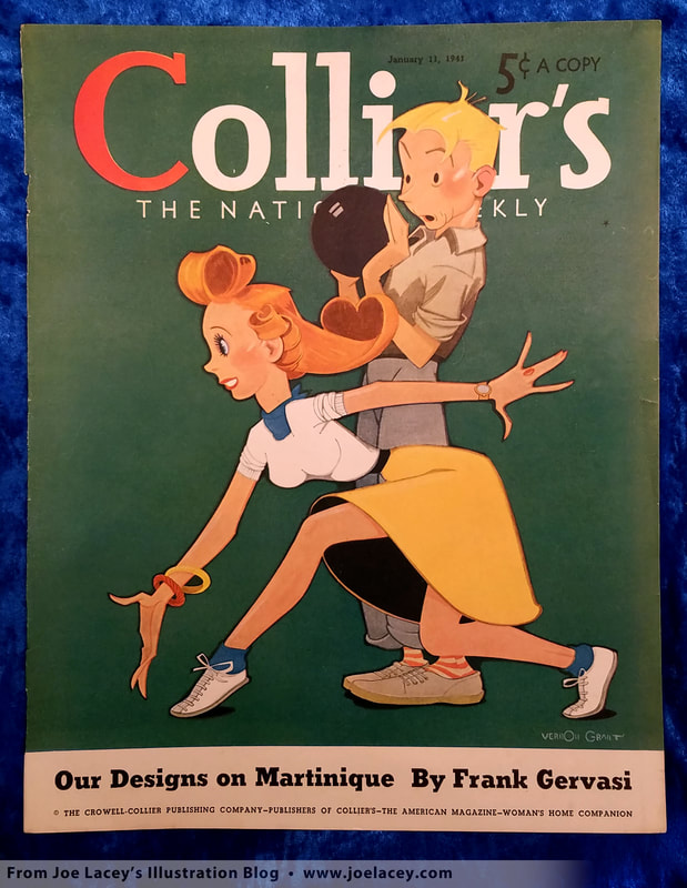
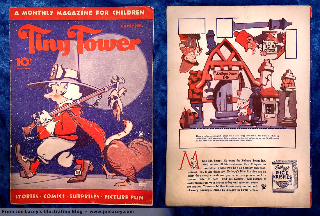
A Look at Vernon Grant's Promotional Books for Kids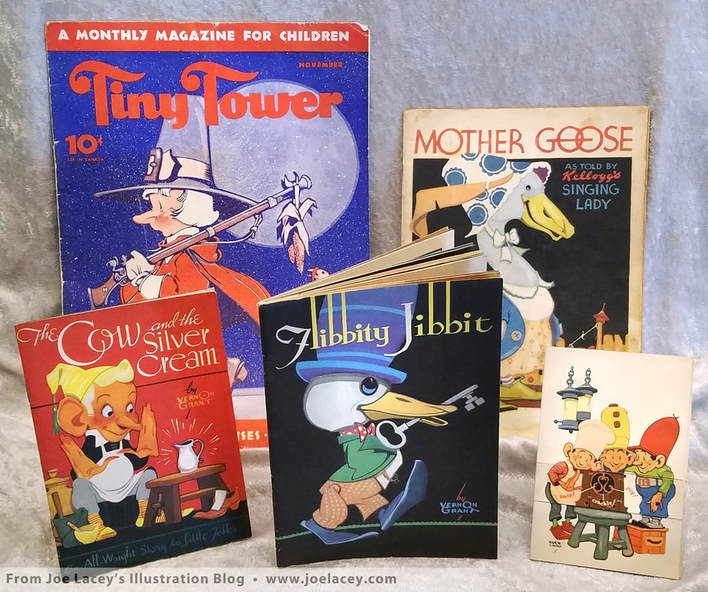 My personal collection of illustrated premiums and books by American illustrator, Vernon Grant. "Tiny Tower" - 1934, "Mother Goose" - 1933, "The Cow and the Silver Cream" - 1944, "Flibbity Jibbit" - 1943, and Kellogg's "Fold Yourself A Lot of Pictures" -1933 You may not know him by name, but you know his work. Vernon Grant (April 26, 1902 – July 9, 1990) is the creator of the Kellogg’s characters Snap! Crackle! and Pop! In 1938, Life magazine called him "America's favorite children's artist." Throughout the 1930s and 1940s, his illustrations appeared on major magazines, cereal boxes, advertising and collectible premiums such as posters and books. It's these premiums which first made me aware of this great illustrator. I hope you enjoy this very brief introduction to the art of Vernon Grant. Years ago I found a small Kellogg's Rice Krispies flip book at an antique market. "Fold yourself a lot of pictures" it read. It delivered on that promise. I was impressed by the whimsical art and the cleverness of the booklet. I bought it. There was a very distinctive signature on it - "Vernon Grant". I thought, "This is a guy I need to see more of." I love promotional giveaways and Grant's are among the best. Since then, I have added to this collection and am always looking for more of Grant's premiums. Then I found Flibbity Jibbit, a promotional kids book that told the tale of a key-keeper, a king, and a little bird named Flibbity Jibbit. Their journey to find the key to unlock the door that held Junket's Rennet Powder for the king's custard party is told by Grant in an illustrated 32 page fairy tale. It was adorable! It also made me want to make some custard. I guess advertising really does work! Grant's style is very economical and not overly rendered. He often makes use of three color tones to create volume with a dark, middle, and light. But more importantly, his drawings have character. A lamp is not just a lamp, it's full of personality. It feels as if even a shoe can be your friend in Vernon Grant's world. His compositions make use of circles and solid shapes. Buildings and backgrounds can be bold and abstract in nature, similar to the German Expressionist movement of the 1920s and 1930s, creating a world full of dream-like twists and turns. He utilizes classic design principles of color and tone to keep the viewer focused on the center of interest. A signature look of his work is the use of solid color backgrounds, often black. Today, these commercial premiums are in the form of activity books, not story books, with puzzles, games and coloring pages replacing story driven themes. I'll be posting an article and samples of my work in this field of illustration sometime soon. In the meantime, to see a small selection of my illustrated kids premiums and books, please visit my website.
BOOKS I RECOMMEND
All the images are from my personal collection.
Harcourt Books Robot Illustrations
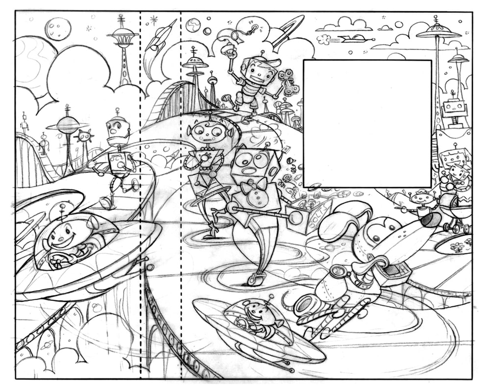
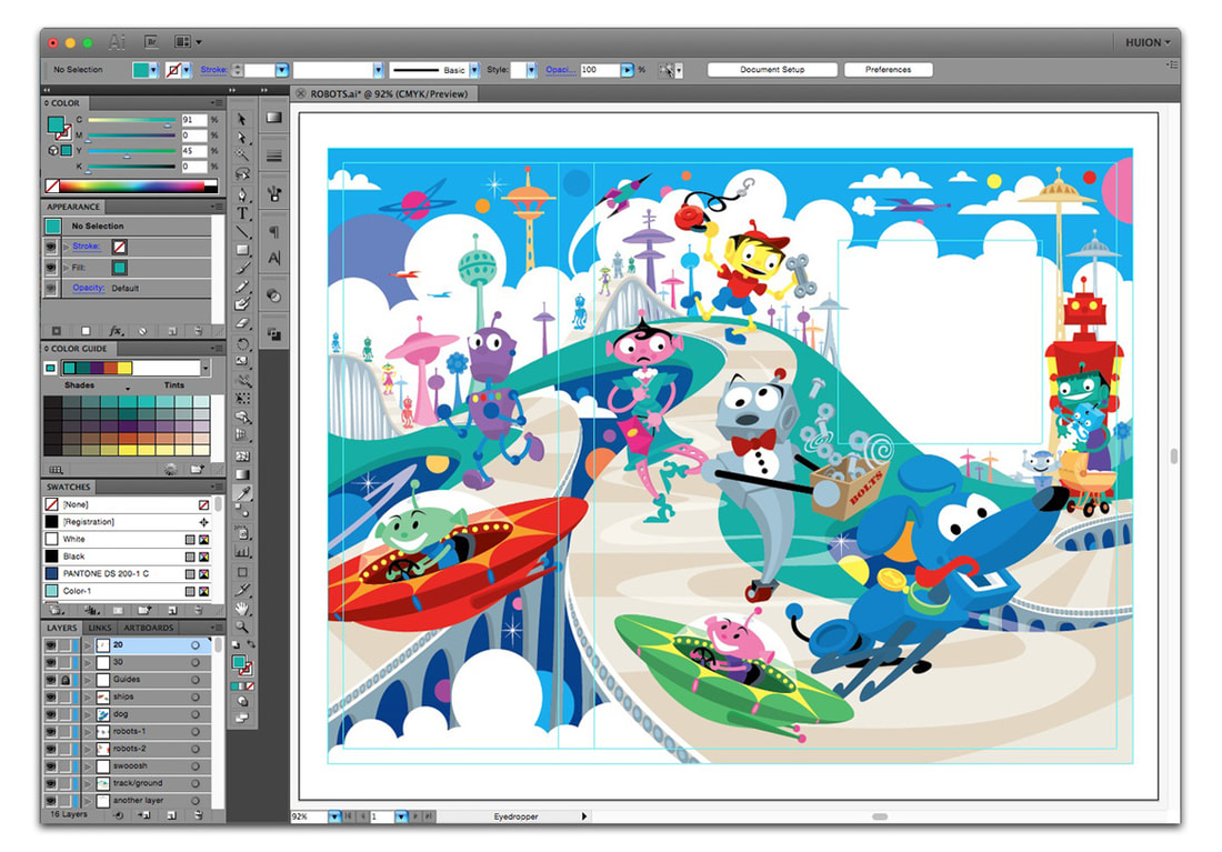
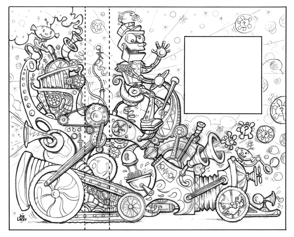
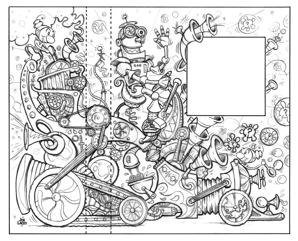
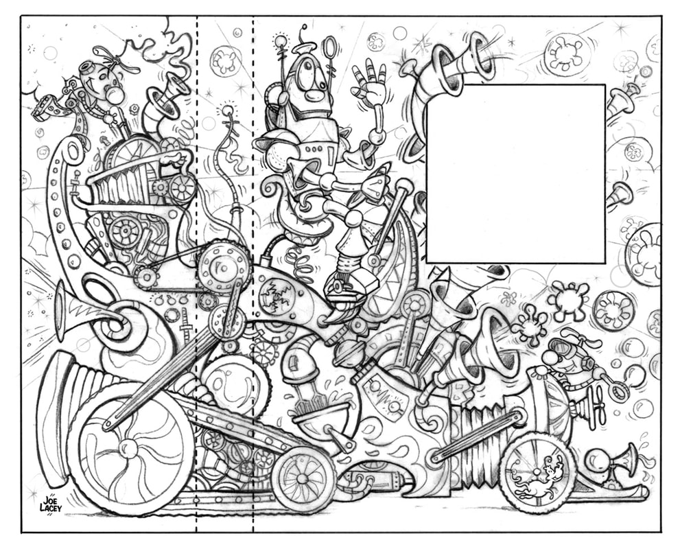
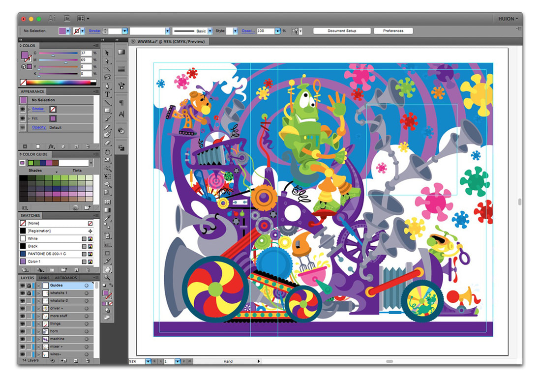
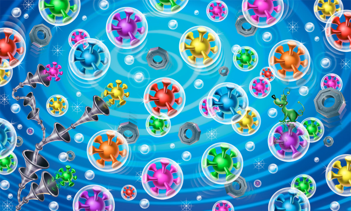
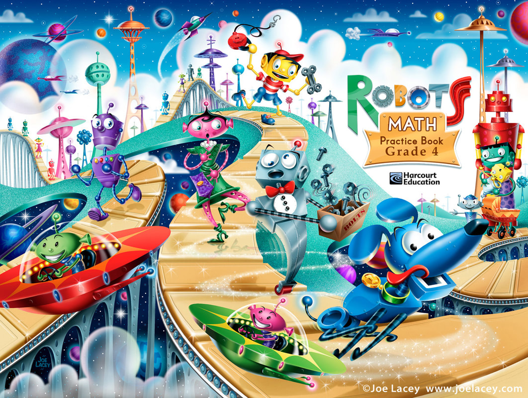 ROBOTS illustrated by Joe Lacey for Harcourt Education Book Publishers. © Joe Lacey THE PROCESS Each picture started out with rough thumbnail sketches. The book covers were 3/4 page wraps - a full cover with spine and about 1/3 of the art wrapping around the back of the book. This always adds a challenge, as I can't let important elements fall off the main page, I have to be aware of the title placement and the spine needs to be kept clean of detail. When the thumbnails are approved, I draw tight pencil sketches. I like sketching by hand on paper. It's often quicker than trying to sketch on a digital tablet (although, depending upon the illustration, I sometimes do just that). The sketch is scanned and used as a guide to make the flat color vector art in Adobe Illustrator. I send a screenshot to the art director to see what the colors will be, but more importantly the positioning of the illustrated elements. Sometimes, there are unexpected changes in size or direction. It can be very easy to move or scale the vector art to correct these changes. The final art is painted digitally using Adobe Photoshop. For these illustrations I used a WACOM digital tablet. It would be near impossible to this kind of art using a computer mouse, never mind the damage you will do to your hands and wrists! Today, I use an interactive pen display and "paint" directly on the screen. Digital painting is a lot like traditional airbrush. I select areas to paint, adjust spray pressure, and manually apply the digital paint using a stylus. I try to avoid using too many preset textures and effects, trying to keep the art looking as hand painted as possible. The art is either sent of flat or with editable layers still intact, depending upon the client's needs. INSPIRATION 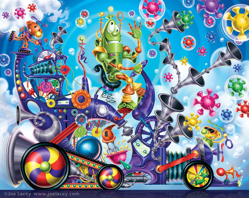 THE WACKY WHAT'S-IT MACHINE illustrated by Joe Lacey for Harcourt Education Book Publishers. © Joe Lacey Nothing beats a robot that looks like it was made out a tin can or three cardboard boxes! This is why so much of my inspiration comes form older toys, movies and TV shows. The trick is to make it look updated without being derivative. My original vision for The Wacky What's-It Machine was inspired by Ideal's Mr. Machine with little alien helpers. I loved it! The art directors did not. I was sad. So, the second one was more of a Wizard Of Oz inspired robot with munchkin styled aliens. I loved it! They did not. Again, I was sad. OK, third time's the charm. Let's think Robbie The Robot from Forbidden Planet. Yay! That one worked! They loved it! Everyone was happy and I was able to go onto the finished painting. The machine is a Dr. Seuss Meets The Wacky Races with a touch of Rube Goldberg sc-ifi tossed in for good measure. I wish this had been turned into a toy! Illustrating all these crazy and colorful gears and gadgets got me ready for the Crayola factory themed Maker Kits that I illustrated several years later. 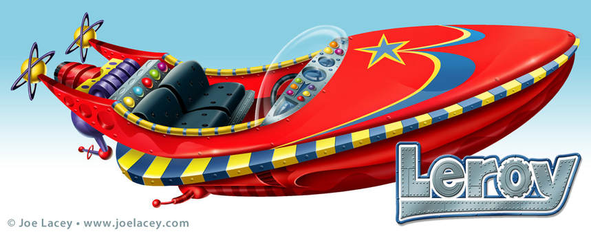 LEROY. Original boat design for one of a series of sci-fi short stories for kids. Harcourt Education. © Joe Lacey 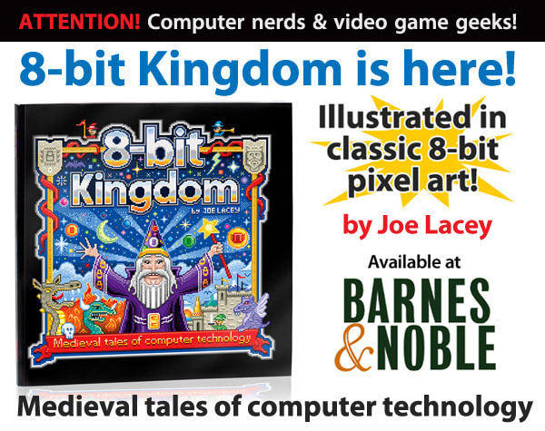 |
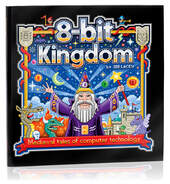
BOOKS
by Joe Lacey 
Categories
All
IllustratorsLinksArchives
May 2023
|


 RSS Feed