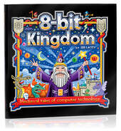
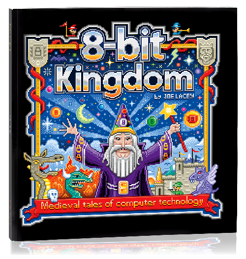
Zoom into 8-bit Cosmos!Sci-Fi tales of computer technology by Joe Lacey 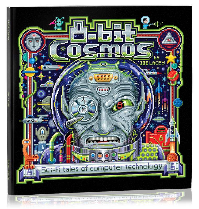 Buy at BARNES & NOBLE and AMAZON Get ready for an adventure beyond your wildest imagination! You have questions. Outer space has the answers! Modern-day social media and AI technology are brought to life in the Sci-Fi tales of 8-bit Cosmos. For we all know, without fiction, there would be no science. Transport yourself to a mind-blowing universe of cosmic computers and amazing aliens! Illustrated in classic 8-bit pixel art! • Cheer for Captain J. Peg as he defends the 8-bit Cosmos with his Galactic Interstellar Fleet! • Cringe in terror as the evil robotic zombie Botnet seeks to destroy the 8-bit Cosmos! • Relax at the Space Bar, groove to the wild wavy sounds of the Funkisites, and party with a dancing banana! • Journey to alien worlds to see the future of social media, crypto banking, AI art, and chatbots! With 90 pages of amazing B&W pixel illustrations and imaginative stories, 8-bit Cosmos is a must-read for anyone who loves science fiction and the unbelievable history of computers. Written and illustrated by Joe Lacey Forward by Demetrius P. Idle, PNG/UFO (Planetary Nebula Guide / United Future Oddballs) 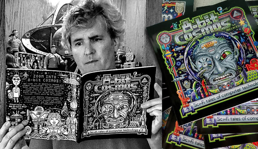 Joe Lacey reviews his book "8-bit Cosmos." 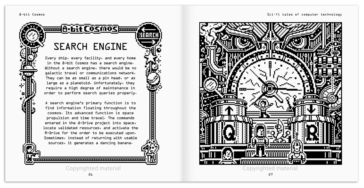 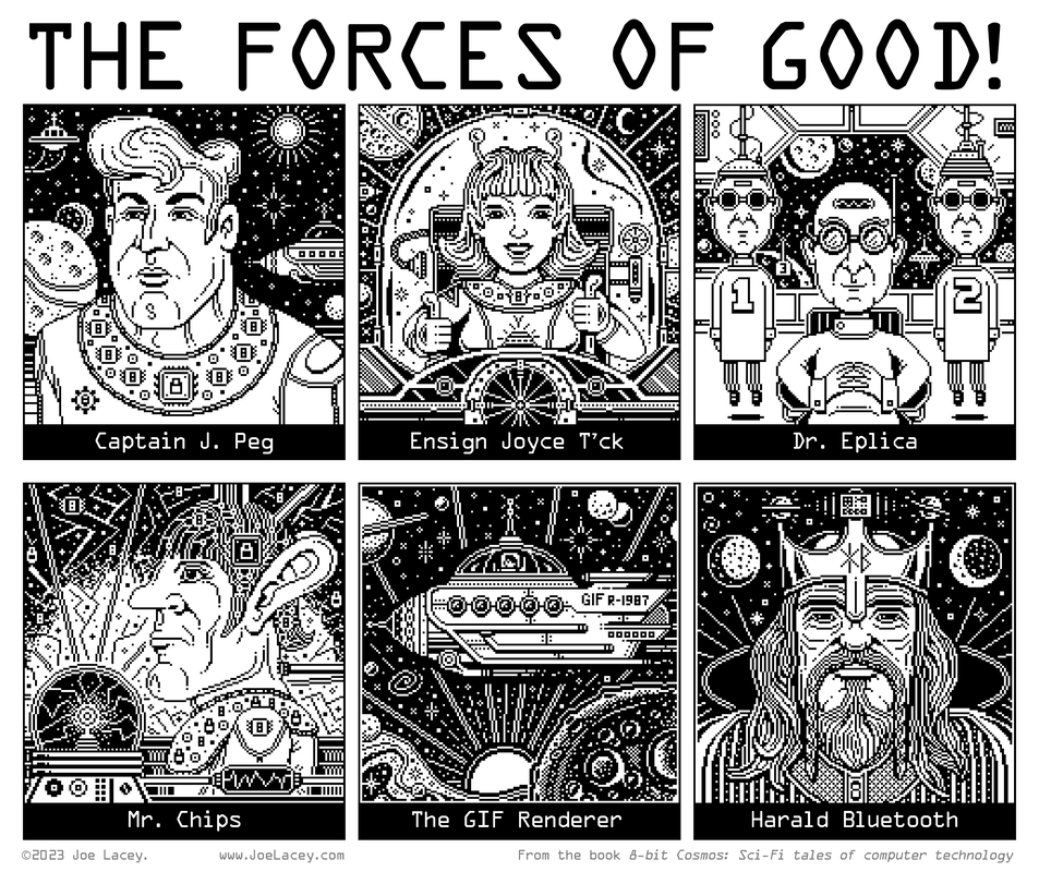 Captain J. Peg, Ensign Joyce T'ck, Dr. Eplica, Mr. Chips, The GIF Renderer, and Harald Bluetooth. 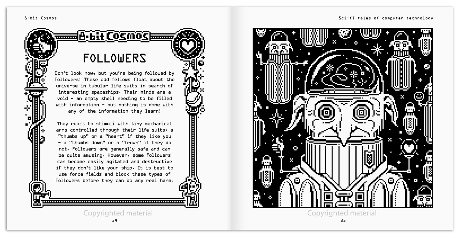 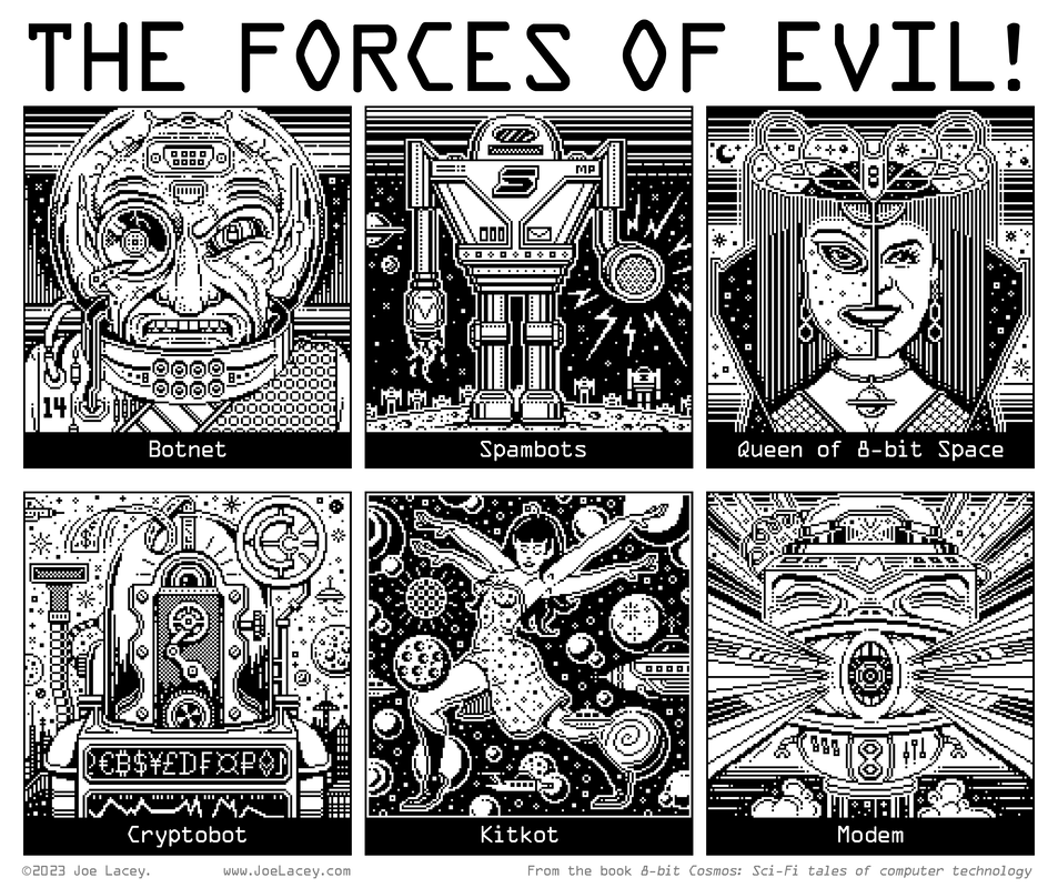 The evil robot zombie - Botnet and his army of Spambots, the Queen of 8-bit Space, Cryptobot, Kitkot, and Modem. A MESSAGE FROM THE AUTHOR 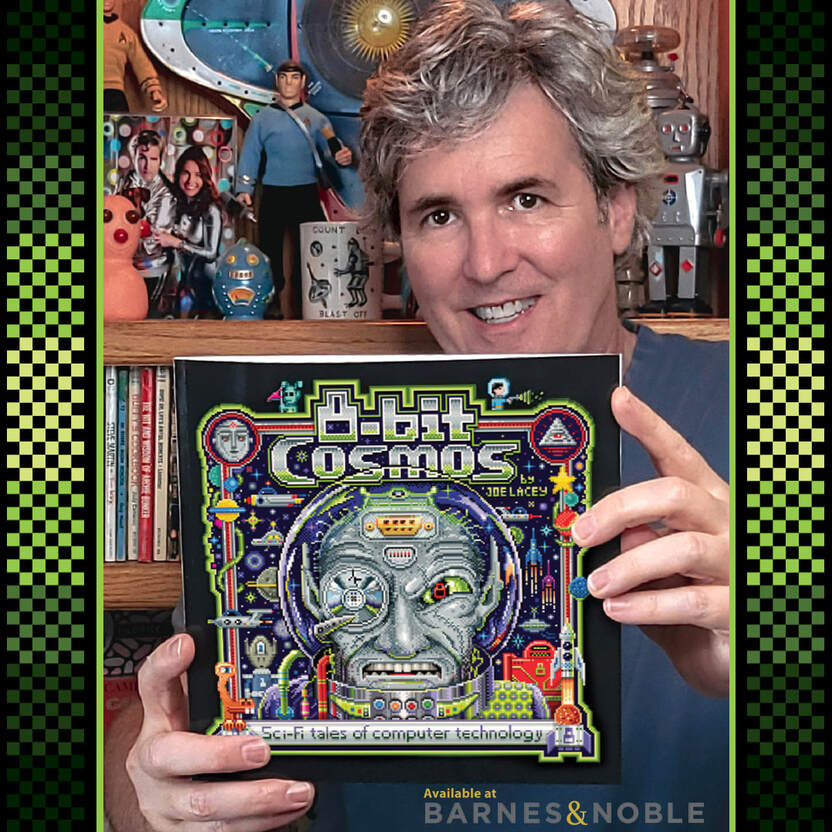 "You don't want this book. You NEED this book!" I made my first book, 8-bit Kingdom: Medieval tales of computer technology because of my love of classic arcade games of the 80s and my interest in mythology and folklore. When I completed the book, I knew I wanted to do another that would take place in outer space. Two years later, 8-bit Cosmos: Sci-Fi tales of computer technology was completed! This book explores more deeply our modern-day social media and technological advancements (or setbacks depending on how you look at them.) It's also quite sarcastic and funny. If you've spent any time on social media, or interacted with an AI chatbot, I think you'll enjoy this book. Believe it or not, I drew all the art by hand using a computer, but without the use any AI technology. Amazing, I know. There's something joyful in those little jagged edges and square circles moving around the screen. They have an innocence and are loaded with personality and often humor. When writing and illustrating 8-bit Cosmos, I strove to bring this personality and humor to each page. I made the art board 160 x 160 pixels in order to preserve that classic arcade feel. It’s impressive just how much character and emotion can be expressed in even the smallest pixel art image. A great amount of information can be delivered just a few pixels. Thirty pixels can depict a heroic fighter or cowardly person. It all depends upon the exact placement of the pixels. A pixel placed high - the character is happy, a pixel placed low - the character is angry. The idea of simple pixel art is actually an oxymoron. It can can be quite a challenge placing the correct pixel in the correct location to achieve the correct effect. So, zoom into the 8-bit Cosmos! A collection of tales that blend retro gaming, personal computing, and social media all illustrated in classic 8-bit b&w pixel art!
ABOUT THE AUTHOR
0 Comments
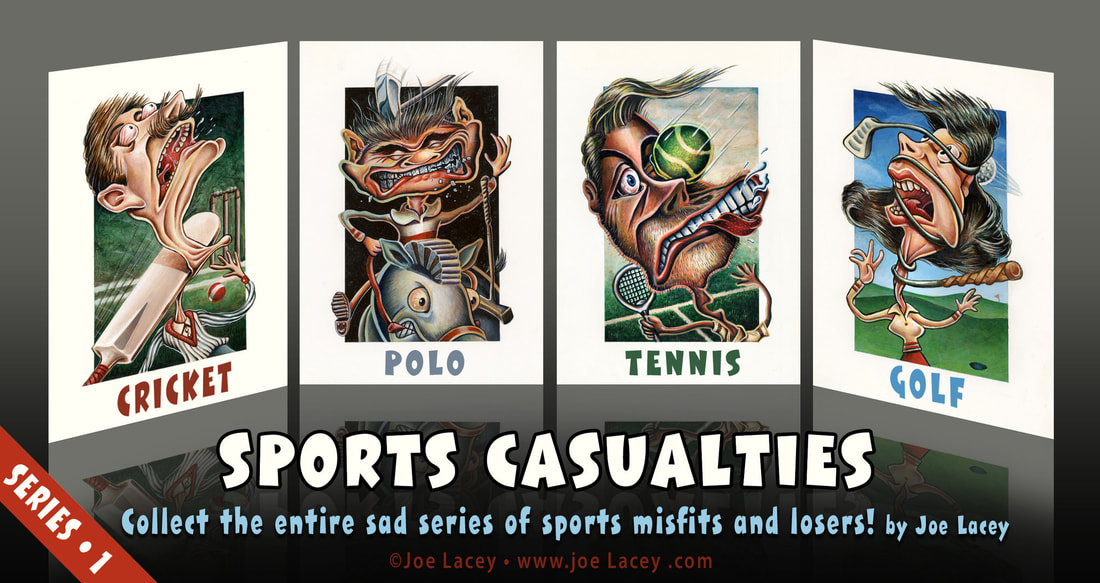 Sports Casualties is a series of illustrated collector cards I made in college. The class featured different visiting faculty. These instructors would visit for four classes and have the students do an assignment that was similar to the instructor's style or real-life commissions. The assignment was to create four sports themed posters. We had no choice of sports. Cricket, Polo, Tennis, and Golf. Ah, the sports of the elite. Everyone can relate. I was less than thrilled to do this, but I had to find a way to turn it into something I would enjoy. I knew everyone would be doing super-realistic watercolors and beautifully rendered ink drawings since that was the style of the instructor. Maybe that was the point? I'm not really sure. In any case, I was willing to be the fool and show up with something out of left field (pun intended). I felt... no... I KNEW it was my obligation to to do something totally freaky. I was, and still am, a huge fan of Wacky Packages by Topps and had collected them for many years. Pretty much anything Topps is cool in my book. Around this time, Topps' Garbage Pail Kids were really big and there were lots of gross-out stuff on the store shelves: booger candy, slime... so why not do something that mom will hate? These were conceived and painted very quickly as I never intended to do anything with them beyond this class. I can't recall what grade I received, probably a "B", but I do remember the critique was very brief. The visiting professor said something along the lines of, "Ha, ha. Now here we have something very different. Perhaps some more of this, some less of that. Interesting"–YES! INTERESTING! They're exceptionally strange, almost Dali-esque. As crazy and violent as they are, I tried to keep them funny. I'm sure that's debatable, but I'll defend it. 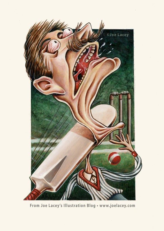 "Cricket" acrylic painting 6" x 8" ©Joe Lacey 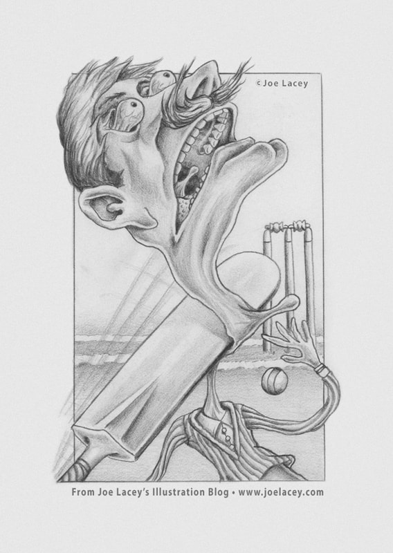 "Cricket" pencil sketch 6" x 8" ©Joe Lacey 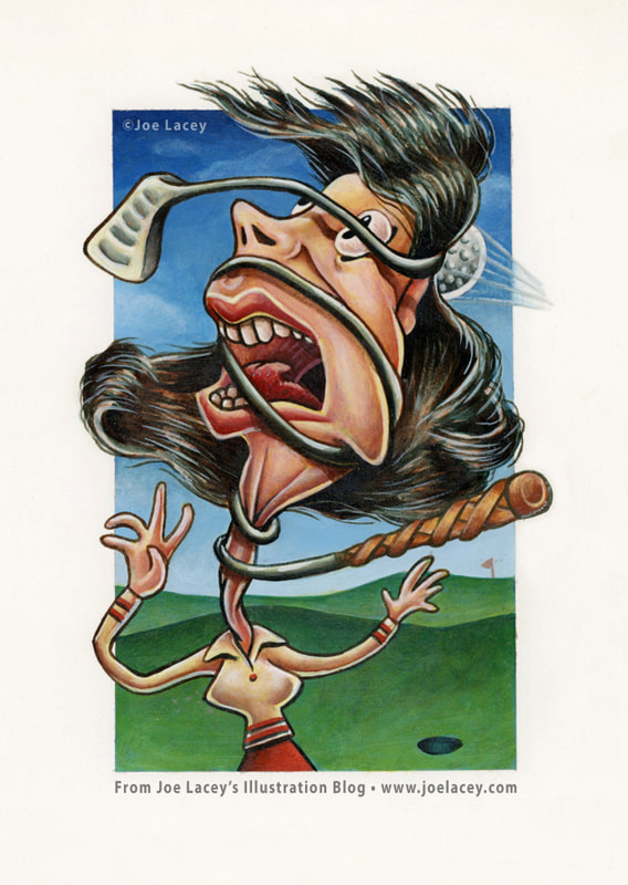 "Golf" acrylic painting 6" x 8" ©Joe Lacey 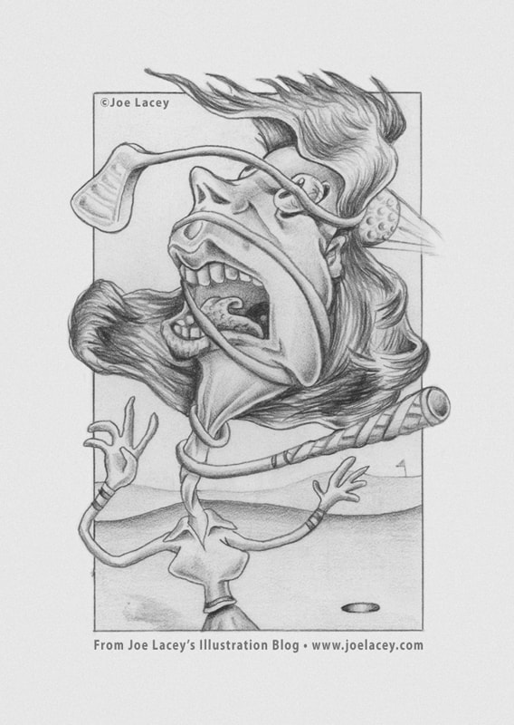 "Golf" pencil sketch 6" x 8" ©Joe Lacey 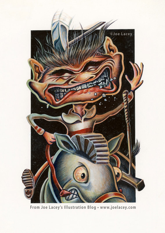 "Polo" acrylic painting 6" x 8" ©Joe Lacey 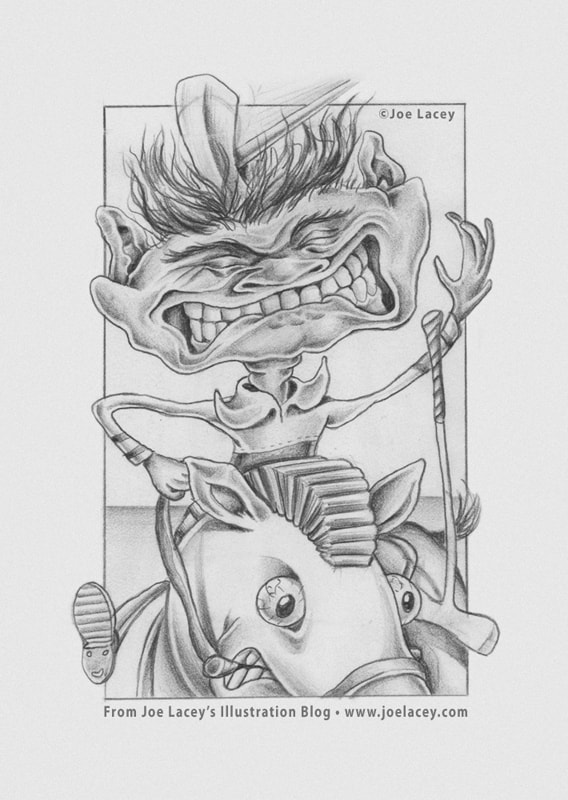 "Polo" pencil sketch 6" x 8" ©Joe Lacey 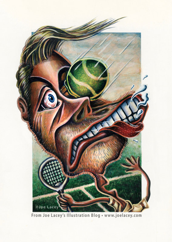 "Tennis" acrylic painting 6" x 8" ©Joe Lacey 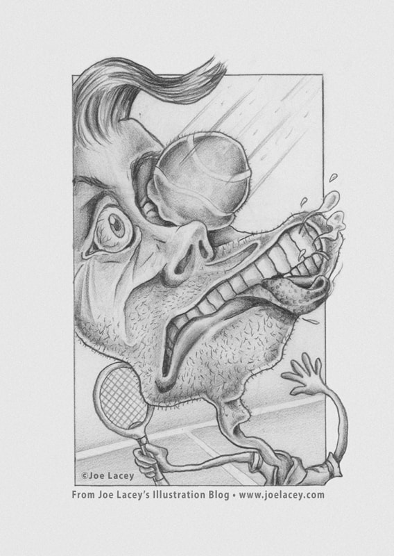 "Tennis" pencil sketch 6" x 8" ©Joe Lacey 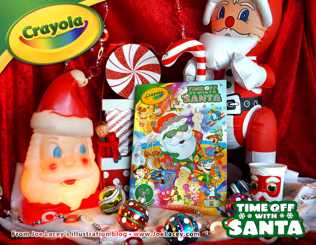 Coloring pages from the Crayola coloring book "Time Off With Santa" illustrated and written by Joe Lacey. Time Off With Santa Crayola Coloring Book with: • 64 Santa Coloring Pages • Santa Stickers Sheet • Metallic Foil Enhanced Cover! Available at the Crayola website! What does Santa do on his 364 days off each year? This cool coloring book uncovers what the big guy does with his free time. Kids will love decorating the 64 coloring pages with the included glitter stickers, and sharing them with friends. Perfect for any occasion, this kids coloring book makes a great birthday or holiday present. Ideal for girls and boys, age 3 & up! What does Santa do when he's not getting ready for Christmas? Why, he's finally getting some well deserved time off! And it's not just Santa who needs a break! His elves and reindeer have tagged along for all the fun! Check out all the wacky hijinks as they ride the wild surf, sing karaoke, play basketball, and party in a hot tub! You never know what will happen next! 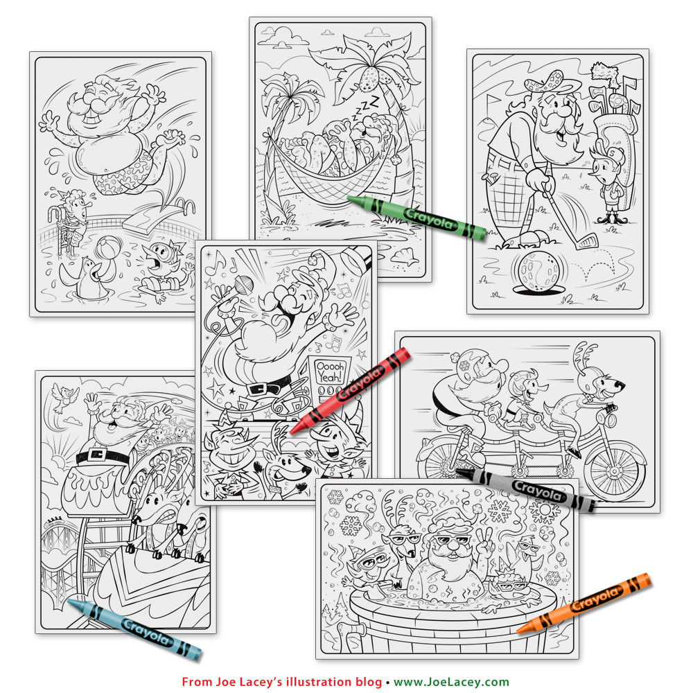 Coloring pages from the Crayola coloring book "Time Off With Santa" illustrated and written by Joe Lacey. 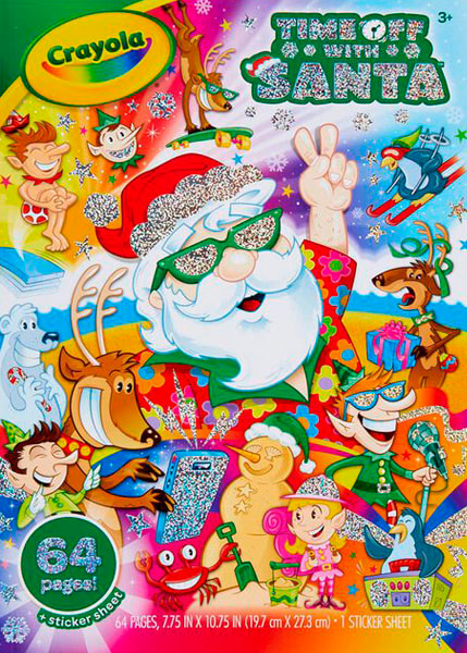 "Time Off With Santa" Crayola Coloring Book written and illustrated by Joe Lacey. Book cover with metallic foil effects. 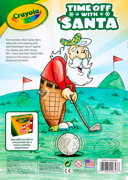 "Time Off With Santa" Crayola Coloring Book written and illustrated by Joe Lacey. Coloring book back cover. 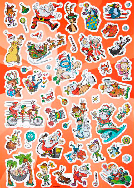 "Time Off With Santa" Crayola Coloring Book sticker sheet. |
BOOKS
by Joe Lacey 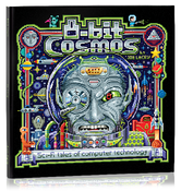
Categories
All
IllustratorsLinksArchives
May 2023
|


 RSS Feed