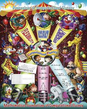
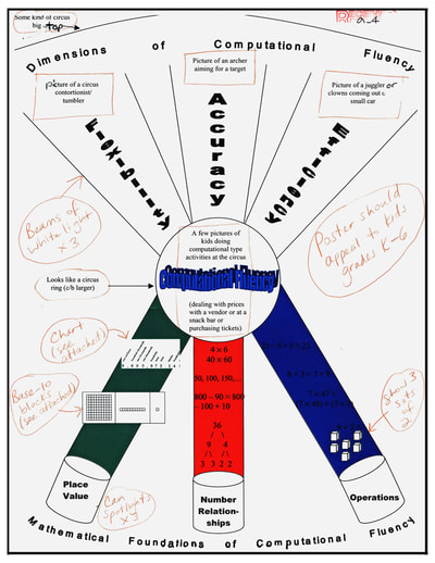
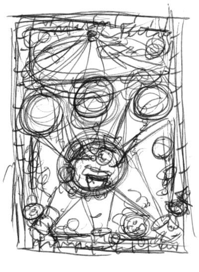
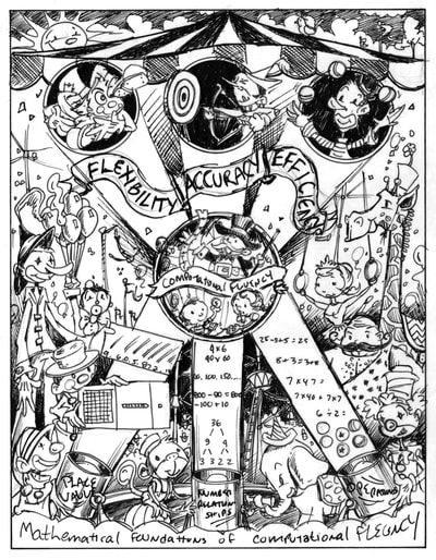
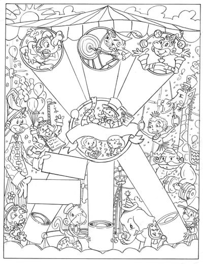
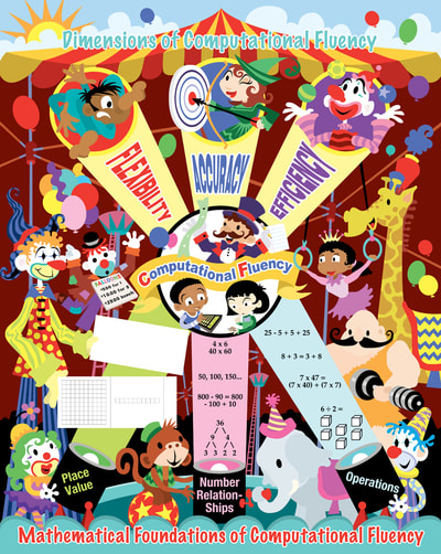
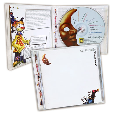
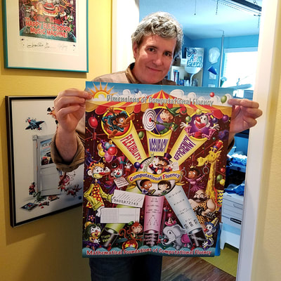
 I remember the day I received an email inquiring if I would be interested in taking on an assignment to illustrate a poster about "the dimensions of computational fluency". At first I thought, "What is this?" and then I thought, "There's no way I want to take this job!" But then I read further and discovered that the poster was going to be a circus tent with clowns, animals and performers! How cool! A chance to take a very serious and often dry subject such as math and make it visually appealing to grade school kids. Of course I accepted the job! The poster is a 16" x 21" stapled pull-out inside a quarterly classroom magazine for the National Council Of Teachers Of Mathematics. The basic layout for the poster was supplied by the client and followed an established design for computational fluency. Sometimes, it's really nice to have a structure in place while working out the look of an illustration, especially when it involves technical issues. Other times, it can be challenging or even burdensome. In this case, it just made my work a lot easier, so I was grateful to have it. I started with a very small thumbnail sketch just to get thinking about it. I often do more thinking than rough sketching and like to have a solid visual in my head before I start any serious sketching. Next I did a rough sketch on tracing paper in marker. Marker? It's one of the few times I ever did a rough sketch using marker. Not sure why, but there it is! I sent the marker sketch to the Senior Designer at The Magazine Group in Washington, D.C. and it was approved with a few minor changes, primarily the banner at the top. I thought a big waving banner with the words FLEXIBILITY, ACCURACY, and EFFICIENCY would look neat being hit by the spot lights. This was nixed, for good reasons. The new layout with each word inside the light beams was a lot better! There were a few character changes, clowns were to be less "hobo" looking, and gender and racial representations were discussed. I was ready to work on the tight pencil sketch. The tight pencil sketch went through with no changes that I can recall and I was ready to create the flat color layout in vector using Adobe Illustrator. I make flat vector art for two reasons: 1) It gives me a close to finished look in color and layout that I can send to the client for approval, prior to starting the painting. 2) I can create each piece of the illustration in layers and easily move or scale things as needed without any destruction of the images that can occur in Adobe Photoshop when painting with pixels. The final art was digitally rendered using Photoshop. You can click through the gallery of images below to see the progression of the art. I was really happy with the final production. The printing came out spot-on and the colors were incredibly accurate. The Dimensions Of Computational Fluency math poster was a big challenge, but a very rewarding project to work on and I'm not clowning around, either! • Publisher: The Magazine Group of Washington, D.C. • Senior Designer: Janelle Welch. • Poster front design: Janie Schielack and Tim Boerst. • Illustration: Joe Lacey. On a side note, shortly after I had completed the poster, I was contacted by a music band in Spain called La Herejia asking if they could use one of my clowns for their new CD "Malabares". Since I owned the rights to the images, I agreed. Funny where things end up. A veces, la vida es un circo ambulante.
Comments are closed.
|
BOOKS
by Joe Lacey 
Categories
All
IllustratorsLinksArchives
May 2023
|


 RSS Feed