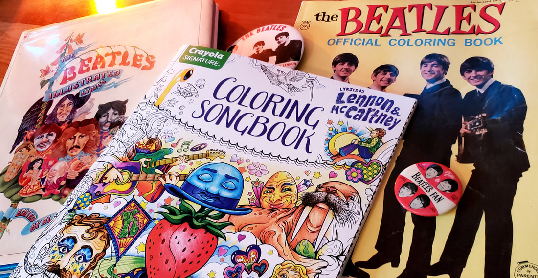
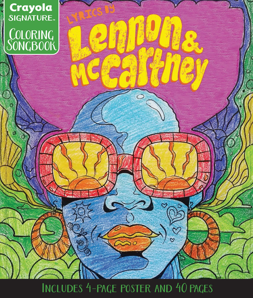
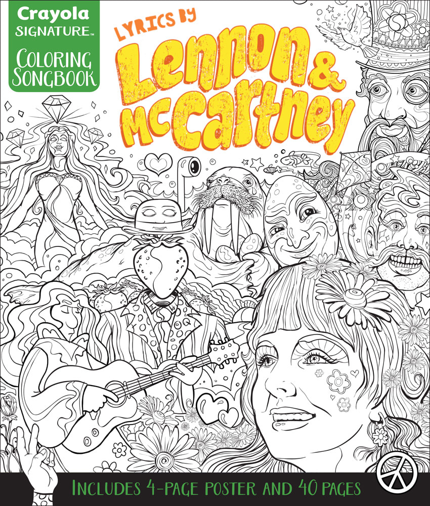
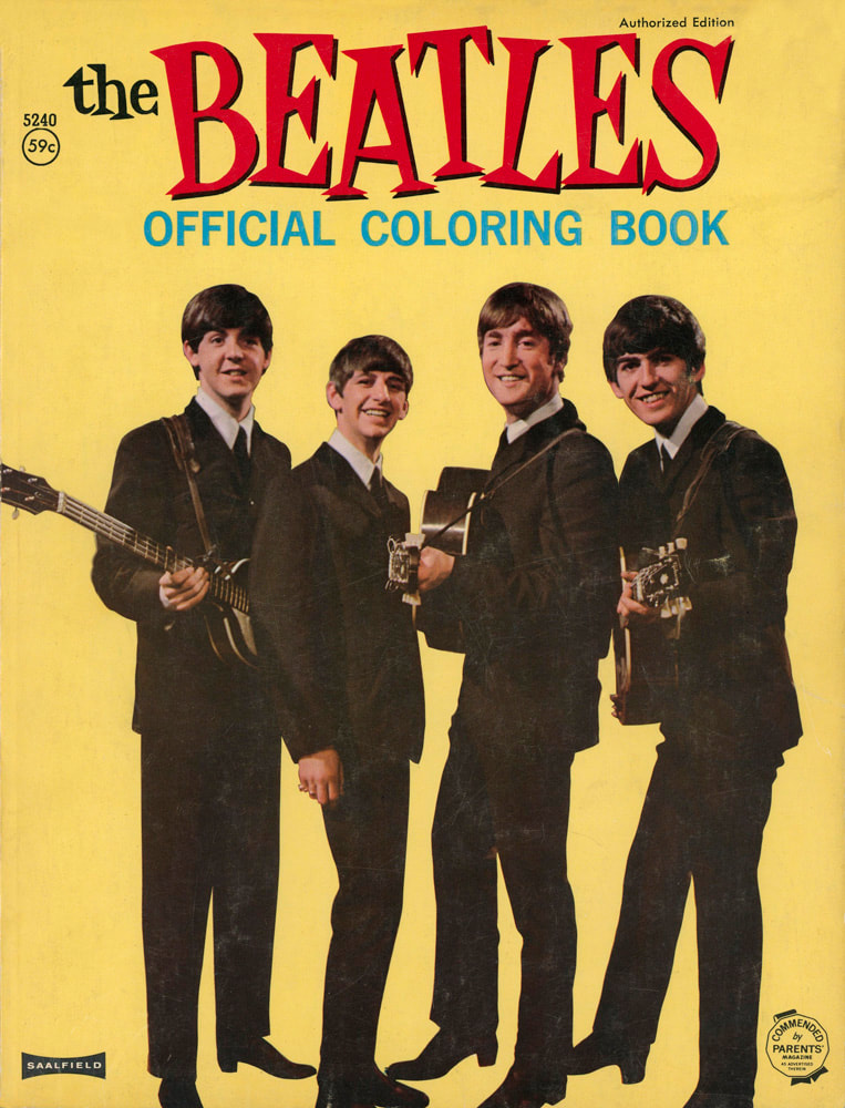
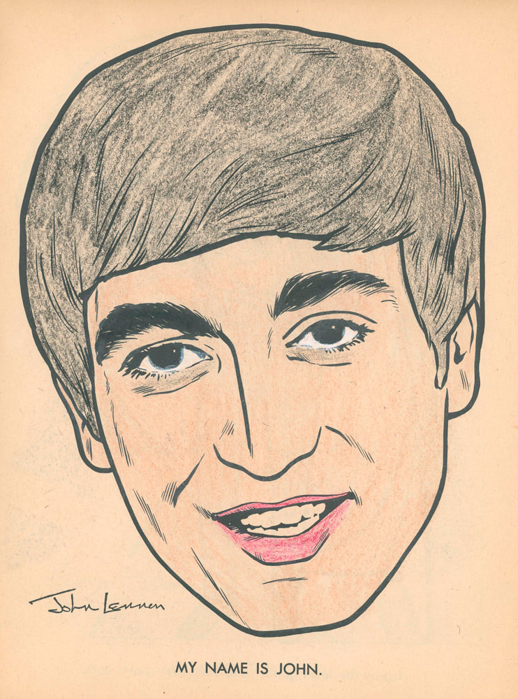
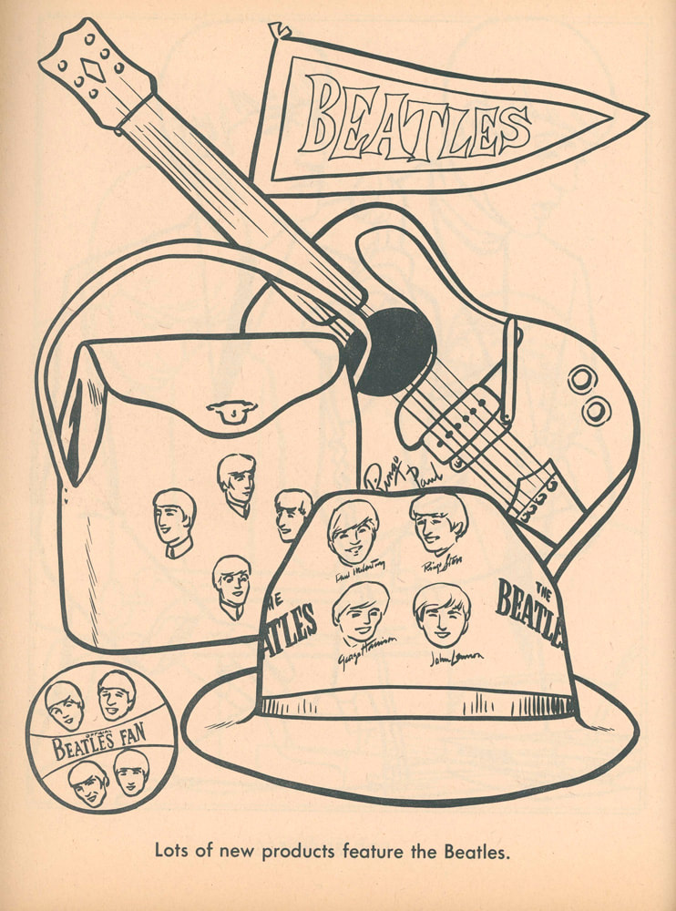
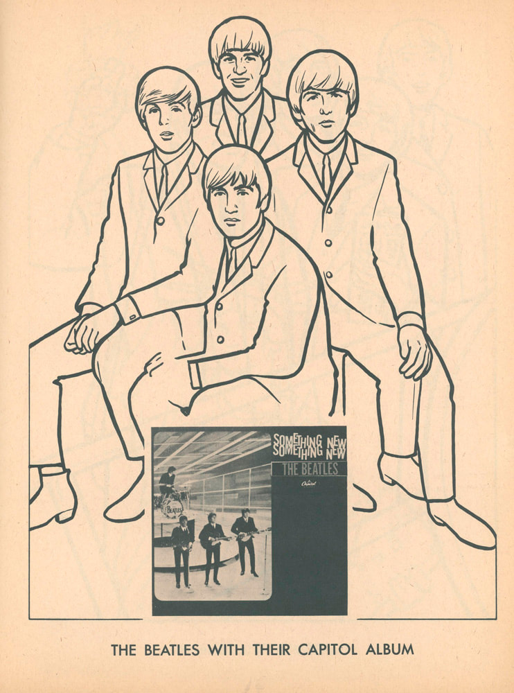
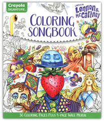
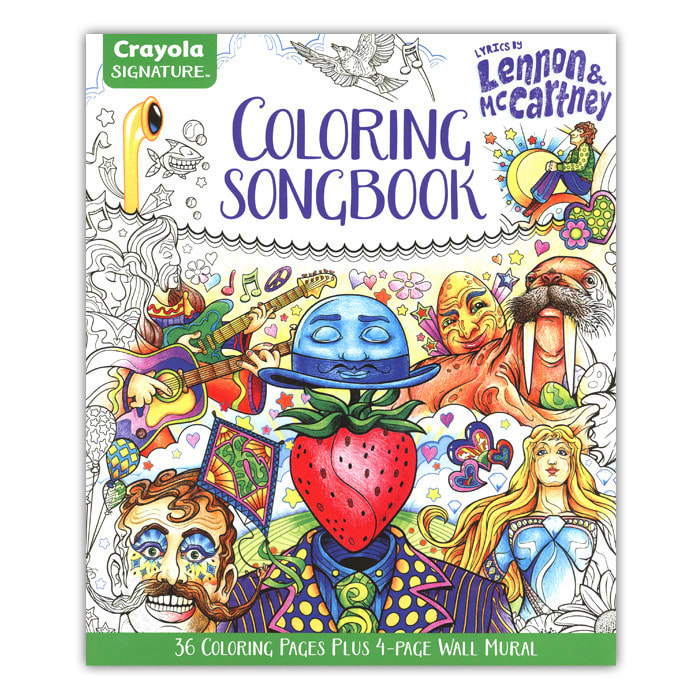
 Designing the Cover for the "Lyrics by Lennon & McCartney" Coloring Songbook by Crayola Covers are very important. And in the long line of books about The Beatles, you really want to stand out. The first draft for the cover of the Lyrics by Lennon & McCartney Coloring Songbook was an internal mock-up by the Crayola Design Department using a rough sketch of my Good Day Sunshine illustration. Later, this sketch was taken to a full finish for the inside of the book. It's typical for publishers to get the general look of the books ready in order to present the proof of concept to potential resellers; that, being a coloring book of Beatles lyrics. This cover was very much a collaborative effort between me and the designers at Crayola. Sometimes these first or second drafts make their way as sales samples or as online images prior to the completion of the book (that's why you often see discrepancies between online images and the final product you hold in your hand. This cover went through several revisions, ultimately becoming a collage of images from selected coloring pages. The first cover I worked on prominently featured Prudence (from the song Dear Prudence). The first layout for the cover was started prior to completing all 40 interior pages and again, was used as a sales sample. You can see that much of the art on the first cover was rough sketches. Once all the interior pages were completed, I went back to work on the refining the cover. The designs became more and more complex — just to see how much I could fit in and still make it look nice. There was a lot of back and forth with the art director at Crayola and it finally got pulled together into design with a strong focal point. I think I did about four or five cover variations before we landed on the one you see today. I sent the final artwork to Crayola with all the Photoshop layers intact, knowing they would need to adjust the art in case of any production changes... the biggest change being the hierarchy of logos and titles. The primary name of the book became The Crayola Signature Coloring Songbook in order to accommodate future books in the series, whether it be Lennon & McCartney or other musical acts. The cover layout and the back of the book were completed in-house at Crayola. When I got my first copy, I was very happy to see what a great job they did adding hand coloring. I don't think I would have done it any better! The First Beatles Coloring Book - 1964 1964 - The Beatles Official Coloring Book by The Saalfield Publishing Company The first licensed Beatles coloring book came out in 1964 by Saalfield Publishing and was intended for an American audience. The coloring pages focus on the Beatles' first visit to America, the products kids could buy, and promoting the American versions of their albums. Some of the pages are actual photographs of the Fab Four. The book is very straightforward in its design, with simplistic but well done inkings meant for very young kids. I love the cover — the colors, the fonts... it really stands out. Printed before I was born, and I finally got my own copy a month ago. A few pages in the book were beautifully colored by some young Beatles fans back in 1964. Illustrated Lyrics by Alan Aldridge
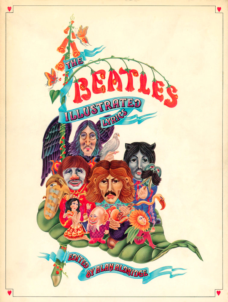
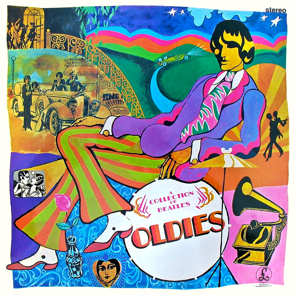
1969 - The Beatles Illustrated Lyrics by Alan Aldridge This book was and is a major influence on me. Alan Aldridge was an amazing artist who illustrated and designed rock posters, magazines, books, and record album covers for or about The Beatles, Elton john, The Rolling Stones, and Bob Dylan to name a few. The way he interprets the lyrics is a uniquely psychedelic approach that is his alone. I was about twelve years old when I got a copy of this book. If my mom had any idea how truly "adult" most of this book is, she would have probably taken it away from me. I'm glad she didn't. In high school, I tried to paint a copy of the cover. I failed miserably. Alan Aldridge is a tough act to follow. Endnotes And in the end... Besides being influenced by Alan Aldridge, I had other images in mind for the Crayola book.
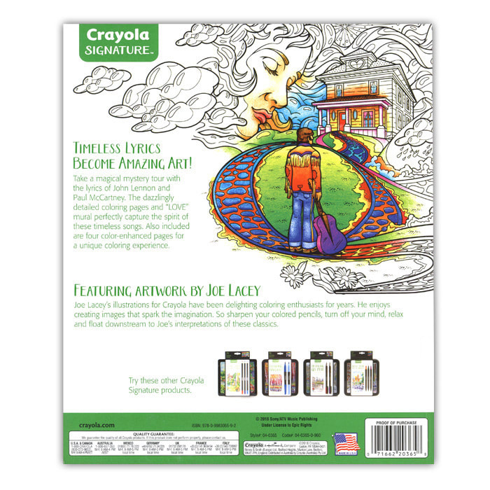
With everything that had come before and in addition to not being able to use any existing Beatles likenesses or imagery — I went out of my way to make my interpretations of The Lyrics by Lennon & McCartney as unique as possible. You can read more about my work for The Crayola Coloring Songbook: Lyrics by Lennon and McCartney here. Crayola Signature Coloring Songbook: Lyrics by Lennon & McCartney 36 premium 8” x 10” line art coloring sheets plus a full color, 4-panel wall art piece.
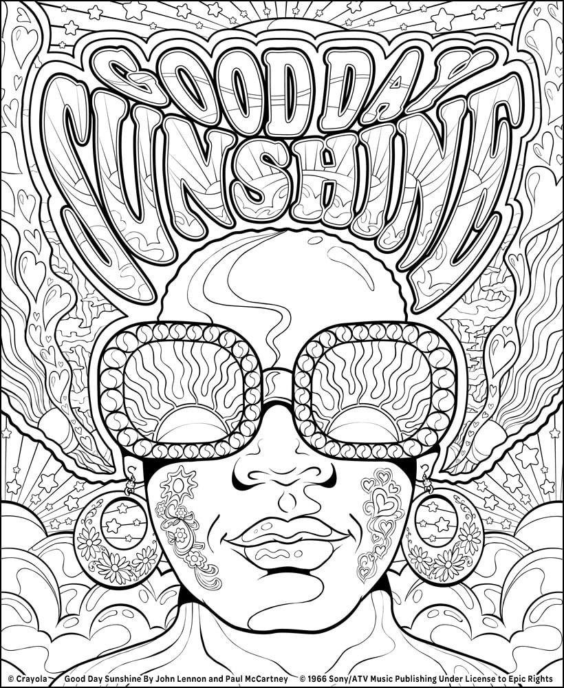
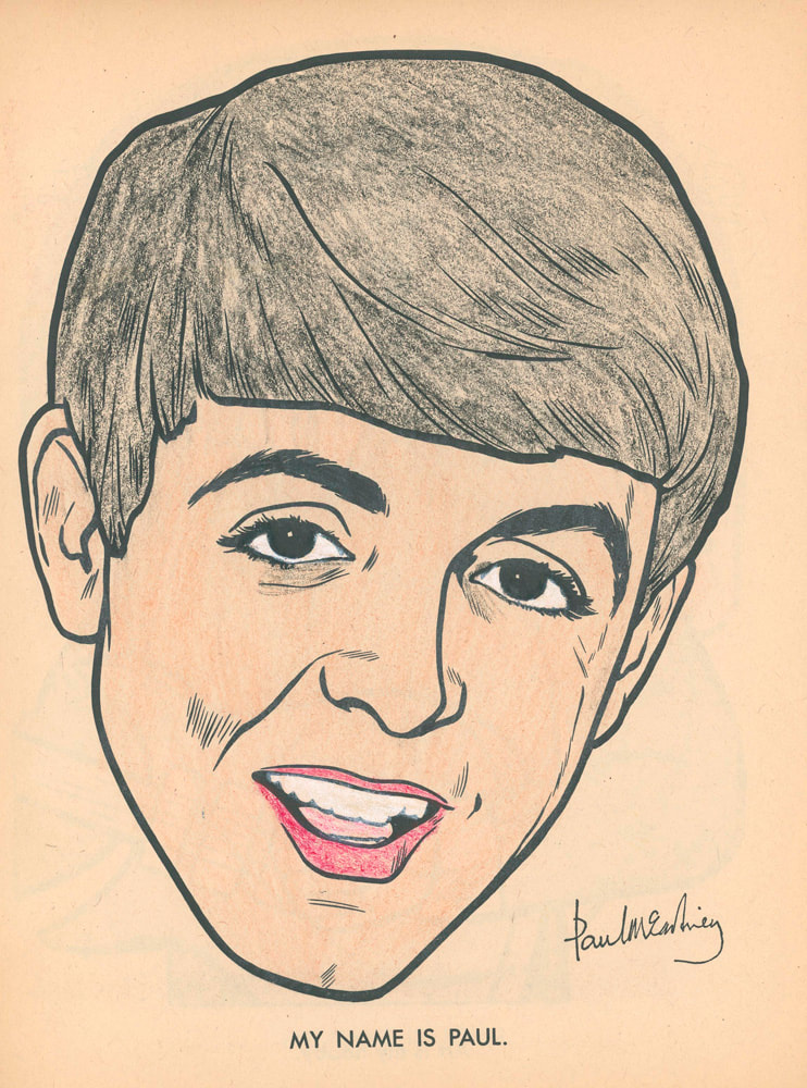
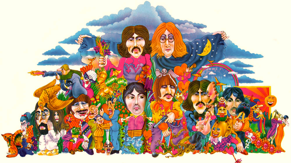
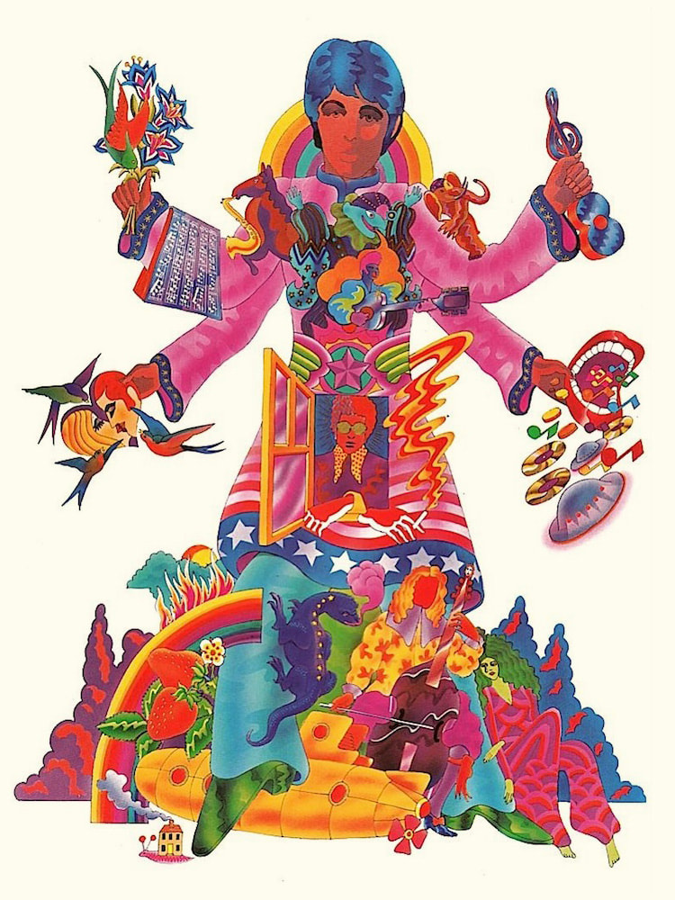
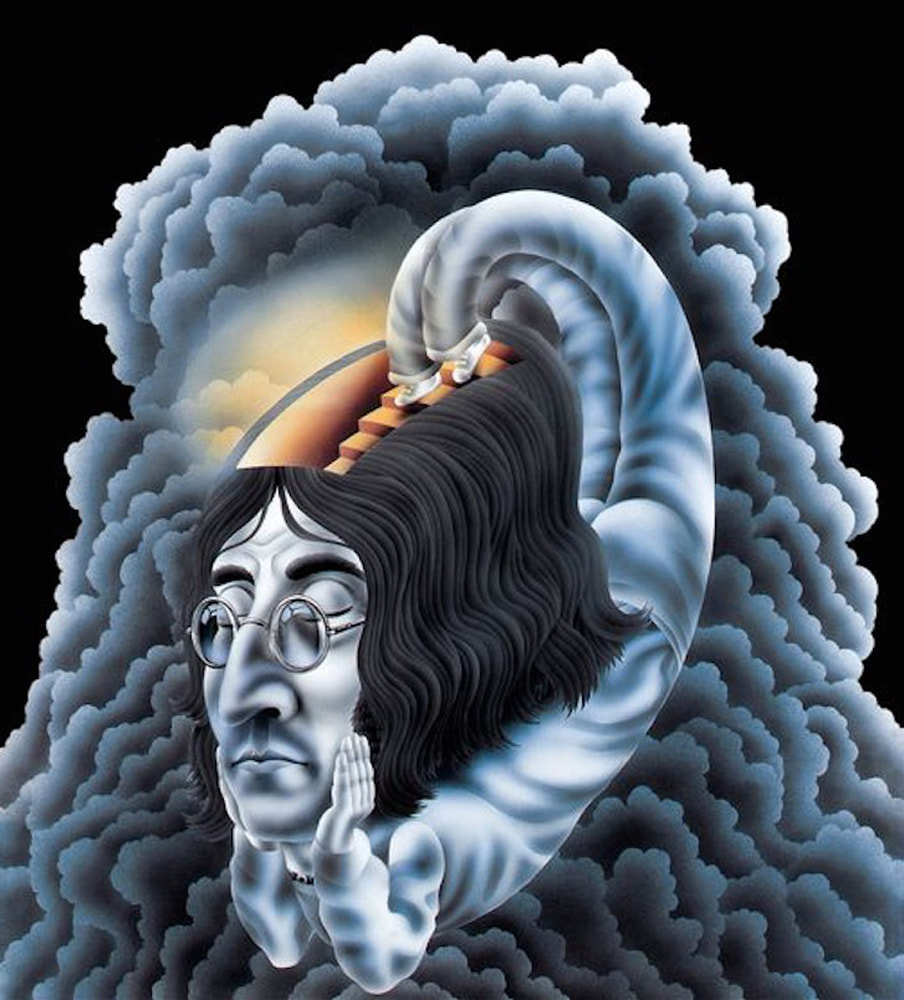
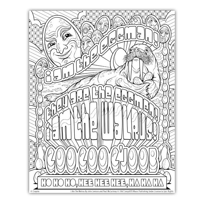
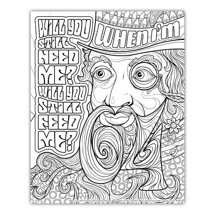
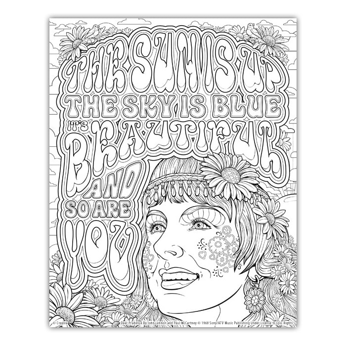
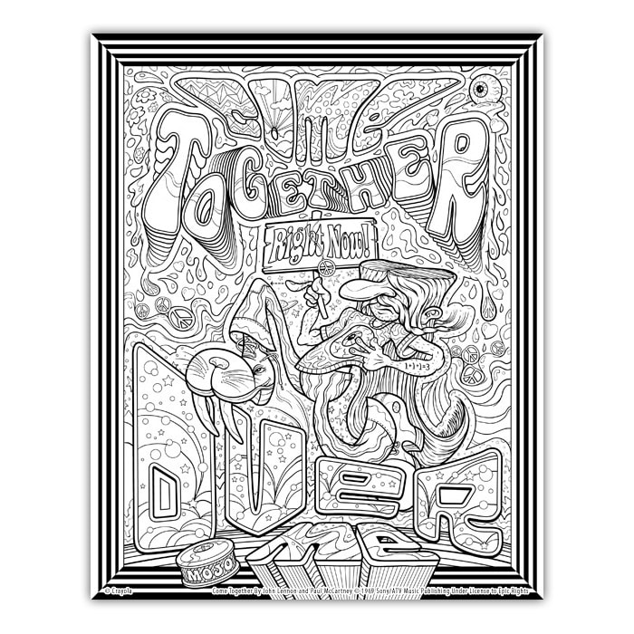
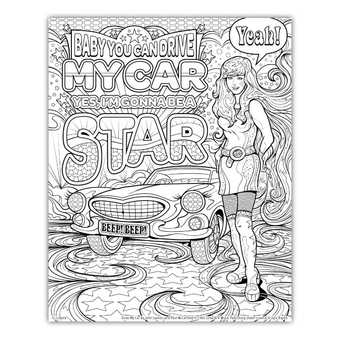
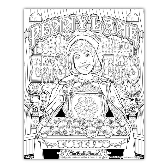
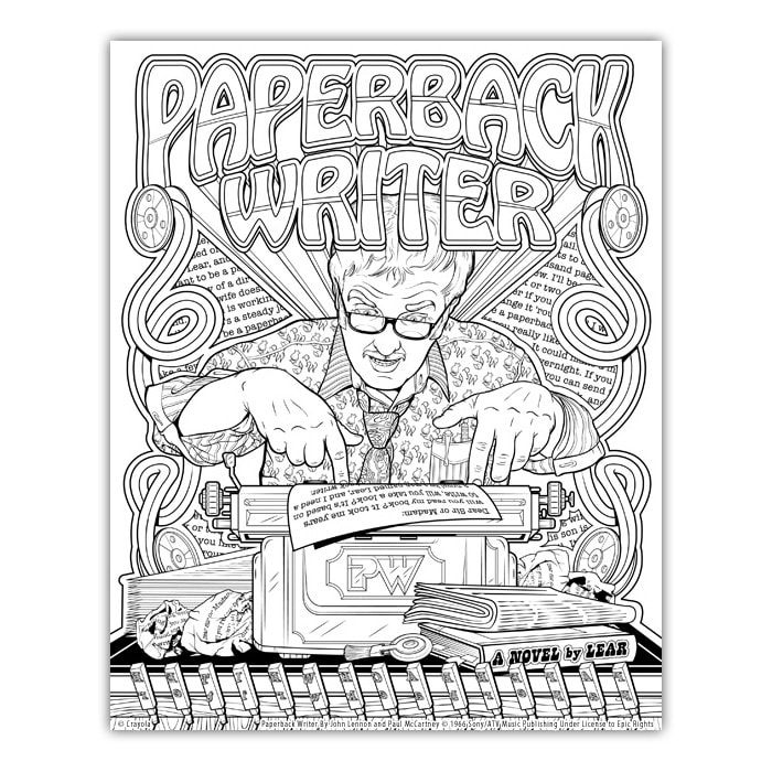
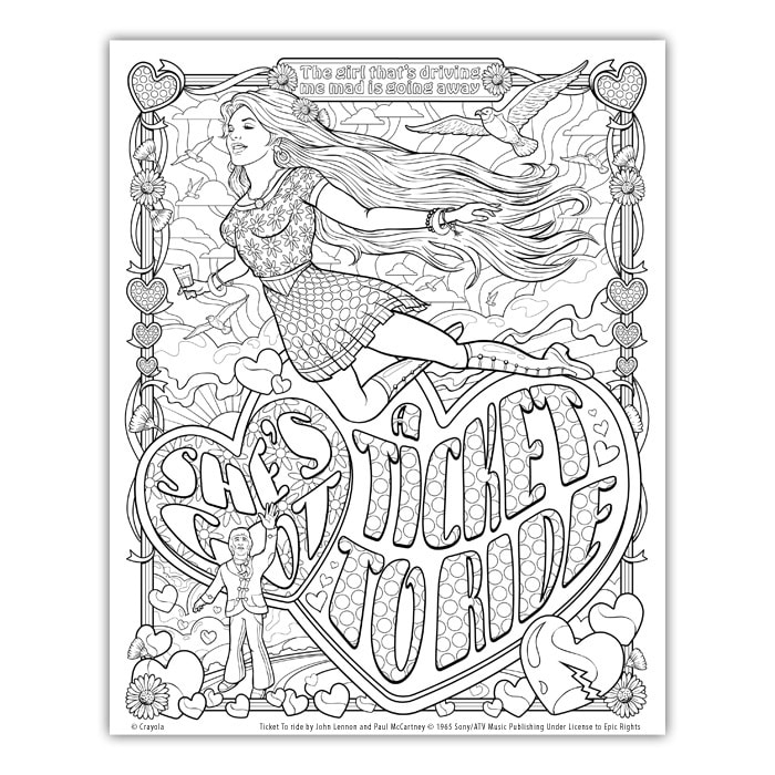
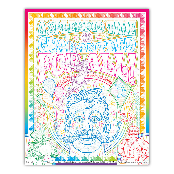
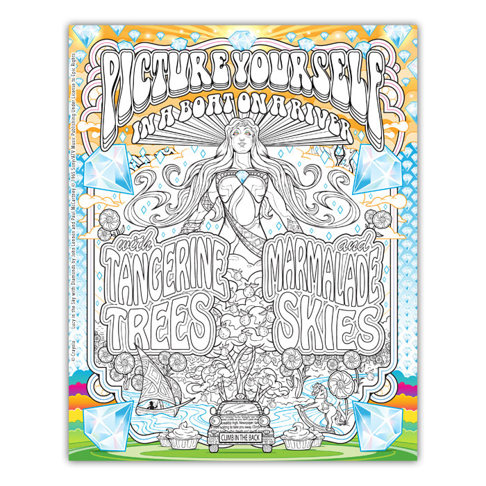
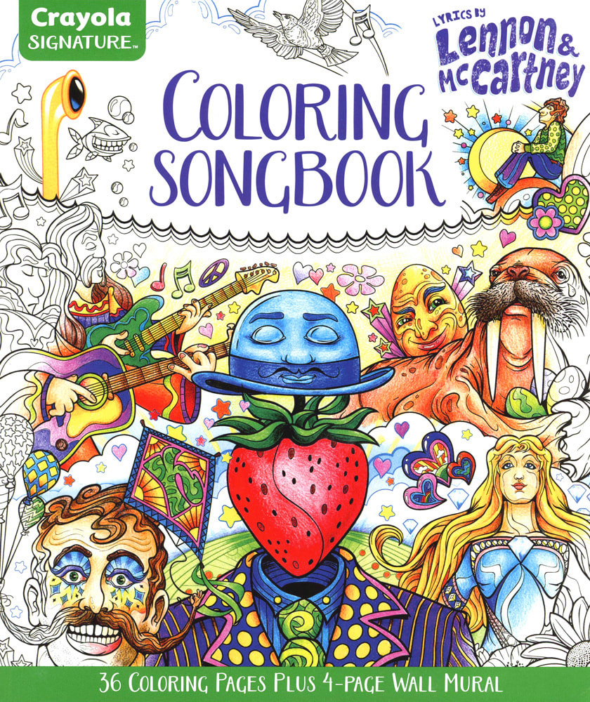 Crayola Signature Coloring Songbook, Lyrics by John Lennon & Paul McCartney When Crayola contacted me to ask if I'd interested in working on this book, I practically jumped out of my chair! Are you kidding?! I was on cloud nine. About a week later, I received all the specs from the licensing agency and I was ready to go. The challenge creating the art for this book was the stipulation that I couldn’t use any preexisting Beatles imagery or likenesses. Everything had to be my original interpretations — something less common for officially licensed products, especially for a project of this size. I embraced this "restriction" as it allowed me to take the book in a direction that totally new. What I learned about the lyrics of Lennon & McCartney is that there are so many numerous ways to depict them. I could have done twelve different illustrations for each song! I was given a list of 50 songs to pick from. The book is made up of 37 Lennon & McCartney songs — All You Need Is Love is a full-color, four page wall mural! I wish I could have illustrated the almost 180 songs they had written together because when I got to the last few pages, I was sad that this project was coming to an end. It was so much fun to work on, and all the people at Crayola could not have been more supportive and enthusiastic about this book. I wanted it to go on forever! There's also four pages — Lucy In The Sky With Diamonds, Being For The Benefit of Mr. Kite, Yellow Submarine, and Revolution — that are color enhanced for even more coloring fun! To say I'm a Beatles fan is putting it modestly. I bought my first Beatles record when I was in fifth grade, and for four more years that's all I bought. I listened to the Beatles, I drew pictures of the Beatles, I basically thought about the Beatles every day. I listened to some of those records so much, I had to buy new copies because they were getting worn out! I still have all of them. I think I'll go play some now. I hope Paul McCartney likes the book. I hope you like the book. Here's the stories behind eight of the illustrated pages: I AM THE WALRUS There were so many ways to illustrate this song. I was quite nervous working on it, since it’s such an amazing musical achievement. In the end, I decided to go for a theatrical feel. This song was first released in 1967 as a double — A side single with HELLO GOODBYE by The Beatles. WHEN I’M SIXTY-FOUR This was the first page of the book I illustrated. It has a Victorian feel to it, which was very popular in the 1960s. One of the first songs Paul McCartney wrote, when he was only sixteen, it was reworked by John and Paul in 1967 for the album SGT. PEPPER’S LONELY HEARTS CLUB BAND. DEAR PRUDENCE I wanted this page to have a real hippie, nature feel to it. This song is from The Beatles’ 1968 WHITE ALBUM and is based on Prudence Farrow, sister of actress Mia Farrow, who was with the Beatles in India while studying with the Maharishi Mahesh Yogi. COME TOGETHER This is definitely the one the of the strangest illustrations in the book and one that was a lot of fun to work on. Lennon started this as a campaign song for Timothy Leary's run for governor of California against Ronald Reagan in 1969. “The thing was created in the studio. It's gobbledygook; Come Together was an expression that Leary had come up with for his attempt at being president or whatever he wanted to be, and he asked me to write a campaign song. I tried and tried, but I couldn't come up with one. But I came up with this, Come Together, which would've been no good to him - you couldn't have a campaign song like that, right?” ~ John Lennon DRIVE MY CAR I wanted this page to be like one of those “WIN THIS BICYCLE!” sweepstakes that appeared so often in the back of comic books. The swirling hair that becomes part of the floor, the smile and eyelashes on the car, were all meant to imply the car and the girl are one in the same. Written in 1965, McCartney said this song was lyrically "one of the stickiest" writing sessions he and Lennon had worked on. PENNY LANE Most of this book stayed very close to my original vision. PENNY LANE started out as mostly text and a small scene of stores and street lamps. I gave it some serious thought and decided all the characters should be a part of the nurse’s “play” that is going on in her head — “she feels as if she's in a play / she is anyway”. I posed my wife for reference and I ended up with one of the coolest pages in this book. McCartney wrote this song based on scenes and characters from Penny Lane, an actual street in Liverpool. Originally intended for inclusion on the album SGT. PEPPER’S LONELY HEARTS CLUB BAND, the song was released in 1967 as a double — A side with STRAWBERRY FIELDS FOREVER. PAPERBACK WRITER This is possibly my favorite Beatles song (which is why I drew myself as the main character). It was fun to include as many references in the song as possible. The two-finger typing method depicted in the illustration is a nod to author Mickey Spillane, famous for his Mike Hammer crime novels. It’s a song that starts and just keeps going! McCartney wrote PAPERBACK WRITER in 1966 after he read an article in the Daily Mail about an aspiring book author. TICKET TO RIDE I saw this one visually more surrealistic than the song actually implies. I focused on the lines "living with me is bringing her down", "she would never be free" and "she's riding so high" to depict her as an uncaged bird. It has a nice comic book romance feel to it. Although the song is obviously about a relationship that has ended sadly, there are several conflicting interpretations of the song that you can research online for yourself. Released in 1965, TICKET TO RIDE became the Beatles' seventh consecutive number 1 hit single in the UK. BEING FOR THE BENEFIT OF MR. KITE John Lennon wrote the song in 1967 based on an actual circus poster from 1843. I paid homage to this by including the same classic Greek styled border around the page. It was my first choice to be one of the four color enhanced pages from this book. LUCY IN THE SKY WITH DIAMONDS I wanted to do a kind of Art Nouveau style on this illustration. It's another page in the book that does not have the title of the song in the picture and because of this, it's more about the scene and what is happening. I never planned on putting as many references into the picture as I did. Wish this page was a poster! i could have done all of them! John Lennon said his inspiration for the song came from a drawing his son Julian brought home from nursery school and that much of the imagery was inspired by Lewis Carroll's Alice in Wonderland books. The song was written in 1967 for the album SGT. PEPPER'S LONELY HEARTS CLUB BAND.  "Listen to the color of your dreams" ~ Tomorrow Never Knows / Lennon & McCartney 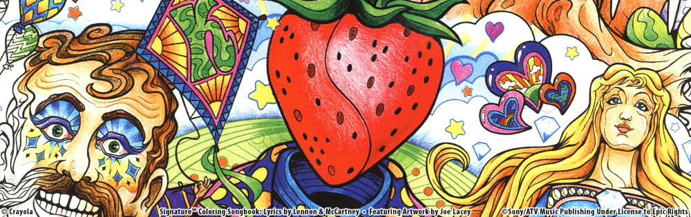
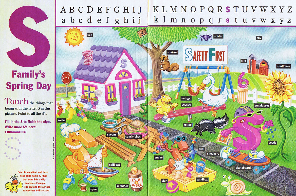
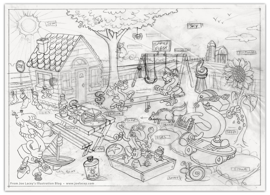
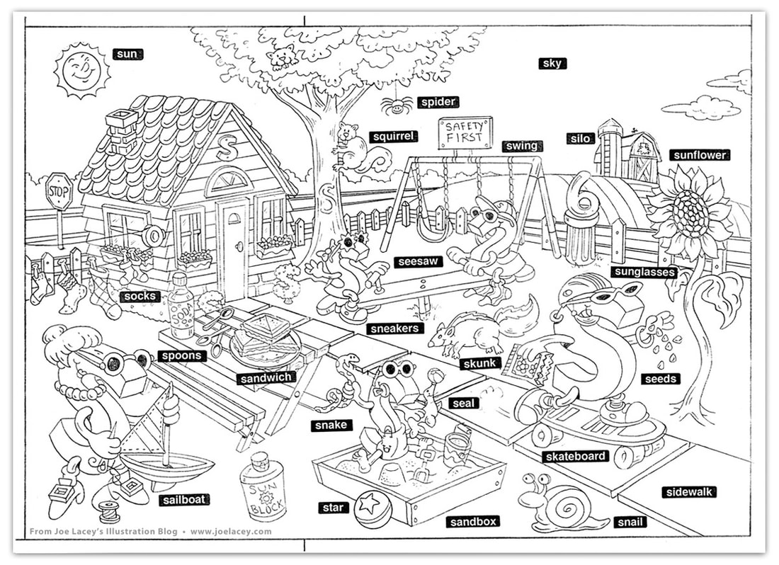
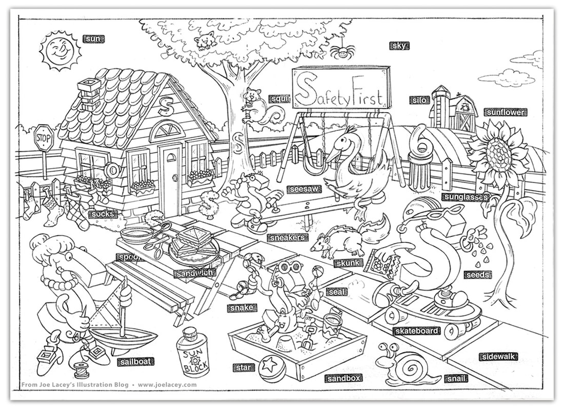
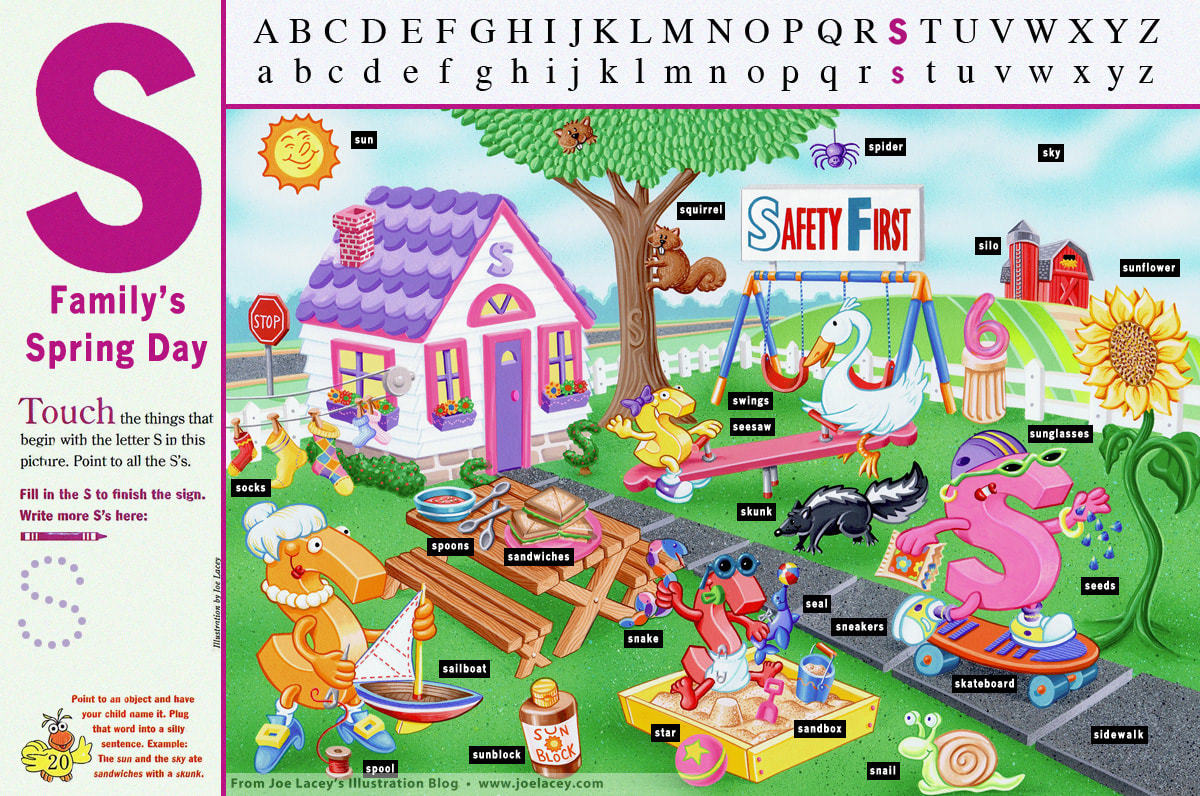 "S" Family's Spring Day. Illustration by Joe Lacey. Children's Television Workshop 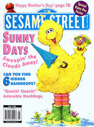 Here's one from the vault that has always held a sentimental place in my heart - a full page spread that appeared in Sesame Street Magazine entitled S Family's Spring Day for Children's Television Workshop. I had just begun work as a regular contributor to Crayola Kids Magazine and had a few jobs under my belt. Around this time, the magazine stands at bookstores and grocery stores were filled with kids magazines. With a pen in hand, I jotted down the names and addresses of the art directors from the magazines I liked. Next, I did what every illustrator is told NOT to do. I went home, folded an 8.5" x 11" color photocopy of an activity page I had done for another magazine and stuffed it into a white envelope with nothing more than the addresses on the outside and my name on the inside. When doing promotional mailers, artists should, for the most part, always send postcards. Art directors don't want to waste time opening envelopes. Most of the time they never even look at your post cards! One week later, I get a phone call from the art director at Sesame Street Magazine in New York City. I was expecting to be commissioned for a small spot illustration or some supporting art, not a full two-page spread. Not a bad return on investment for a stamp and envelope! My contract arrived with the most whimsical cover letter: "Sesame Street Magazine is guaranteed to be a smash hit now that you've agreed to do an illustration for it!" There were little to no changes to the art, but there were some changes to the content as the sketches evolved. Since it's an educational magazine, the games and activities are developed and reviewed long before they reach my desk. I received a very detailed list of what to include in the illustration and how the overall feel of the page should be presented. Beyond that, the characters and style were up to me. The art was hand-painted with airbrush and gouache on bristol board. At this time, I was transitioning into digital art, but still producing a fair number of illustrations in traditional mediums. It's cute little illustration, and I hope it made the kids happy. Original hand-painted art and the printed page as it appeared in the magazine. Pencil sketch stages.  |
BOOKS
by Joe Lacey 
Categories
All
IllustratorsLinksArchives
May 2023
|


 RSS Feed