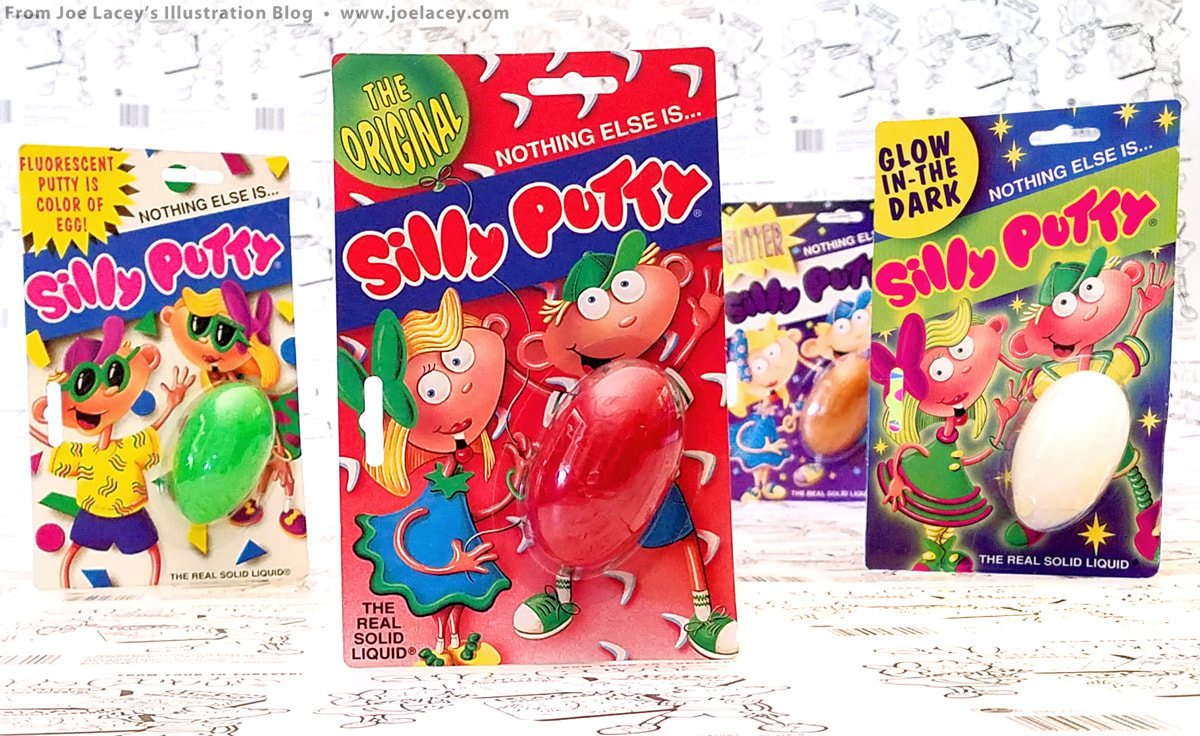
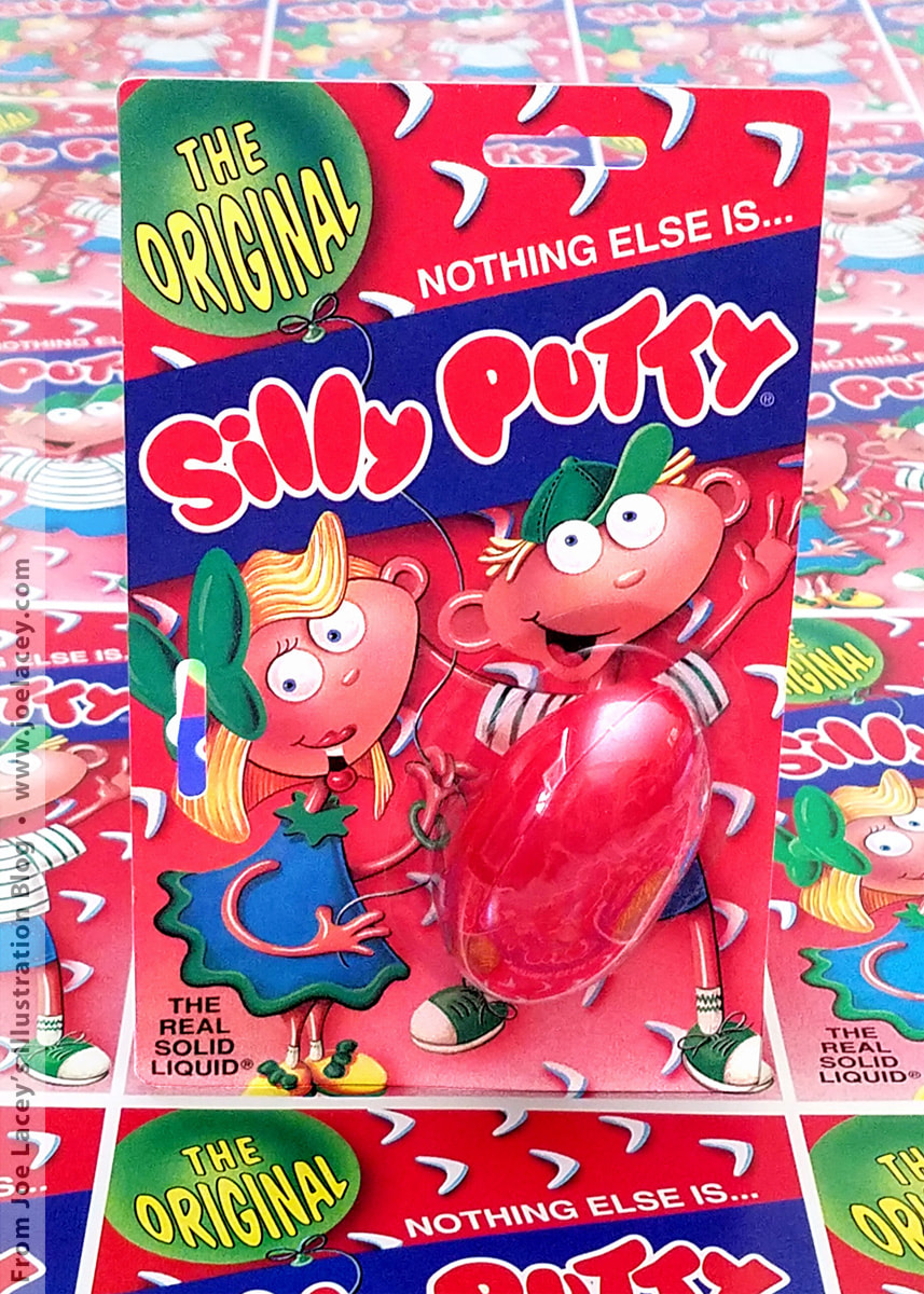
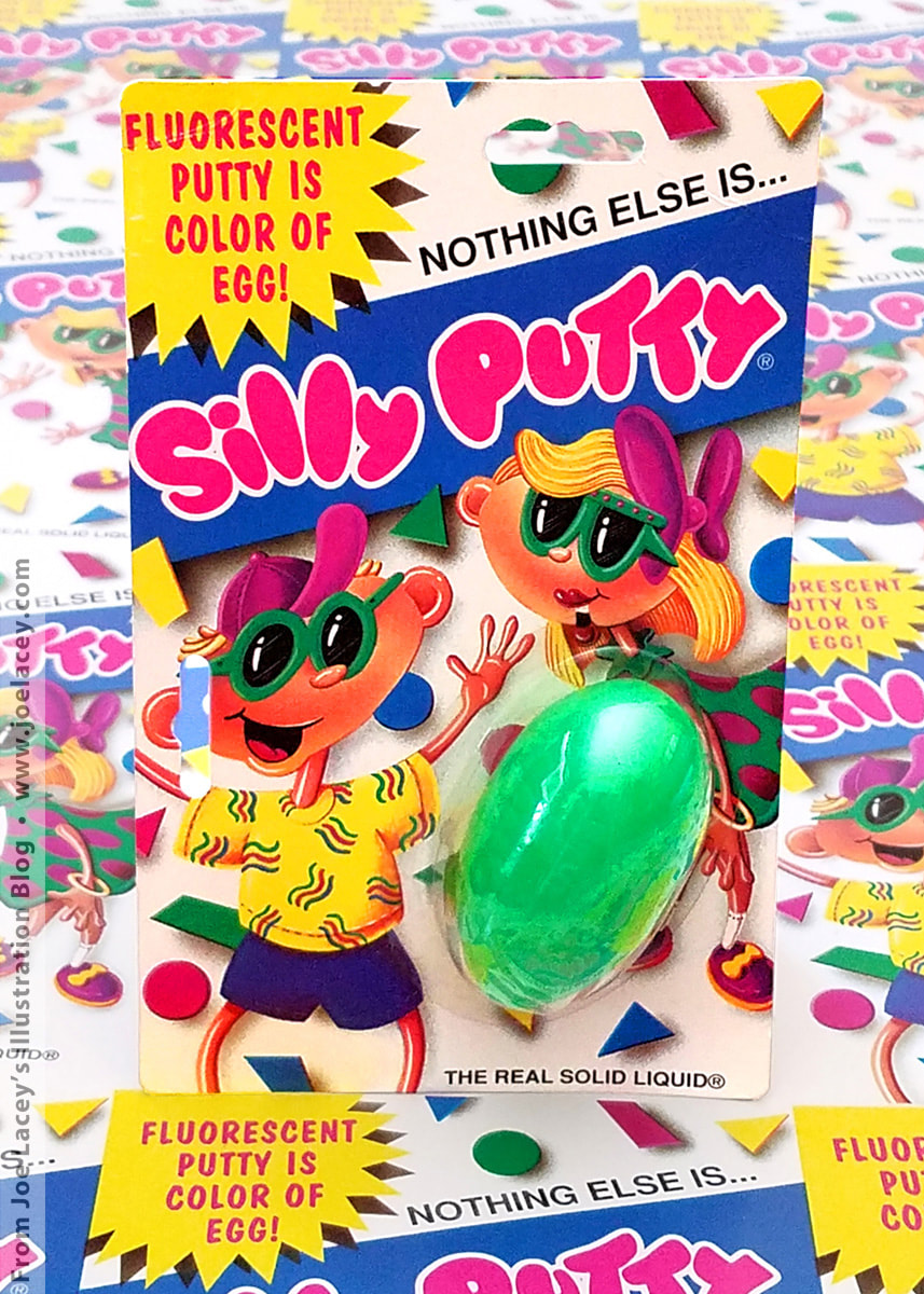
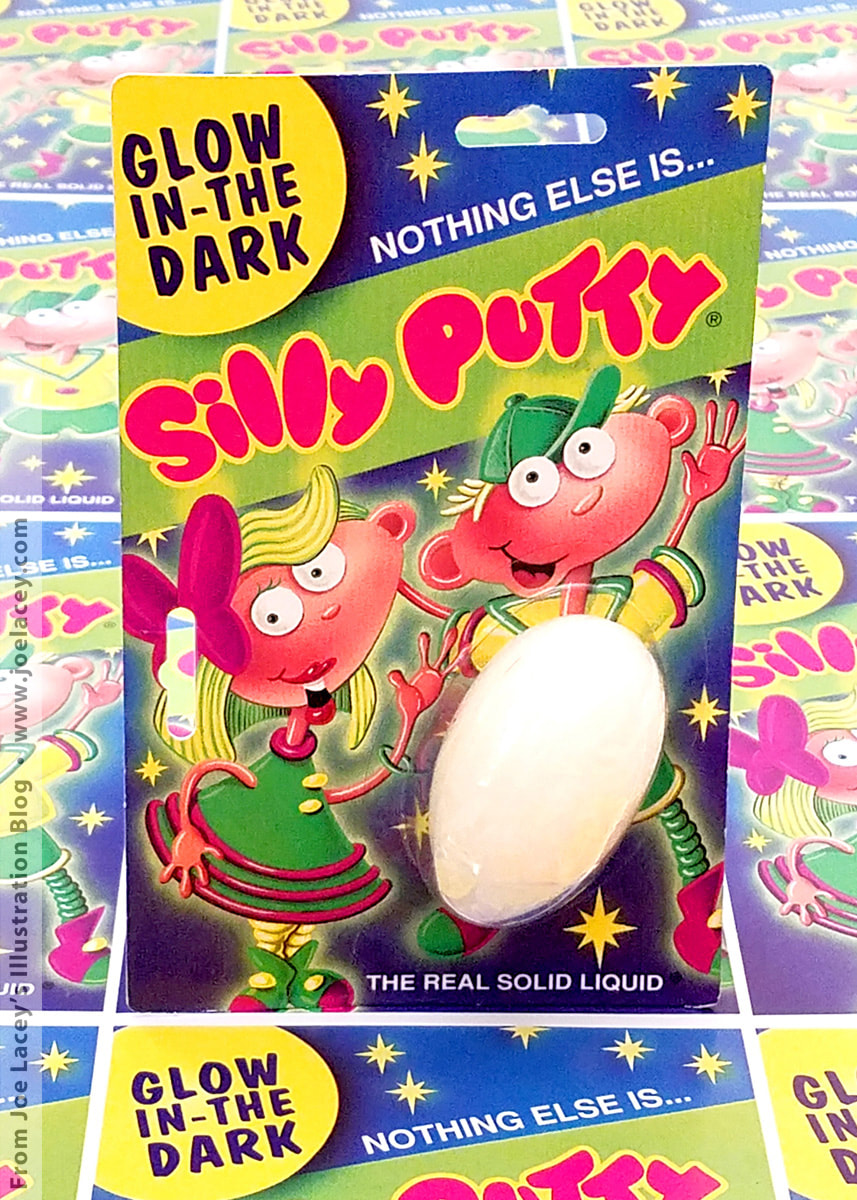
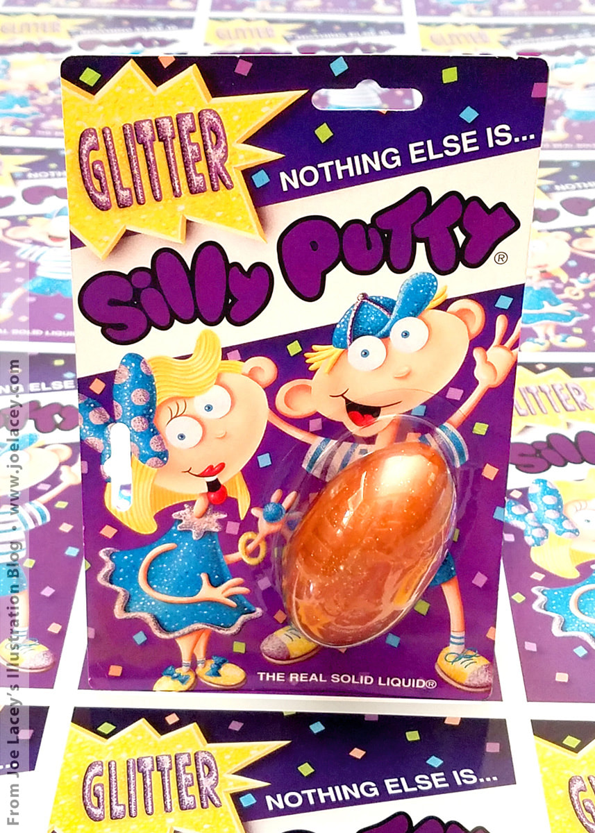
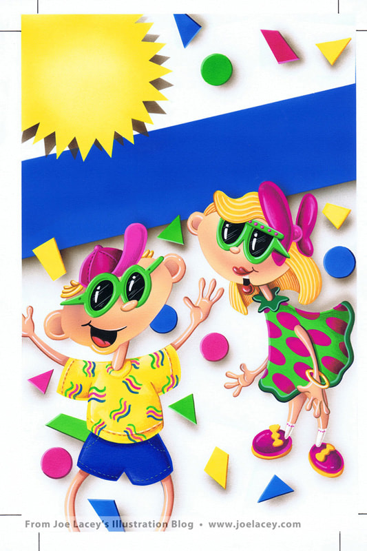
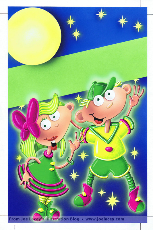
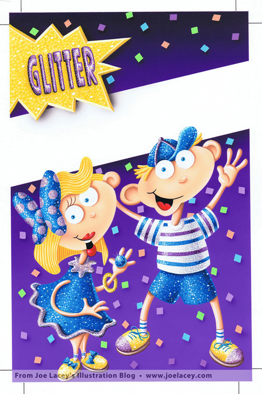
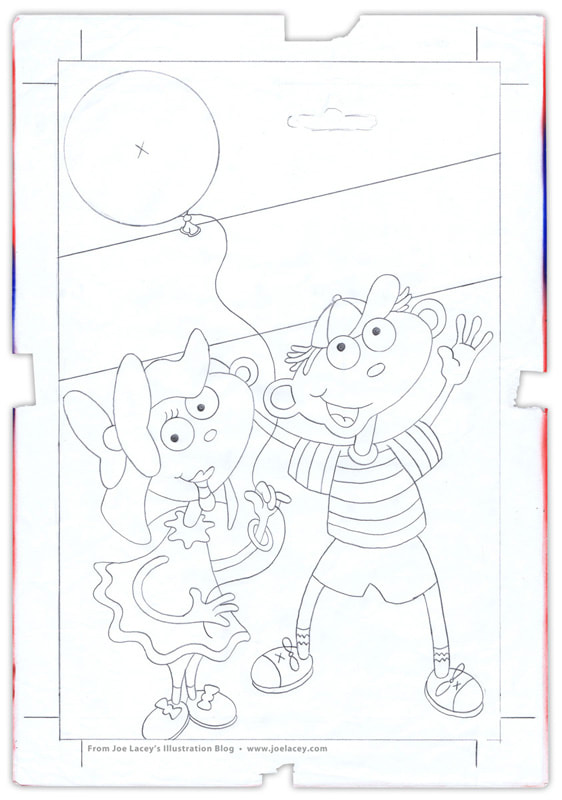
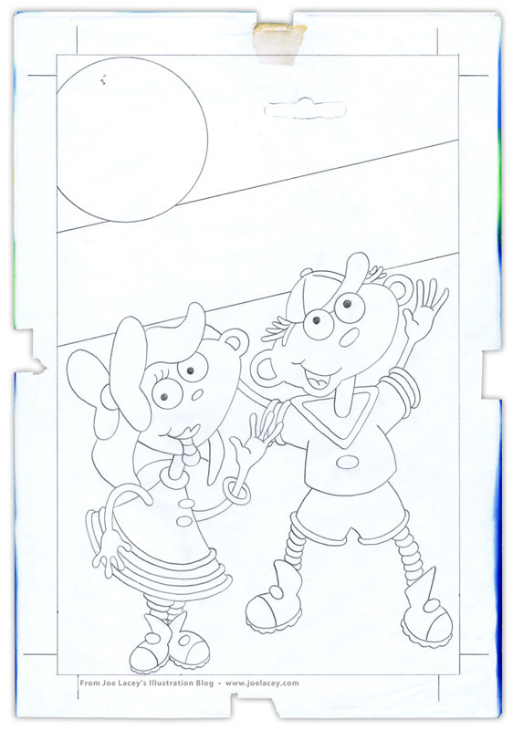
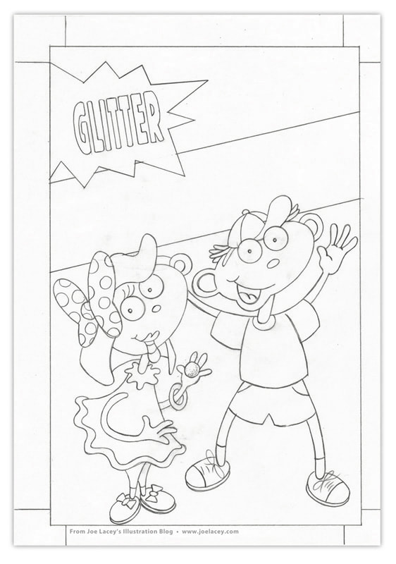
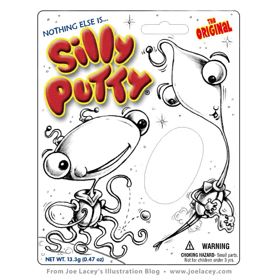
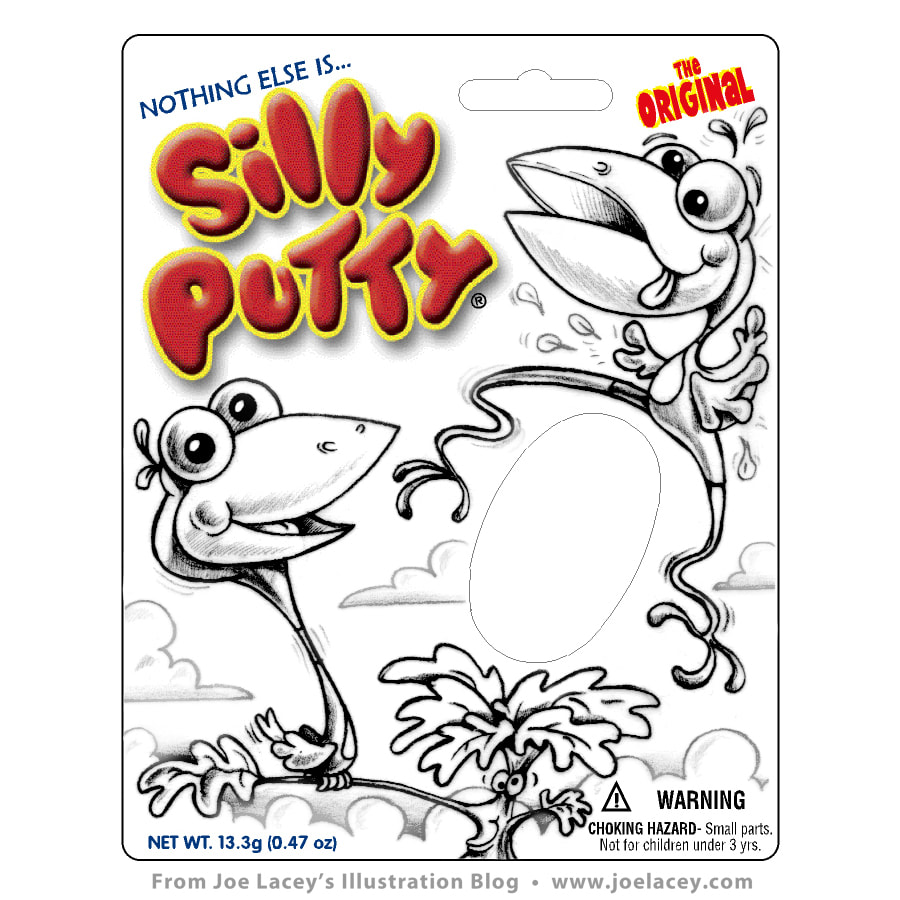
 Original Silly Putty, Fluorescent Silly Putty, Glow-In-The Dark Silly Putty, and Glitter Silly Putty. Redesigning An American Classic 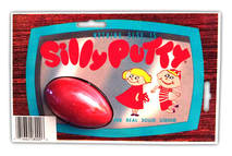 1989 Binney & Smith Silly Putty packaging. 1989 Binney & Smith Silly Putty packaging. Silly Putty first major toy packaging commission. Until then, I was doing a lot of product rendering, concept boards, and a lot of line art. To tell this story properly, I need to start with a brief history of Silly Putty packaging. Binney & Smith (Crayola, LLC.) acquired Silly Putty in 1977. The look pretty much stayed the way it was originally introduced in 1951, retaining it's iconic television frame and two blonde haired kids. Up until 1989, they were still producing Silly putty with this packaging. The nineties were rolling in and it was time for an update. I couldn't believe I was going to be the the guy who got to take this on! Granted, there were several attempts in the '70s at updated packaging, Silly Putty Man featured a Marvel-esque superhero fighting off space pirates and limited run holiday packaging from the early '80s. But they never radically changed the packaging for the original Silly Putty until 1992. I had just finished my studies at Syracuse University and was ready to go full-time into the world of freelancing. I had an interview for a full-time job at an ad agency in Harrisburg, PA, then the phone rang. "Hey Joe, you wanna work on the rebranding for Silly Putty?" "Sure!", I said. "When does it start?" "We need the art in a couple months, gotta redesign the characters... Come in on Thursday, we'll talk about it." "I'll be there." I hung up the phone and cancelled my job interview. I couldn't pass this up! Silly Putty Packaging The first round of the redesign was Original Silly Putty, Fluorescent Silly Putty, and Glow-In-The Dark Silly Putty. The main focus was on Original Silly Putty, as it would dictate how the others were to be handled. The kids were still blonde, striped shirt, baseball cap and sun dress. I decided to make the kids' heads look like a ball of egg-shaped Silly Putty. A pattern of boomerangs was used as a nod to the 1950s origins of Silly Putty. The back was b&w line art where I was able to include my name. A year later I illustrated the packaging for Glitter Silly Putty and a stocking shaped holiday four-pack of metallic putty. When the newly designed Silly Putty was released in 1992, David Letterman held up the The Original Silly Putty package I had illustrated during one of his skits about funny warning labels, proclaiming, "Use of this product may cause extreme silliness"... or something like that. I never saw the episode, so if anyone out there knows where I can see it, PLEASE LET ME KNOW! The fluorescent Silly Putty package had a cameo in the Seinfeld episode The Big Salad which aired on September 29, 1994. For you collectors out there, these packages appear to be extremely rare. I have searched the internet for several years and have yet to see them posted anywhere. I've never even seen them for sale on ebay! I have quite a few of them and even some huge press sheets of uncut boards given to me by the art director at Binney & Smith. I had planned to wallpaper a room with them. Maybe someday, I will. In 1997 the packaging was again re-designed with new characters of which I was not involved. Silly Putty continues to go through many package revisions and was inducted into the National Toy Hall Of Fame in 2001. Rest of article continues...
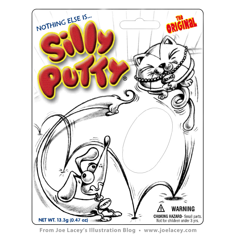
PACKAGE BACKS  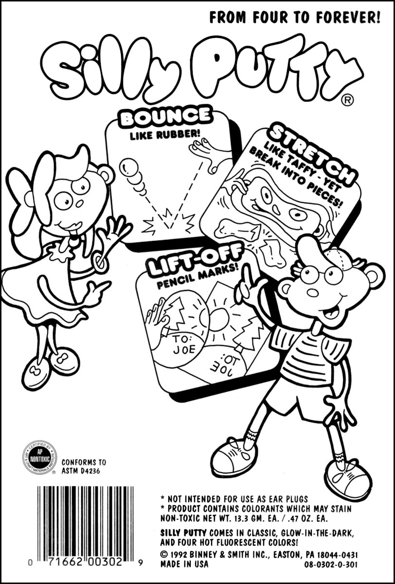 HOLIDAY PACKAGING 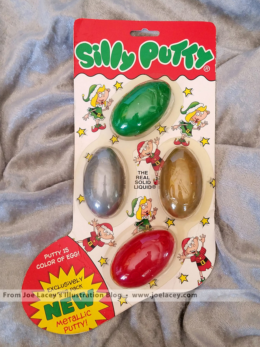   In 2002 I worked on some concept art for yet another redesign of Silly Putty. Three pencil sketches of rubbery aliens, goofy birds, and a dog and cat named Stretch and Bounce, never made it past the drawing board, but it was fun to work on Silly Putty again. I hope this article gets you in the mood to go out and buy some Silly Putty. Like the package says, it's for kids aged "Four to forever". There's nothing else quite like it! Comments are closed.
|
BOOKS
by Joe Lacey 

Categories
All
IllustratorsLinksArchives
May 2023
|

 RSS Feed